Anything from the inception of this blog is copyright to Danielle Harrison ©
Showing posts with label Cruises. Show all posts

Wednesday, 23 April 2014

OUGD505 - Design Production 2: Studio Brief 2 - Colours

To think of colours for the brand, I started collecting images from the destinations so I could find a theme.
Initially I wanted to do blue and yellow, as it reflects the sea, sun and is bright and fun like a holiday should be. However, P&O, Norwegian Cruise Line and Royal Caribbean use these colours, so I wanted to do something different.

Here are the colour palettes I created based on Mediterranean countries.


Orange, purple and blue seem to be the most popular colours that were in the images.
I think my favourite combinations are Mykonos, Corfu, Rome, Venice, Valencia, Florence, Monte Carlo, Santorini, Ajaccio and Villafranche.
I need to work out which is best suited to my audience, and how I can incorporate more than two colours into the brand, as I haven't really done that before.


OUGD505 - Design Production 2: Studio Brief 2 - Cruise Story

Cruise Story
I thought of a story for my cruise liner so I could narrow it down more.
  • It is a small company
  • Fleet of three ships
  • Only departs from Southampton Port
  • Only calls to Mediterranean Ports
  • Yearly Cruises
  • Primarily English passengers, but could be more affluent Americans and people from other countries who will fly over
  • Families, maturer couples and groups of friends. 30+
  • For people who are new to cruising, want a relaxing holiday or experience a smaller ship
Name
I then started thinking of a name for the cruise liner, thinking of keywords and the tone of voice of the company.
  • Trustworthy
  • Fun/Exciting
  • New to cruising
  • From UK
  • France, Spain, Italy, Croatia, Turkey, Corsica, Cyprus, Portugal, Canary Islands, Greece
  • British company
  • Mediterranean
  • Beach, city, landscape
  • Sun
  • Travel
  • Discover
  • Explore
  • Nautical
  • Entertaining
  • Holiday
  • Wake up somewhere new everyday
  • Special
  • Voyage - travel by sea
  • Discover the med
  • From comfort of UK
  • Once in a lifetime
From this, I thought of existing names for cruises - Princess Cruises, Celebrity Cruises, Royal Carribbean, Cunard Cruises, P&O, Norwegian Cruise Line. They all exude luxury holidays or focus on geographical locations.

So I thought of three possible names:
  • Mediterranean Cruises
  • Mediterranean Voyages
  • Mediterranean Explorer
I decided that Mediterranean Voyages was the best name, because it is straight to the point and does what it says on the tin. Voyage means to travel by sea, so is appropriate, and it only travels to the Med, so people know exactly where it goes.

Name:

Mediterranean Voyages

Collateral
I thought of a list of things that I wanted to create for this:

  • Website
  • Card/Pass
  • Loyalty drinks card
  • Loyalty ice cream card
  • Business card
  • Printed stationary
  • Bag
  • Sick bag
  • Mini brochure
  • Whats going on
  • Web banner
  • Ship
  • Card holder or lanyard
  • Stamp

Now I am going to think of colours for the brand.


Tuesday, 25 March 2014

OUGD505 - Design Production 2: Cruise Presentation and Written Brief

We have to present our research topic through a presentation, and discuss our idea for the next brief.

For my presentation, I had an introduction page to introduce what I researched, and a few dps's from my publication to show people what I am interested in from the research, and what I have produced.
I then have two slides dedicated to the two ideas that I have for Studio Brief 2.

Here are the rewritten briefs:

Idea 1
To create branding for a small cruise line, which departs from Southampton and travels to the Med.
I could create a website, brochures, cabin toiletries, amenities collateral, boarding passes, 18+ loyalty cards etc for it.
The one thing putting me off this, is that it might be too big of a project to do, as there is so much to do.


Idea 2
To create branding for a new excursions trip, which specialises in organising shore trips for cruise passengers from Barcelona.
This is a different direction from my original topic, and is a lot more manageable, but I don't know if it will be as fun.


Here is my presentation:

Monday, 24 March 2014

OUGD505 - Design Production 2: Studio Brief 2

We had a briefing for Studio Brief 2, and an exercise following that. The idea I have in mind for this brief is to create Cruise Line branding. Try and keep it small by having 3 ships in a fleet, embarking from Southampton and only going to the Mediterranean.

The exercise was to write down a list of as many words as you can think of in 3 minutes to do with your topic.

Cruises

  • Travel
  • Holiday
  • Luxury
  • Abroad
  • Ship
  • Swimming Pool
  • Restaurants
  • 24/7 Buffet
  • Johnny Rockets
  • Ice Cream
  • Slushies
  • Drink Card
  • Cocktails
  • Food Sculptures
  • Exotic Food
  • Sick Bags
  • Photographers
  • Gallery
  • Formal Evenings
  • Captain
  • Cinema
  • Shows
  • Cabin
  • View
  • Windy
  • Sun Lounger
  • Destinations
  • Mediterranean
  • France
  • Cannes
  • Villafranche
  • Monaco 
  • Monte Carlo
  • St Raphael
  • Riviera
  • Yachts
  • Red Carpet
  • Casino
  • Italy
  • Pompeii
  • Naples
  • Sorrento
  • Sicily
  • Naples
  • Mascot
  • Promenade
  • Florence
  • Pisa
  • Trevi Fountain
  • Leaning Tower
  • Vatican City
  • Four Scooped Icecream
  • Hot
  • Shoulders/Knees covered
  • Spain
  • Barcelona
  • Park Guell
  • Casa Batllo
  • Gaudi
  • Flamenco
  • Water Fountain
  • Valencia
  • Palma
  • Mallorca
  • Corsica
  • Turtles
  • Croatia
  • Dubrovnik
  • Turkey
  • Greece
  • Santorini
  • Alaska
  • Caribbean
  • America
  • Australia
  • Scandinavia
  • On Board
  • Boarding Pass
  • Airplanes
  • Family Holiday
  • Towel Animals
  • Workers - global
  • Kids Club
  • Water
  • Waiters
  • Photographers
  • Merchendise
  • Lifeguard
  • Maids
  • Receptionist
  • Chef
  • Sports Centre
  • Rock Climbing Wall
Processes I Want To Try
Then we had to list processes that we wanted to try
  • App design
  • Coding
  • Vinyl cutting
  • Using 3D Workshop
  • Branding Guidelines
  • Advanced Form/Big Website
  • Information/Wayfinding
  • Editorial - printing externally
  • Photographing work
  • Photoshop Mockups
Products Interested In Creating
We were then asked to write a list of products we could create for this project

  • In depth website - functional, viable, forms, corporate
  • App Design
  • Editorial design - brochure
  • Matt lamination
  • Mockups
  • Branding Guidelines
  • Email format
  • Letterheads
  • Banners
  • Social media
  • Drinks/loyalty card
  • 18+ wristband/card
  • Cabin toiletries
  • Embossed soap
  • Shower gel capsules
  • Bottles
  • Towel animals
  • Towel animal handbook
  • Do not disturb sign
  • Biscuits
  • Ship map
  • Uniform
  • Lanyard
  • Stationary
  • Ship merch
  • Teddy
  • Pens
  • T shirts
  • Walkway
  • Directions
  • Show advertising
  • Sick bags
  • Boarding pass
  • Airplane material
  • Mailshot
  • Travel agents presence
  • Swimming pool signage
  • Health and safety
Audience
We then had to ask questions we didn't know about our audience
  • Which particular audiences go at different times of year
  • What nationalities go to certain destinations
  • Biggest audience for med cruises
  • What jobs/income do they have
  • Why do they go on cruises
  • Age
  • How many fly/depart from own country
  • What countries do they want to see
  • Why is there so many ships in a fleet

After doing this I realised how much I could go with it, and that I should bring it back a bit because it is a very big task at the minute, and is unrealistic.

OUGD505 - Design Production 2: Cruise - Final Crit Alterations

After the final crit on the publication, I had to change things anyway due to spelling errors and too big text, so I thought I would take board everything on that people had said and try out all of the suggestions.

This actually made my publication a lot better than it was, and I'm glad this crit was done at a point I could go back and make changes, as it has improved it for the better.

Feedback included:
  • Make weight of lines thinner
  • Make text smaller
  • Use a sans serif for the bodycopy
  • High resolution images
  • Number placement on pictures could be more consistent

Alterations Development:

I started on the contents page as it is the first dps, and by getting this right with all the point sizes and gutters I could do the next pages more easily.
I also made the weight on the lines to 0.5pt.
I also made the bottom margin 25mm, not 20mm.


Here I tried a sans serif next to Rockwell, and I have to admit, the feedback was right and it does look better. I used Museo 500, and I have used Museo 900 for the headings.
I added a sub-heading, as since designing the original I have started noticing these a lot more in magazines and brochures, so it makes it more realistic and gives the viewer more of an idea of the content.

I had a 10mm space between the image and the sub-heading, and then a 7mm space between the sub-heading and bodycopy.


I also went into Photoshop, and made the image the right size, as previously I had stretched it in InDesign and it looked blurry.


Amenities
I then started on this page, and I desperately needed to sort out the top area of the text. I hate how there is a gap on one side. I added a subheading on this as well, so the viewer knows more about the introduction. 


I then made the secondary subheadings capital letters to match the subheadings.


Then I made the title on one line, and this looks a lot more balanced now.


I added more content to the introduction because I had lost of lot of space when reducing pt size and lengthening the title.


I then made the bodycopy 8.5pt as this is more descriptive, short bursts of information that is under the introduction.


I also added more content on these, so there was a 10mm gap til the photos.


One word of advice was to add the ship titles on the pictures, so I did that. I also made it 8.5pt, as it printed really big and doesn't need to be, it's only supposed to be a caption.


I also tried the captions started at the beginning of the margin, but this looked weird.


Here is the dps, and I think it looks a lot better and more polished.
I also made the pagenation smaller to 11pt.


I then realised I hadn't changed the bottom margin, so I went back and altered this.


Fly Cruise
Then I went onto the next page, and had quite a lot of space to fill. I added a subheading and moved the plane illustration to above the title rather than next to the itinerary. 


I then started fiddling about with the itinerary.


Embark from Southampton
I then started working on the next page.


To make it the height as photo, I added another day to the itinerary.


Here is the final dps.


I also changed the pagenation.


Mediterranean
Then I started working on the next dps which is around the mediterranean. I altered the photos so made them smaller and added the excursion title.


I then added a subheading.


Then I remembered I didn't change the margin bottom on the last dps, so went back and altered that.


Here is is finished.


I then darkened a lot of the photos because you couldn't see the white text behind it, and this makes it more legible. 


Back of Book
I altered all the point sizes and fonts on the back of the book, and added more information.


Here is the back of the book, and I am happy with it because it is appropriate.


Med
Back to the med dps, I had to add more content as when I reduced the pt size there was a lot of gaps. I made sure to follow the same gutter sizes.


Here is the final dps. 


Caribbean
Then I went onto the caribbean dps, and started doing the same format here, adding more content, darkening imags and adding captions, changing pt sizes and fonts and pagenation.


I added a subheading here, and altered all the spacing on the highlights section.


This is the final dps.
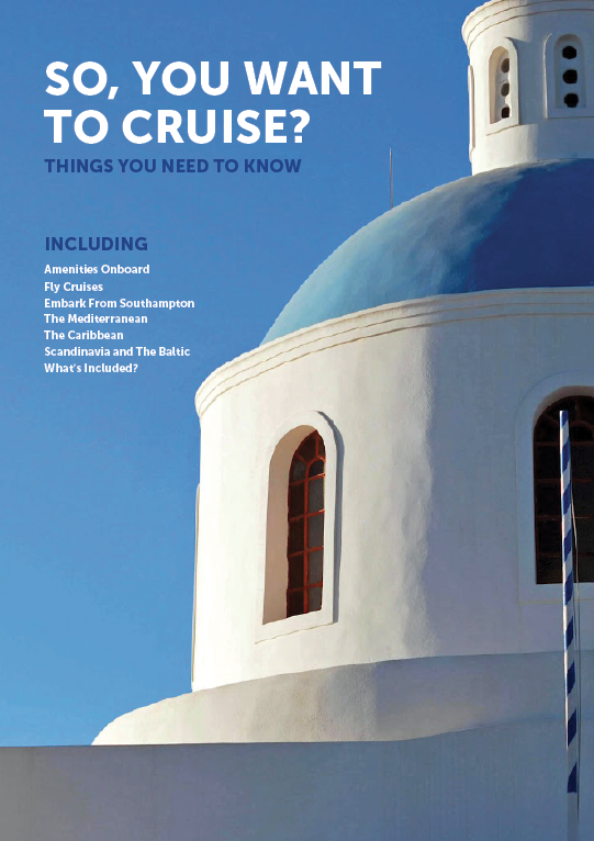

Front
Then I started working on the front, and I needed to find a high res image to use. This actually proved so difficult to get one big enough, and I really wanted a scene of Santorini. This is because it is really picteresque, on the coast and has blue and white buildings. This means the colour scheme will match the back of the book, and with it by the sea it relates to cruises as well as one of the destinations talked about in the book.


I moved the placement of the introduction.


I changed the image which is nice, but again not very sharp.


I changed it again and this time it is better resolution.


I decided to get rid of the including bit, because it's on the next page anyway in the contents and it didn't look right.


Scandinavia
I started doing the same for this dps as I had done for the med and caribbean.


I added more content which looked more full.


Here are the dps's for the destination pages.


Here shows that I changed the bottom margin to 25mm.


For the last page I just made all the text smaller, and felt like it looked fine as it was.


Here is the final booklet ready for print: