Mindmap
I did a mindmap thinking of everything related to the words and the cruise, and saw a recurring theme in 'flowing water'.
Flowing Water
This is a recurring theme because of:
- Cruise pool
- Onboard Spa
- Drinks
- Sea
- Waves
- Venice
- Hydration
- Jacuzzis
- Trevi Fountain
- Magica Fountain Barcelona
I decided this would be a strong concept to come up with a logo with this as a theme.
Designing
I started by drawing on paper as well as screen random logos to see if I came up with anything that I liked. I tried to work quickly just changing elements to see if I could think of anything because I was a bit apprehensive of starting.
I started by writing the name, I chose Museo Sans at first because it is a contemporary, sturdy typeface to convey it's modern and well built. This is so people feel more trusting towards the boat - and that it won't sink.

I then tried it left aligned.

I changed the font to appeal to a more maturer audience, but I think this might look a little too dated.

I went back to Museo, and made a wave shape to obscure a couple of the letters. This is to convey a ripple in the water.

I made another wave and altered it with the width tool.

I started playing around putting through letters.

I also changed colours. This looks like it is directed at a maturer audience, and the colours represent a sunset, so portrays relaxation.

I tried adding another wave to the first word.

I just started making different wave shapes.


I put three together.

and tidied up the edges.

Then I started playing with this and words seeing how it looked in different arrangements. I don't like it on top because it is quite distracting.

Then I tried it above, but I don't think the scale is right.

Then I started trying it next to the words.

I tried covering up some of the letters.

I tried positioning it over the letters more.


I then tried it as a pattern next to Voyages.

I tried it over voyages but I think this possibly represents the waves going over the boat which isn't what I want.

I tried it between, but it seems to separate the words too much.

I then tried having Voyages in a lighter version and seeing how that looked justified,

as well as smaller. I prefer it smaller.

I then tried a wave over it.

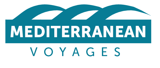
I then tried three waves above it to represent the three ships.


I then tried this text over the wave.

And above the wave.

I tried to focus on the wave going through the O.

I also changed colour which I preferred - more of a contrast and holiday.

I made Mediterranean bolder which I think works better as it stands out more. This is the only logo that I sort of like so far.

I tried a baby wave next to it.

I also tried a drop shadow.

Then I tried three waves again. Looks a bit old-fashioned, but then this could appeal to my audience.

I then thought about having the wave in a box.

I then thought about having the wave as negative space in the box. I did this using the Minus Front pathfinder option.

I tried a few different vartions of this.


This was my favourite wave, and I altered it a bit further. I made the text closer together, and then I made the square the same height as this.

I then thought of seeing what the other pathfinder options do.
Exclude

Intersect

Unite

Minus Back

I then tried a square behind the mediterranean to see what it would look like.

I changed the colour of it.

I then tried adding three waves above it.
I then tried three different waves but this looked too thin.

I then tried one wave as an arch over the words.

I then changed the colour of the wave.

I then just messed around with colour choices.


I then started making a different kind of wave.

I made three of them to represent the three ships.

I also tried these two with a line in between, and different colours.


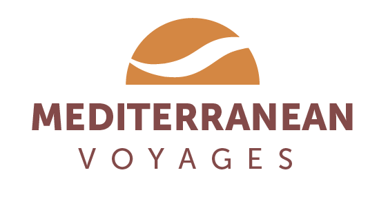
I then thought of adding a sunset, and try different colours to reflect this.

I put a wave through it and tried one of the pathfinder options with it.

Then I tried this, which I prefer.
I tried having the wave between the words.

I tried doing this to see what it looks like, and I think it might be a bit too busy.

I have done a few logos now, so I am going to ask for feedback on these to see what to develop further.
No comments:
Post a Comment