Anything from the inception of this blog is copyright to Danielle Harrison ©
Showing posts with label Creative Suite Session. Show all posts

Wednesday, 23 April 2014

OUGD505 - Design Production 2: Studio Brief 2 - Choosing Which Brief

I had rewritten two briefs - one for shore excursion trips and one for cruise line branding.

Shore Excursion Trip
Initially I decided to go for shore excursion trips because I thought this would be a more manageable task, and I wouldn't be able to bite off more than I can chew.
However, when I started doing mindmaps trying to think of a name I wasn't really getting excited about it.


I also looked at some words on thesauraus.com to try and think of a name.


Cruise Ship Branding
So I had a word with Lorraine about it, and she reminded me that I didn't have to make the cruise ship branding a mammoth task and can just focus on the boat. 

I made a list of things I could do without going overboard and thinking about more branded things on the ship:
  • Website
  • App
  • Boarding Pass
  • Ice Cream/Drinks Loyalty Card
  • Membership Card
  • Card
  • Merchandise
  • Mini Brochures
  • 'What's On' Flyer
I felt more comfortable about it now, and Lorraine suggested writing a boat story so I know more about who my audience is and what my brand is.

Wednesday, 4 December 2013

OUGD504 - Creative Suite Session 4

We had to find nine things wrong with this InDesign document.


One of the images had the colour space as RGB, which is for web, and to fix this you can just edit the image in Photoshop and change the colour mode to CMYK and save it.


The PPI for this isn't right, the effective resolution is the result of the change of an image size in InDesign. It has been scaled to 13% of its original size which has effected the PPI. A consequence of this is that it is a large file and unnecessary processing that needs to take place.


By having the colour in registration, it uses all plates to produce this colour so is 100% of every single colour. Consequence is that it might misregister and it won't be completely black.


One of the Pantone swatches isn't being used - Pantone 363C - and so there is no point in having it because it will create an extra unneeded positive.


By selecting all unused, this shows us that the Pantone swatch isn't being used.


As this image is at the edge of the page, it should be stretched to reach the bleed for cropping purposes.

This has been scaled to 233.4% which is too big and has effected the Effective PPI to 129.


This has been scaled down too small and has created a massive Effective PPI and needs to be edited in Photoshop.


This is a jpeg file which shouldn't be used because every time you save it the quality decreases and so is bad to use in a working progress. You can edit the photo and resave it, then choose the relink option in InDesign so that you can replace it and it stays the same.


This is the wrong colour mode to be using for print.


Preflighting is what you do before you print a document - checking your document.

Wednesday, 20 November 2013

OUGD504 - Creative Suite Session 3

To create a tint swatch in InDesign, you select the colour you want to make a tint out of your swatches, then you click on Swatches > New Tint Swatch


Then you type in the value of the tint you want to make, and they appear in your swatches with the percentage next to them.


Here is what a series of tints from one colour look like:


To find a Pantone colour, you can go on Swatches > New Colour Swatch, and select from the Colour Modes which colour swatches you want to choose from


 When adding images to InDesign, we need to consider a few things in Photoshop:

  • Work in CMYK
  • Actual Size - size it's going to be when placed in InDesign. If you enlarge it, it will go pixelated, and if you shrink it the file size will be too big and can cause errors when going to print
  • 300dpi
  • Save as TIFF or PSD. PSD works with alpha channels which has transparency, whereas TIFF doesn't
When working in Illustrator, we have to consider:
  • We don't have to create it a specific size as it is a vector, not resolution
  • CMYK or SPOT
  • Save as AI file, or copy and paste between files

In InDesign, we can see the Separation of colour to see what colours make up an image. This is useful when setting up for screenprinting


Wednesday, 6 November 2013

OUGD504 - Design for Print: Creative Suite Session 2

Photoshop Session

RGB + CMYK
Gamut is another word for range, and this is used when talking about CMYK and RGB.
There is a bigger gamut in RGB than there is in CMYK.

RGB files are smaller

Gamut
By choosing View > Gamut Warning, it puts a grey overlay over the image to show you where the colours will be changed during print as it is out of the gamut range.


By changing the Hue/Saturation you can alter the gamut so that there is none.


To change the gamut on a selected area that needs it without affecting the whole image you can add a mask and an adjustment layer.


Black is what isn't visible, and white is what visible when you use a layer mask. By using the paintbrush tool you can brush away on the mask and eliminate the gamut.


Adobe


Swatches
To delete swatches in Photoshop there is no easy way around it. You can either click and drag a swatch to the trash bin, or hover over a swatch, press alt and click.


To save a swatch you have to have at least one colour in the palette. To add a colour to a swatch, you just double click on the foreground colour and Add to Swatches.


The top warning lets you know it is out of gamut range in CMYK, and if you click on it, it gives you the nearest colour that is good for printing. The second warning says that it isn't a web safe colour, but if you click it, it will give you the nearest web safe colour. 


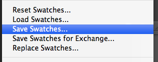
Save Swatches is for if you are just going to use the swatch in Photoshop, and the second option for Exchange, is for if you are going to use it in other programmes. 


When you click on the foreground colour you can also look at Colour Libraries which shows you all of the Pantone colours.


Creating a Duo tone image
Creating a duo tone image has to be a grayscale image.
Duo = two
Tone = ink

I went onto Image > Mode > Duotone Options.
Clicking on the black square lets you change what ever colour you want.


By going on the Colour Libraries you can pick the Pantone colour you want.


By clicking on the first box, you can change the curves. 


You can create it duotone by choosing the option from the drop down box that is there. 


On a greyscale image, you can create a new spot colour which will add a mask which you can paint onto the image and create different effects. Go onto the Channels panel in the Layers section and click New Spot Channel.


You can then pick the colour you want


The mask will change according to how you paint it


You can also change the opacity


This is good for if you want to do spot varnish, as you can tell the printer don't apply ink where it is black on the mask - apply a spot varnish there.

To save it, spot colours needs to be selected and it can either be saved as a Photoshop or Tiff file