Anything from the inception of this blog is copyright to Danielle Harrison ©
Showing posts with label what is visual literacy. Show all posts

Monday, 10 December 2012

OUGD404 - Readability, Legibility and Hierarchy

Visual
Metaphor
Metanym
Synecdoche

These are elements of how we understand the visual world.

'Work the metaphor. Every object has the capacity to stand for something other than what is apparent. Work on what it stands for.'


 Even though these are just images, they all have connotations with New York, as that is what we associate these things with.

The Big Apple
A visual metaphor is used to transfer the meaning from one image to another.

Statue of Liberty
Synecdoche - when a part is used to represent the whole, or vice versa. Quite simply, the main subject is substituted for something that is inherently connected to it. This substitution only works if what the synecdoche is, is universally recognised.

Yellow Cab
A visual metonym is a symbolic image that is used to make reference to something with a more literal meaning. Eg. a cross signifies the chruch. The viewer makes a connection between the image and the intended subject.

'In trying to seperate words from pictures we have to accept that words are pictures of letters'. - David Crow

For today's task we had to put out the sentences we made in bold, regular and light. We then had to mix around the fonts within the same point sizes, so there were varying weights in each sentence.


We then had to say each of these sentences to each other in the tone that we thought they were written in.

For the next task we had to pick five sentences using diferent weights and point sizes, and say them out loud to each other in the different tones we thought of them in.


For the final task, we had to think of five scenarios in our head and say these out loud to each other in the different tones, and each person in the group had to select the weights and sizes they thought the sentence was said in. We found that it sounded a lot differently in our head than it did when we said it out loud. 
Here were my sentences that I thought depicted everyone elses verbal sentences:


The last task is to find 11 fonts that represent 11 different accents, which are:
Scottish
South African
Texan
Italian
Mexican
Brummie
Somerset
Cockney
German
Chinese 
Swedish 

South African - South Afrikas 2100


 German - Blackletter ITC


Chinese - Chinese Takeaway


Mexican - Taco Salad


Scottish - Stonehenge

Italian - Champignon

Texan - Pointedly Mad
Swedish - Elephant
Somerset - Engravers MT

Brummie - Zil Semi Slab
Cockney - Old Newspaper Type


Tuesday, 20 November 2012

OUGD404 - The Language of Graphic Design

These are my notes from todays design principles session.

Line length and distance affects readability as the more lines text uses, it makes you pause after each one, therefore if a sentence is just on one line it is easier to digest.

Script fonts are display fonts, and the amount of words affect readability as they are chaotic and take time to digest. When it is bodycopy it is illegible, but when there are too many words enlarged it is too chaotic.

Look and Listen are the two things that we need to be capable of as designers.

The solution to a problem of communication through design.

Semiotics
Sign
Symbol
Signifier

Apple -
Sign for Apple Mac
Symbolies an apple, not an actual apple
Signifies creativity, independence, quality and lifestyle

We will work with type, type and image, and type as image.

Visual literacy is multicultural and a global language.

Pictograms are found at airports because it is an international language.

For this weeks task we had to stick up the five fonts we collected in the most readable point size, and discuss them.

We then had to trace the letterforms that we bought in, and make them into thinner and bolder fonts.


Sunday, 11 November 2012

OUGD404 - Type Anatomy

 These are some notes from Freds Design Principle session last week.

Visual Communication is a process of sending and recieving and is based on a shared understanding of signs, symbols, gestures and objects. It is affected by audience, context, media and method of distrubution.

Visual Literacy
The ability to construct meaning from visual images and type.
Interpreting images of the present, past and a range of cultures.
Producing images that effectively communicate a message to an audience.

Rules are there to be learnt, but can later be broken.
Principles are things to be explored, and can be applied to our own understanding, and are there to be questioned.

Core statement - all that is nessacery for any language to exist is an agreement amongst a group of people that one thing will stand for another. Eg, this 'T' is a T. When put next to a 'H' we understand/pronounce it as 'Th' - we have to accept that; it is a rule.

Type is basis of my practise
Develop an understanding of it by using it
We don't have an option of choosing it as type is basis of everything in Graphic Design
How we work with it is our choice, but we first have to understand the rules and principles.

What is Typography?
Through the centuries different materials have been used to create type, depending on what has been available.
Stone - when type was chiselled with stone there had to be serifs so that when carving, the lines would meet an end
Sable - brushes, sticks in stone, from oriental culture
Bone - driven through the middle east, created a fluid type with a nib
Wood - more forward, could carve it still, but it kept it shape so more type could be produced - woodblock type
Lead/Metal - gave more options with fineness of the line
Silicone - digital age, based on mathematical on screen. Mimics brush, quill etc

Origins are grounded in print - digital has only been around for 20 years, type has been around for over 2000.
Bauhaus was first time that arts and crafts were merged with industrialisation
Form had to follow function in type in Bauhaus
Graphic Design was born out of Bauhaus

Typography Timeline
1450. Johann Guthen created moveable type. By 1455 he made 42 line bible
1716 - 28 William Caslon created old style typeface which are the model for several typefaces in use today
1750 - John Baskerville created transitional typefaces
17th/18th century saw industrialisation allowing for mass production

Enlightenment period - people were creating notebooks, experiments etc, and there was a need to let it be known on a mass scale - birth of publication.
People began to learn to read - only in 1920 did the education act come into practise so everyone from the age of 5 had to read.

Bauhaus came as a response to this.

As a group task we had to seperate the five typefaces we all bought in each into different categories.
Our categories were:

Sans serif
Serif regular
Serif bold
Handrendered
Calligraphic

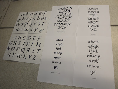
Here are photos of the types in their categories:


We then had to sort out the same typefaces into the categories that type originated from: stone, sable, wood, metal, bone and silicone.
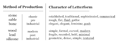
As a whole class, we then had to desribe the top font using one word and write it on a table along with everyone elses.


This table is a replica of the one in class where everybodies descriptions of a font were put up for each category. The words that are underlined are the ones that my group came up with.


Point is the size of a letter:

1 point = 1/72 inches =
               25.4/72mm =
               0.3527mm

12 points = 1 pica


Origins in print - lowercase and uppercase
In the print foundry letters would be organised into cases - and the capital letters would be in the case above the lowercase letters, and that's where the names uppercase and lowercase originated from.

Type Anatomy
Stem - significant vertical stroke
Sans serif - without serifs
Bowl - rounded form that describes counter
Terminal - point at which the serif/stem ends