Here are my design boards for Design for Web.
Here are my design boards for Design for Print and Web.
Here are my design boards for Design for Print.
Showing posts with label design for web. Show all posts
Showing posts with label design for web. Show all posts
Tuesday, 14 January 2014
OUGD504 - Design Production: Module Evaluation
1. What skills have you learnt throughout this module and how effectively do you think you have applied them?
Design for Print
For this brief I definitely learnt a lot of new skills, and improved on ones I already had. Firstly I did some practice prints using foiling and monoprinting methods, as I hadn't done them before and wanted to become more confident in them before I included them in my project. As I then applied these methods, plus screenprinting, embossing and linoprinting I began to learn a lot more about them as I went through complications and successes.
I came across a number of problems, particularly as I used mountboard for my stock - this was hard for embossing onto as well as monoprinting onto so I had to find ways around this. I had to use MDF to emboss onto my stock which didn't leave as big of an impression as I wanted, but I learnt for next time. I also realised that monoprinting didn't work with small designs onto mountboard, although it would on a thinner stock - so I screen printed these areas instead. I think by encountering these problems I have learnt a lot about stocks, inks and the processes themselves so I am very confident to do all of these processes again in the future.
I think I have applied these well to the project because I used all the processes that were relevant to my audience and used multiple techniques that can be used (thermochromic ink, colour blends etc) to show my understanding of it. I have used text as well as image to show my understanding throughout the project and show the viewers what can be achieved.
Design for Web
I was really excited for this brief because I got interested in web design and coding over Summer, and I wanted to push myself on it doing things I hadn't done before. I applied the (limited) HTML and CSS skills I already had, and learnt more for the site by looking at tutorials and working out the best way to do things myself. I also applied the new skills I learnt in the web sessions such as using rollover buttons. I put in a lot of time learning more about HTML and CSS so that I could achieve the design that I wanted. In the end I had experimented with drop down menus and parallax scrolling, and included page jumps, forms, responsive full background images and made sure I used web safe fonts and colours. I was really proud at the time of the outcome, but if I did it again I would have a better idea on how to make it more professionally and do things differently regarding containers and other areas I have since practiced on but couldn't do at the time. I have already learnt so much since this website that I feel it could be improved drastically in the way I have coded, but I did learn a lot of new things for the project so I am happy with it.
Design for Print and Web
For this project I concentrated on print as it was more appropriate for my project, but I also wanted to explore web as I was itching to code again.
For the print side, I wanted the project to be closely linked to the concept that it is a library cafe. Because of this, I decided to use buckram throughout the project on menu boards, placemats etc. I had already bound hardcover books before in the first year, so I already knew how to do it but I had a practice go anyway. I forgot how simple it was, so that was an easy part of the project, and I then screenprinted on top of this. I knew it wouldn't take me long to screenprint as I have already done a lot of it this year and feel confident with it. However, I didn't anticipate that it would look dull against the black buckram - to overcome this I just reprinted over the dried printed area to add another layer. This then worked, and because I am confident with screen printing it didn't take long to reprint it all. I think this shows I have applied my skills well because I have become a lot more efficient with screen printing and didn't see it as a challenge. I was also working within a tight schedule, so it wasn't a problem for that either.
I designed the screen aspect for it after the Numiko talk, and remembered how they had created the responsive Design Council website. Remembering what they said, I designed the website, tablet and mobile aspect with their words in mind. For example, on the mobile version on the Book page I only showed three bookcovers as opposed to five bookcovers on the website and tablet form. Instead of resizing the site to the screen size, I adapted them instead which I think shows a greater understanding of designing for the web.
When I was coding the website, it only took me 6 hours to do as it is a very simple site, using page jumps which I used in the Design for Web project. I really enjoy coding and I think that this shows how I can apply my skills efficiently to a project.
I also learnt how to make a gif for this project, as I feel that is a good way to present a website. This required using Photoshop which I'm not very good at, but after a few attempts I got there in the end and I can now use this method when designing for web in the future.
2. What approaches to/methods of design production have you developed and how have they informed your design development process?
I think my design production methods have developed from the fact that I have worked and learnt better by physically doing things. Rather than reading about how to foil, I just went out and did it. This is the same for all of the techniques I used really, and just learnt from my mistakes as I went. Luckily I started the production for Design for Print early on, so I had a lot of time to mess it up and try different things. From mixing colours so they overlapped correctly, to trying different methods of using thermochromic ink, I don't think I could have learnt all of this by reading from a book or watching a video, I just had to do it for myself.
For the coding aspect of it, I experimented a lot and tried everything I could to make something work. I would start by looking at a tutorial and then just coded relentlessly and seeing how something worked best, mainly by using the Inspect Element feature on Chrome. I think this has helped me realise how I worked best, because I feel a lot more confident now with coding and printmaking.
3. What strengths can you identify in your work and how have/will you capitalise on these?
I think an apparent strength within my work is coding. I enjoy doing it, and I don't mind spending hours trying to figure out why something isn't working which I think is important to coding as you definitely need patience! I have already capitalized on this by producing a live website and helping a lot of people in the class on their websites. By also coding the website for Print and Web even though I focused on the printed material shows that I am interested in it. To improve my skills further I am going to two web design events at the end of the month and hope to gain contacts from that, as well as putting myself out there to do websites for clients.
4. What weaknesses can you identify in your work and how will you address these for the future?
I think the biggest weakness in my work is the fact that I don't do enough drawings and ideas at the beginning stages. I explore one idea a lot, but if I like it I won't bother exploring more ideas in depth because I like to just get on with it. I don't know if this is a bad thing or not - probably is if I want to get a good grade, but when I'm working to a tight deadline it's not necessarily a bad thing. I realised this by Design for Print and Web and I did a couple more ideas at the beginning and started to research them, but not really in depth, so this is something I could improve on.
I also think the quality of finish could be improved - I think this will just come from making more things and practicing more. For example, when I reprinted over the top of the existing screenprinted area for Print and Web, some of it isn't registered 100% which affects the quality. Also for Design for Print the finish of the work could be improved - for example the font I used bled a little because of the stock I chose, and it was hard to get the illustrations completely in centered and in line on the posters. This will just come with practice but is something I need to keep an eye on.
5. Identify the things you will do differently next time and what you expect to gain from doing these?
- Explore more ideas initially - I might think of a better one.
- I do want to draw more as well - using hand drawn type and illustration rather than the clean, digital style I have at the moment. I think it's good to have a broad range of skills as not every project will require the same style.
- Try and have a better finish to my work so it looks more professional.
- Consider the limitations of the stock I choose and whether techniques will work on them properly as this can save me a lot of time and make the resolution look better.
Wednesday, 11 December 2013
OUGD504 - Design for Web: Final Crit
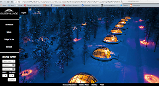
I had my final crit today and presented my website and design boards. Here are my design boards:


We had to ask questions that we wanted feedback on, and mine were:


We had to ask questions that we wanted feedback on, and mine were:
- Is the website easy to use?
- Does the site/content make you want to go?
- Is there anything else you would expect/want on this website?
I also added that:
- More pictures will be added/updated
- Arrows need to be added on the Resort, Things to Do and Igloos page
- There is a link to the original website on the other tab
I was actually really happy with the feedback that I got. Here it is:
- Massive improvement from the original, much more welcoming, easy to use, clear well designed.
- The website is clear, easy to use. Only thing, when your on the Things To Do page, it's not obvious that you have to scroll down. (sorry, just seen that you need to add arrows). Apart from the fact theres no pictures I'd definitely like to go.
- The black and white logo give it a very corporate feel. Maybe try a baby blue, or white?
- You have gone beyond the requirements for this brief well done! Easy to use and makes me want to go. I don't understand the forecast? Why is the '6' in bold?
- Yeah very easy to navigate. Yeah the website makes the place look appealing. Not sure why The Resort and Igloos page have the same background, a little confusing. Other than that is really good and easy to navigate.
- I like the layout/tool bars and existing images. The colour scheme really suits the ethos of the resort. Maybe horizontally flip the santa image so he isn't hidden behind the text box! All in all, very good and you seem to know what needs to be improved anyway, keep it up! It is easy to use. Maybe had more images of the resort. I think people would be more intrigued to go if there was more images of each place (igloos/resort) maybe like a 'we are here' type of thing as people know of Lapland but not really where that is. If you are going to invest and book a holiday you want a lot of visuals (almost as a reassurance) (room images?) I know that you have started this. I know coding is annoying but if you do have more images could the background picture scroll or change after a few seconds?
- In regards to content, I like the images used as it puts the Igloo Village in a good light making you want to go but the placement of the text takes away from this effect as it covers the images which sell the destination themselves. Could you layout/present the text in a way so it doesn't overlap the images? The usability of the navigation bar and buttons is clear and easy yet I couldn't tell that you needed to scroll the pages until I need your points - could you make it more obvious? The inclusion of a Things To Do page is great so you've already included what I would want in the page.
- Boards - TL;DR less text. The grid is a good strong boards grid. When creating final boards, avoid use of first person as it can lead you into storytelling. A board showing typeface and colour ways (even if it just black and white) would be helpful, especially given the rebranding. Showing website in context (on a computer, tablet) is more aesthetically pleasing. If you were creating for a client, you'd want to avoid the phrase I Wanted. Client will be interested in what works and why, not wants of the designer. Good board aesthetics overall - just reduce text. Good use of product branding on boards to tie it all in.
I was really happy with my feedback, and I know that the scrolling isn't obvious at first glance but if everyone read my note (some people did) they would know I'm going to add arrows to it. So at least I know that what I plan to do is needed.
Someone said the black and white gives it a corporate feel - I kind of wanted to go with that so that it looks professional. The original website is baby blue and white (which they suggested) and looks quite cheap and untrustworthy in my opinion.
Someone suggested flipping the santa image which were in my thoughts too so I'm glad they agree. I do really agree with the same person who said people like visuals to reassure themselves about going, and I do intend to add a room image of the glass igloo - unfortunately there isn't a lot of good images to choose from.
I was really glad that people said it was easy to navigate through and use because this is a main part of the website.
Monday, 9 December 2013
OUGD504 - Design for Web: Website Content
I'm writing the content for the website as I'm designing it so I can think of how many words I will need and what I'm going to include on each page.
I'm using the content from the original website, the Visit Finland website, and adding some bits of my own.
The Resort
In Winter, from December to April, the Igloo VIllage Resort is open. There is a unique range of winter recreation activities to enjoy here while you stay in one of our 20 glass igloos or 60 snow igloos. You can dine in a snow restaurant; admire ice marvels in the ice gallery or get married in our highly popular snow chapel.
Ice Gallery
Sculptors from all over the world create ice and snow art for the gallery. You have the opportunity to make your own sculptures, and these are a great way to surprise your guests and decorate your igloo.
Snow Chapel
We have arranged weddings for more than ten years now, and our snow chapel is very popular among guests. Whether its a marriage, civil ceremony, renewal of vows or honeymoon, we can cater for all of them, all year round. We aim to make it easy for you, and can take care of all the formalities on behalf of Finland.
Snow Restaurant
Open from December till April, the restaurant is situated inside a huge snow igloo. You can enjoy a three course meal on a table made of crystal clear ice in this very special environment. There is also an ice bar where you can have a drink or two after your meal to cleanse the palette. The seating capacity of the restaurant is for 150 people.
Glass Kota
This is a heated traditional Lapp teepee, 8 metres high and wide. It is made of thermal glass, and offers an unobscured view of the beautiful Lapp night sky. The snow chapel is nearby making it ideal for the reception party, or for the actual ceremony as it has its own altar.
Igloo
There is a choice of two accomomdation in Igloo Village, one being the snow igloo, and the other being the glass igloo. Both are unique to Lapland and allow you to experience nature and the traditional Lappish culture. There are 20 glass igloos and 60 snow igloos in the resort.
Snow Igloo
Imagine yourself sleeping completely surrounded by snow. The silence is enchanting and lights inside the ice cast mysterious shadows on the snow walls. The temperature inside the snow igloo stays always between -3°C and -6°C. Besides a warm down sleeping bag (rated extreme temperature is -32°C), we provide you woollen socks and a hood, so that you will never feel cold.
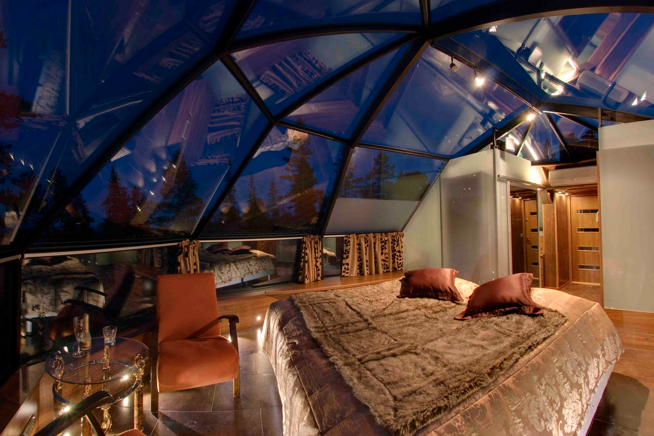
Glass Igloo
Glass igloo provides an one of a kind opportunity to admire the northern lights and millions of stars of the crystal clear sky in a comfortable room temperature. Built from a special thermal glass the temperature inside the igloo always stays a normal level. It also prevents the glass from not getting white frosted, hence keeping the view clear even when the temperature outside drops to under -30°C. Every igloo is equipped with a toilet and luxury beds.
Things To Do
I'm choosing the top five things that people said they would want to do here on my survey as content for the website, plus the santa visit as I think that is what people associate a lot with Lapland.
Smoke Sauna
We are the proud owners of the World’s Largest Smoke Sauna. The sauna is beautifully situated by the pond overlooking the Igloo Village. It provides room for over 100 persons in three separate saunas. Each sauna has its own relaxation room with an open fireplace, showers and WC and the large terrace between the two saunas is a great place for cooling off. In the winter you can dive into an ice-hole nearby, a perfect way to relax after hot air in the sauna.
Northern Lights
Husky Safari
Our Husky farm is situated just across the road from the hotel and is home to about 250 eager huskies ready to take you on an unforgettable journey through breathtaking winter scenery.
Reindeer safari is a relaxing experience, in which you peacefully glide through the magical winter forest pulled by your very own reindeer. We pick you up from the hotel by car and drive to the reindeer farm, where all necessary equipment will be provided. This safari requires no skills and the reindeer will do all the work for you as you comfortably relax in your own sleigh.
Ice Karting
Ice karting is a fun motor sport suited for everyone. The full driving gear guarantees that you will not be cold while speeding away. In fact, with the challenging track and the feisty go-karts you are more likely to be hot. There are no age limits but the driver must be tall enough (approx. 150 cm) to reach the pedals. You can either drive at your own pace or take part in a playful contest. The high-performance cars with studded tyres ensure that even the most daring of drivers can test their limits and see how hard the snowbanks are.
Contact
Enquiry Form
Name:
Email Address:
Confirm Email Address:
Inquiry: Weddings, Employment, Press, Booking, Other, Excursions
Message:
Send
Telephone: +35816667100
Fax: +358166667168
Where We Are:
Igloo Village is located 250 km above the Arctic Circle in the Finnish part of Lapland. The Ivalo airport is just 35 km away and a bus transfer takes you directly from the airport to the front door of the hotel.
The hotel is conveniently located nearby Highway 4 with regular bus services to Rovaniemi, Saariselkä, Ivalo and all over Finland. There is a direct bus from Helsinki to Kakslauttanen and also there is a train service to Rovaniemi, from where you can take a bus to Kakslautanen.
Photos
Igloo Village
This will be used as a background image on the home page, contact page and book now page. I chose this one because I think it shows you a good idea of what it looks like - igloos at night surrounded by snow and nature.

Glass Igloo
This is an image of the inside of one of the glass igloos. I think it shows a luxury room and a good insight to what you will be getting.

Snow Igloo
This is a picture of the outside of two of the snow igloos. I couldn't really find an image of the inside, especially one that was big enough.

Snow Chapel
I think this is quite a romantic image of the chapel, and it isn't anybody else's wedding picture so the viewer can imagine it could be their own wedding. Other images make it looks quite cold, but the lighting here makes it warmer and more inviting.

Snow Restaurant
This is a really high quality picture, but it isn't one of the Lapland restaurant. This is because the images for that weren't as high quality and didn't really give a good view of the inside.

Ice Gallery
I chose this image because it is a good view of the inside of the gallery, and works well with the layout of my website.

Glass Kota
This was the only large image of the glass kota so I had to choose this. It also uses the rule of thirds which is good for my layout because the text box is more to the left in the center, so it won't obscure the focal point.

Ice Karting
This is an image of ice karting in Lapland. I chose it because it is actually in Lapland and it is high quality.

Sauna
I chose this image because I think it shows a luxury sauna, and it says on the website it has the world's largest smoke sauna and this image shows a big one. I didn't choose one from the website because they're very small and don't portray luxury or give the viewer an insight to the sauna.

Northern Lights
I chose an image of the Northern Lights from Lapland so that it fits in with the website and I chose this one because it's quite dark which I think matches the navigation bar, is a bit of a contrast from the other images and the white buttons will show up on the side.
It also shows a prominent aurora borealis which is what people want when they go to Lapland.

Husky Safari
I chose this image because it has a wide depth of field and is very clear, but also because the focal point is at the side. This means that the viewer will be able to see it clearly because the text box is more central to the left so it won't cover it up.

Reindeer Safari
I really like this image because it shows the reindeers up close in sharp focus, and a lot of the images had people in which I didn't want because they didn't seem as professional - more holiday snaps. I think with the wooden sleigh involved it shows a more traditional finnish reindeer safari.

Santa Visit
It was really hard to find an image of Santa which was large, not cartoony, from Lapland and didn't have lots of children in the shot. I chose this one because he looks really happy and inviting.

I'm using the content from the original website, the Visit Finland website, and adding some bits of my own.
The Resort
In Winter, from December to April, the Igloo VIllage Resort is open. There is a unique range of winter recreation activities to enjoy here while you stay in one of our 20 glass igloos or 60 snow igloos. You can dine in a snow restaurant; admire ice marvels in the ice gallery or get married in our highly popular snow chapel.
Ice Gallery
Sculptors from all over the world create ice and snow art for the gallery. You have the opportunity to make your own sculptures, and these are a great way to surprise your guests and decorate your igloo.
Snow Chapel
We have arranged weddings for more than ten years now, and our snow chapel is very popular among guests. Whether its a marriage, civil ceremony, renewal of vows or honeymoon, we can cater for all of them, all year round. We aim to make it easy for you, and can take care of all the formalities on behalf of Finland.
Snow Restaurant
Open from December till April, the restaurant is situated inside a huge snow igloo. You can enjoy a three course meal on a table made of crystal clear ice in this very special environment. There is also an ice bar where you can have a drink or two after your meal to cleanse the palette. The seating capacity of the restaurant is for 150 people.
Glass Kota
This is a heated traditional Lapp teepee, 8 metres high and wide. It is made of thermal glass, and offers an unobscured view of the beautiful Lapp night sky. The snow chapel is nearby making it ideal for the reception party, or for the actual ceremony as it has its own altar.
Igloo
There is a choice of two accomomdation in Igloo Village, one being the snow igloo, and the other being the glass igloo. Both are unique to Lapland and allow you to experience nature and the traditional Lappish culture. There are 20 glass igloos and 60 snow igloos in the resort.
Snow Igloo
Imagine yourself sleeping completely surrounded by snow. The silence is enchanting and lights inside the ice cast mysterious shadows on the snow walls. The temperature inside the snow igloo stays always between -3°C and -6°C. Besides a warm down sleeping bag (rated extreme temperature is -32°C), we provide you woollen socks and a hood, so that you will never feel cold.
Glass Igloo
Glass igloo provides an one of a kind opportunity to admire the northern lights and millions of stars of the crystal clear sky in a comfortable room temperature. Built from a special thermal glass the temperature inside the igloo always stays a normal level. It also prevents the glass from not getting white frosted, hence keeping the view clear even when the temperature outside drops to under -30°C. Every igloo is equipped with a toilet and luxury beds.
Things To Do
I'm choosing the top five things that people said they would want to do here on my survey as content for the website, plus the santa visit as I think that is what people associate a lot with Lapland.
Smoke Sauna
We are the proud owners of the World’s Largest Smoke Sauna. The sauna is beautifully situated by the pond overlooking the Igloo Village. It provides room for over 100 persons in three separate saunas. Each sauna has its own relaxation room with an open fireplace, showers and WC and the large terrace between the two saunas is a great place for cooling off. In the winter you can dive into an ice-hole nearby, a perfect way to relax after hot air in the sauna.
Northern Lights
The thrill of witnessing the Aurora Borealis is a once-in-a-lifetime experience for many. Some, however, get hooked and can never get enough of the blazing colours in the sky.
The Northern Lights dancing up above is such a powerful and unique natural phenomenon it changes lives down on Earth.
Kakslauttanen provides perfect opportunities for observing Aurora Borealis, as there is virtually no light pollution and very few trees obscuring the sky nearby. Furthermore, our warm Glass Kota is an ideal place to spot Aurora Borealis. Enjoy Aurora Borealis while sipping cold drinks, instead of standing watch outside in the freezing temperature! Aurora Borealis is visible from late August till late April.
Husky Safari
Our Husky farm is situated just across the road from the hotel and is home to about 250 eager huskies ready to take you on an unforgettable journey through breathtaking winter scenery.
On arrival we will provide you with a warm outer thermal suit, gloves and hat and then we will present your very own Husky team. You will be given a lesson on how to drive the sledge and how to observe important hand signals given by your leader. Each team consists of about six dogs, you the driver and your passenger, who is comfortably seated in the wooden sledge. The driver and the passenger can change places at any time during the safari.
You can choose from a shorter Husky safari, which lasts two hours and during which you will be served a hot drink, or a longer one, which lasts for four hours and includes a lunch served over an open fire in a wooden teepee.
Reindeer SafariReindeer safari is a relaxing experience, in which you peacefully glide through the magical winter forest pulled by your very own reindeer. We pick you up from the hotel by car and drive to the reindeer farm, where all necessary equipment will be provided. This safari requires no skills and the reindeer will do all the work for you as you comfortably relax in your own sleigh.
You can take a short safari lasting 2 hours including a short break for coffee or a longer one which lasts for 4 hours and includes a hot lunch in a reindeer herdsman’s hut. This safari gives you a wonderful opportunity to learn all about the Sami people, their traditions and way of life. This is something not to be overlooked.
Santa Visit
If you are particularly eager to meet Santa Claus and his jolly elves before Christmas or just want to personally say ‘thank you’, you are warmly invited to stop by his official office, situated on the mysterious Arctic Circle in Finland.
Open all year round in the city of Rovaniemi, children and adults can visit Santa’s office, enjoy a private chat with him and revel in the enchanted atmosphere.
As we all know, Santa’s annual mission is to deliver happiness around the world with the help of his team of furry reindeer friends. A visit to Santa’s office could end with you stroking the fur of a real reindeer – just be sure to keep an eye open for the one with a red nose.
The magic of Christmas is undeniable. It’s a time of goodwill and spending time with your family and friends. Santa also enjoys the simple Yuletide pleasures, such as eating tasty ginger bread biscuits freshly baked by Mrs. Claus and singing festive songs with the elves, so come and join him in the magical Arctic Circle – he might even sing you a carol.
Santa may only visit your home once a year, but he welcomes everybody to visit him during the rest of the year. Don’t pass up the invitation.
Ice Karting
Ice karting is a fun motor sport suited for everyone. The full driving gear guarantees that you will not be cold while speeding away. In fact, with the challenging track and the feisty go-karts you are more likely to be hot. There are no age limits but the driver must be tall enough (approx. 150 cm) to reach the pedals. You can either drive at your own pace or take part in a playful contest. The high-performance cars with studded tyres ensure that even the most daring of drivers can test their limits and see how hard the snowbanks are.
Contact
Enquiry Form
Name:
Email Address:
Confirm Email Address:
Inquiry: Weddings, Employment, Press, Booking, Other, Excursions
Message:
Send
Telephone: +35816667100
Fax: +358166667168
Where We Are:
Igloo Village is located 250 km above the Arctic Circle in the Finnish part of Lapland. The Ivalo airport is just 35 km away and a bus transfer takes you directly from the airport to the front door of the hotel.
The hotel is conveniently located nearby Highway 4 with regular bus services to Rovaniemi, Saariselkä, Ivalo and all over Finland. There is a direct bus from Helsinki to Kakslauttanen and also there is a train service to Rovaniemi, from where you can take a bus to Kakslautanen.
Photos
Igloo Village
This will be used as a background image on the home page, contact page and book now page. I chose this one because I think it shows you a good idea of what it looks like - igloos at night surrounded by snow and nature.

Glass Igloo
This is an image of the inside of one of the glass igloos. I think it shows a luxury room and a good insight to what you will be getting.
Snow Igloo
This is a picture of the outside of two of the snow igloos. I couldn't really find an image of the inside, especially one that was big enough.

Snow Chapel
I think this is quite a romantic image of the chapel, and it isn't anybody else's wedding picture so the viewer can imagine it could be their own wedding. Other images make it looks quite cold, but the lighting here makes it warmer and more inviting.

Snow Restaurant
This is a really high quality picture, but it isn't one of the Lapland restaurant. This is because the images for that weren't as high quality and didn't really give a good view of the inside.

Ice Gallery
I chose this image because it is a good view of the inside of the gallery, and works well with the layout of my website.

Glass Kota
This was the only large image of the glass kota so I had to choose this. It also uses the rule of thirds which is good for my layout because the text box is more to the left in the center, so it won't obscure the focal point.

Ice Karting
This is an image of ice karting in Lapland. I chose it because it is actually in Lapland and it is high quality.

Sauna
I chose this image because I think it shows a luxury sauna, and it says on the website it has the world's largest smoke sauna and this image shows a big one. I didn't choose one from the website because they're very small and don't portray luxury or give the viewer an insight to the sauna.

Northern Lights
I chose an image of the Northern Lights from Lapland so that it fits in with the website and I chose this one because it's quite dark which I think matches the navigation bar, is a bit of a contrast from the other images and the white buttons will show up on the side.
It also shows a prominent aurora borealis which is what people want when they go to Lapland.

Husky Safari
I chose this image because it has a wide depth of field and is very clear, but also because the focal point is at the side. This means that the viewer will be able to see it clearly because the text box is more central to the left so it won't cover it up.

Reindeer Safari
I really like this image because it shows the reindeers up close in sharp focus, and a lot of the images had people in which I didn't want because they didn't seem as professional - more holiday snaps. I think with the wooden sleigh involved it shows a more traditional finnish reindeer safari.

Santa Visit
It was really hard to find an image of Santa which was large, not cartoony, from Lapland and didn't have lots of children in the shot. I chose this one because he looks really happy and inviting.

Sunday, 8 December 2013
OUGD504 - Design for Web: Coding the Website
I started coding my website now I have mocked up what I want to do on Fireworks.
I started by opening up Dreamweaver and creating a html and css stylesheet.
I want to use a font from google web fonts, called Roboto, in three different styles. I downloaded it and added the link to my html sheet, and am able to start using it in css. My font family is going to be Roboto, Arial, Helvetica, sans-serif.

Index
Background Image
I wanted to get the full size background image on first, and so I researched how to do this, and found this website.
I made the photo ready for web, and added this css:


 \
\


I started by opening up Dreamweaver and creating a html and css stylesheet.
I want to use a font from google web fonts, called Roboto, in three different styles. I downloaded it and added the link to my html sheet, and am able to start using it in css. My font family is going to be Roboto, Arial, Helvetica, sans-serif.

Index
Background Image
I wanted to get the full size background image on first, and so I researched how to do this, and found this website.
I made the photo ready for web, and added this css:

This was the outcome, and now whenever I resize it, it's the same.


Navigation Bar
For the side nav bar, I needed to set the dimensions in the body first, so that I could make it full size. I have also started adding comments in the CSS labelling specific parts of the website, as this will help me keep things organised and be easy to find.
Here is the css for the nav bar:
Here is the html so far:
Here is the outcome with the nav bar on the left:

Logo
I started doing the logo, and I saved it appropriately for web in Photoshop. In CSS I made it centered by doing the margin-left and margin-right auto and made the margin-top 18px as that is where the logo starts on the Fireworks document.
This is what the html looks like. The img had to be within the nav id because I want it to be within the nav bar.

This is what the outcome:

Navigation Links
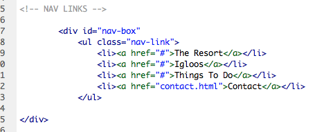
I added the links now, and here is the html. I made a list, and at the moment I've put a # in the link, but when I add the pages I'll change this.

This is the CSS.


This is what it looks like at the minute, and I need to change the spacing.

Space Between Links
I've now changed the spacing so that it appears how it does on the Fireworks document.

To do this I needed to change the padding smaller, and set the margin top to start at the appropriate place.


This is how it looks in html now I've added the id.

I then remembered I had a white line between the sections on the side nav, so I added this nav-box which has a top and bottom border which will be the white line.
When you hover over the links and click on them, I want them to be underlined, so this is the CSS for that.
This is what it looks like with the lines on now.

This is what it looks like when you hover over one of the links.

Booking Feature
I now want to add the booking feature. I created a box for this so that I can contain everything within it.

The booknow class is for the header.

This is what it looks like in html. I made sure the booknow class is within the bookfeature id.

Booking Feature Buttons
Simon said in the crit I didn't have to make these and could add them as pictures but I thought I would give it a go on the 'Select Igloo' button as the drop down list is text based.
I added this form which created a drop down list, and I've tried so many ways of trying to add styles to it, such as adding a class around it (like here) and within areas of the form but it just didn't work.

Here is the CSS I tried to apply:
This is how the drop down list looked, although it work, it isn't how I want it to work.
But I managed to add the check in and check out pictures easily to mimic buttons, with these styles:
I then decided to add the select igloo picture in as well to make life easier, and this is how it looked in HTML:
This is how it looks now and I need to delete the form.
I then added the number buttons, and this hasn't gone as straightforward as the first ones:
Here is the CSS for the number button so far:
and the HTML:

In the Inspect Element aspect of Chrome I tried adding a margin-left which helped it a little bit:
I decided to move on from that for a bit while I think of a solution, and go onto the search button:

I added the form for a button in HTML:

This is what it looks like at the moment so got to work a bit on the styles:
After messing around a bit in the Inspect Element, I actually solved all of my problems. I realised that because I had padding and a width on the container for the booking feature, this meant when I adding float:right; onto the elements inside, it would go further than I wanted. So I changed the measurement from 158px to 106px for the width of the container.
I added the final styles to the button, changing margins on this and the buttons to fit with the new container width.
I also got rid of the top margins for the number buttons because I realised I had bottom margin for the 'adult' and 'children' which was creating double spacing.
Footer
To do the footer, I created the id styles in CSS. I know that it is 29px high due to the Fireworks mock up, and I want it to be 100% wide. By adding bottom: 0px; and position: absolute; it keeps it at the bottom of the page.
In HTML I just placed it after the nav id tag, as I didn't want it to be part of that.
At first when I checked it, it looked right - but then when I scrolled down there is a bit of space underneath the footer now which I don't want.

I've tried deleting the float: right, which made no difference, editing the height of the footer and the height of the body but none of these have worked.
Then I changed the footer to fixed and this worked!
Now I need to add the text onto the footer and make links. The footer-box is to contain the links in:
This means that when you hover or click on the links, they will stay underlined, and the display: inline on the 'li' makes it horizontal.
At first I had margin-left: auto and margin-right: auto, but I needed spacing between the words, so I got rid of margin-right: auto, and changed margin-left to 19px which worked.
This is what it looks like so far, but I want to make more central in terms of height.
I tried a few margin-tops on Inspect Element, then I figured out the right one was footer-link

Northern Lights Forecast
For this I created a new box for the container for the words that will go inside. Here is the CSS for it so far, it's about right I just need to sort out the positioning of it.
At the moment its in the top right corner.

I started altering the margins and found one that worked and fitted within the grid:

I then started to add the headings, I'm going to use the same class for them both cause they will use the same margins etc, but I need to add them separately in the HTML as I need to add the divider.
I've put it inside the container so that it will always be within it and the margins won't be massive.


To make a line divider between the two things in the box I needed to make a white line somehow. You can make a horizontal one using the <hr> tag but I needed to make it vertical. To do this I just created the height in CSS and then added border-left as this would make the line visible.
I fiddled around with the settings on Inspect Element to get all the spacing correct, which is done through these styles on the box and headings:

This is how it looks in HTM. The line had to be between the headings as this is how it is displayed.

This is what the outcome looks like, and I now need to add the other text.

I added the time in the HTML between the first heading and line.

At first it came out looking like this:

I then styled it to this, making sure the margin left is the same as the 'Local Time'
And it looked like this:

I then started to add the rest of the text, which had varying margins. At first I made the position absolute and checked it when resizing the window:
But it did this, which isn't what I want:
So I removed the position and now it works fine when being resized:
To make the bold '6' stand out, I changed the font-weight in CSS of the text, and adding a <b> tag in HTML:


Language Drop Down Menu
I needed to create the drop down menu for the language options. I was debating whether to make this a rollover image for easy, but thought I may as well give it a go doing a working drop down menu.
I'm following a tutorial how to make one, and at first I was messing the code up as I was altering it for my own needs.


I then realised what I was doing wrong and rectified it:

Without styles it looks like this at the moment:
And when you hover over it the links appear:
I started to then add some styles following the tutorial:
I added some styles specific to my own such as the background and size, but then added things that are on the tutorial. By checking my site each time I add something and understanding what each element does, I can make sure that I won't mess it up and not know what I've done.
This is what it looks like when normal, and when hovered over at the moment:
I then added some styles to text to make it like the rest of my website, but I couldn't figure out how to make the text only underlined when you hover over it.
I went into Inspect Element and changed some of the positioning elements to make it more clean, but this is something I need to work further on, or create a rollover button instead.
For the Resort page I started by trying a couple different things. I tried adding a container like this that would hold content but it seemed pointless because I may as well use the whole page.

I then added some content in a box like this instead, which I like, but I want to change the background image and make it have page jumps or parallax scrolling.

Here is the CSS for it so far. I haven't specified a height so that no matter what length the text is, it will always fit in. I made the padding 15px all around so that there is some space between the text and sides even though I've not specified the height.

This is what the text looks like inside which I am happy with:

I then attempted to do a 'page jump' tutorial which I aimed for the user to be able to click on a button for the page to jump down further which I have mocked up in Fireworks. I did this by following a tutorial on page jumps.
Here is what I put into HTML, the #top and #bot will make the browser look for these within the document which will be where the page jumps to.

I placed bot just before footer as I want it to jump to the bottom.
And top just after the body as I want it to be the first page.
Here are the styles for the dot:
The outcome didn't work for positioning, so I tried putting them within a container called jump but this didn't work either.
It also moved the nav bar down, so I gave up on this idea for now.

I then tried to follow a tutorial for parallax scrolling, and I had to download a few plugins and insert them in the head section of the html. I followed it through, editing certain things that applied to me, for example doing 'background-image' instead of 'background-color'.

For some reason the links on the arrow I made don't work which are supposed to make it jump to the next page, so I tried editing this and changing the data-slide which didn't work.

This is so the dots I wanted to let people know what slide they are on would be visible. By having the z-index it puts it on the top layer.
I also did this on the arrow as it wasn't visible at first, and when it did appear, it also worked when you hovered over it - but didn't jump to another page!

I tried different ways of making it work, like changing the slide class to position: absolute rather than relative, because the slides weren't placed like this - however, this meant the scroll didn't work then.

Here is what it looks like now, so not quite what I had in mind:


Here is the coding for it:


I then asked for advice, and Simon said that I could do this a lot easier by using CSS sections.


I decided to move on from this and concentrate on the Book Now page as I know that this would be easier. I wanted rollover buttons which you can change size so I followed a tutorial to do this.
I created a container with no set height so that it will change according to the content. I added the Search Results inside it using <h1>.

I then followed the tutorial and added my own bits in - the sizing, image and position.

This was the HTML for it:
This is how it turned out:
For the next one I needed to do different sizes, and I got all the measurements of these from the Fireworks file that they are from. At first it was going on top of the first rollover, so I changed the margin-left and this fixed that.

This is all of the HTML for it:

This is how it looks so far - I need to add the text and button now.

I decided to change the opacity back to 1 because it is making the top layers of the background transparent as well. Now I needed to sort out the positioning of it.

I played around with the margins in Inspect Element, and realised that it was the bottom margin of the heading <h2> that was making it so low.

Now it is all in the right position!

I then started making one of the boxes for the content and called it and set the position:fixed so that it wouldn't move on the page, and didn't set the height because it would depend on the content. I also did the padding so the text wouldn't be too close to the edges.
This is the text for the info:
This is the HTML:

Here is the outcome:

For the smaller boxes I made the text smaller:
I made all the squares the same, just at different percentages for positioning. Thinking about it now I've done it, I could have used the same box, just with a margin-right. I'll try this on the next set of boxes.


This is the outcome:

This is the HTML:

Then I needed to add the arrows, I did this by inserting an image, which I then added classes to. I wanted it to change opacity when you hovered over it, so I then decided to make it a rollover image instead.

Here it is as a rollover image, with the left arrow being hovered over:

Here is the CSS:

Here is what the container looks like for the content, and I called it #book because it's specific to this page.

After doing the rollover image for the arrows, I then decided to do it for the languag drop down menu, because although I had already made it into a working link drop down it had some issues with it (text being underlined, moving content when hovered over), and thought this would be easier for me.
Here is the HTML:
Here is the CSS for it - a lot less than the original drop down.

And here is the outcome:
I started doing the price boxes and trying different sizes to see what looked best on screen, and I think the second box looks better than the first one as there is less content.

Here is the finished outcome:

I then started doing the box for the 'Add Excursions' section. I made a container for it which would have a black background.
When I saw the outcome I changed the margins and got it sorted.

At first I had the arrows left as a percentage, but I realised that when I resized the arrows they moved and this wasn't working.

So I then made a container around the content, and I didn't have to use any margin-lefts then.

This is what it looked like with the new arrows and the excursions box in the right place.

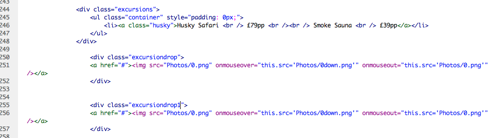
I started to add the content to the excursions.

It was going well to start of with.
However, when I began to add more content it wouldn't go next to the other text because there seemed to be a margin-right even though I had set it as 0px.
I tried adding a span instead of a div to make it inline.
 \
\
Then I putting them in separate divs.

I decided to give up on that for now, and tried to add a link to the book now page on the booking feature button. However, I then realised you couldn't make actual buttons into links, so I changed it to look like a button.

I started doing the contact page, and linked other pages to it in the HTML.
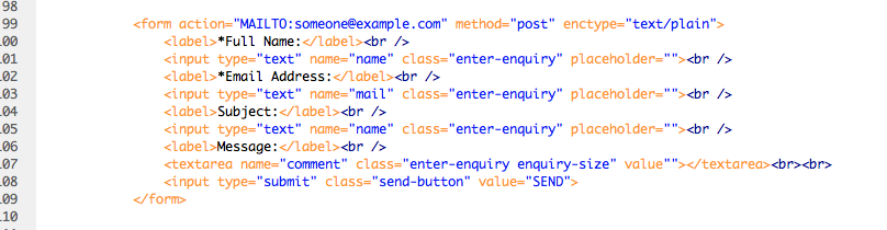
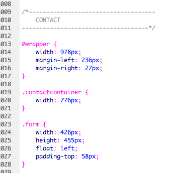
I then started the contact page, and put it into a form container.

I also grouped two classes together, so that I could use <h2> a lot, but add different margins to it when needed.

I added a form in HTML which would have all the textboxes in it.
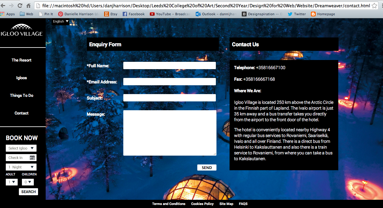
This is the outcome at the moment:

I sorted out all the sizing, then adde another class for the message button so that I could make the height longer. I also set the button to float: right because I had set the form container to be the exact width of the text boxes so it lined up.

This is what it looks like when you type in it:

I then began on the second half of the page, which will have all the contact details on. Again, I grouped classes together.

I created a box which the content would go in.
I also added a wrapper around both of the boxes because at first the contact box was going underneath the enquiry form, not next to it.
I added a black box for the text to sit in so it looks more contained. I used information I found on the contact area of the original website.

I then adjusted the height of both the containers so that they matched.
This is the HTML for the text I added:

I then went back to the book now page to try and finish of the add excursion box, with this being the aim:

However, I wasn't having much luck working it out. I tried a few different things going back and forth between Inspect Element and Dreamweaver, but I just can't figure out how to get the right sizing between all the text!


Things to Do Page Jump
I then went back to figure out how to do the page jump properly. I asked Simon, and he said just put the dots and the nav bar into a container and make it fixed, so that it wouldn't move, but the content would.
I did this, and placed the container around the nav and the dots, but ended the </div> before the content started in HTML.

I had a gap above the content which was making an unwanted gap at the top of the screen. To get rid of this, I got rid of the margin-top on the content, which solved the problem, but then the content box started too high.

So I created a new container called topcontainer which I set a height on the same as the old margin-left. This made a gap the same as the margin-height but didn't affect the rest of the page.

I put it above each content box.

When you click on the dots it goes to the right section of the page!

I decided to just add an image for the Add Excursions as it would take less time than trying to code it all separately as I was having trouble with that.

Here is the photo I added in HTML:

Here is the class around it:
I then added the Confirm Booking button as well, using the same class as the Search Again button on the page. Now this page is done!

To add the background image to the Things To Do page, I made another container to go around the content, and added the image in CSS.
In the CSS I made the z-index -1 so that it would go behind the content, and made the width 100% so that it would always cover the sides. I used the same code I've used for the background image and made everything 'cover' the screen. I've made separate containers for each image so I can change the url - in hindsight I could have just done this in HTML and used the same container for each one.

At first I had a gap so I changed the height to 640px as thats the size of my body.

This is when I added the 'cover' element because it was starting to repeat.

Here is the outcome:


I did the same for the igloo page.


This is one of the pictures for the Resort page:

I linked up all the navigation links, and I also made each link on the specific page underlined, so that when you are active on a page that part of the navigation is underlined so the user knows where they are.

All I need to do now is link up all the pictures to each page.
I added a container around each section in HTML, and in that container is the image.

In CSS it looked like this - the z-index: -1 is to make it go behind the content, the height is so that it covers the exact amount of screen and I added the image in here too. I did this for each picture.

I then started to add the arrows to the pages to make it easier for the user to see that you can scroll. I just inserted these as images rather than working buttons as that would be too hard for me to code, plus the dots work.
I added the images in to HTML with a class on them.
The class puts them in the right position and makes the position fixed.
I made the margin top the same as the text box - 65px, and also made sure the bottom one was 65px from the footer.

I sorted out the positioning of the dots by making them all equal to each other.

In CSS I made sure all the margin-tops were changed on the dots so that they were all equal, and the spacing between them all is 60px;.
The website is now finished and coded!
Subscribe to:
Comments (Atom)