Typeface
For the font I decided to use Roboto Sans - for all of the printed collateral I have used Roboto Slab. So the same font, just different versions. This is because on screen the slab looked too old fashioned and wasn't as readable as a sans serif. The sans version also looks more contemporary on a website, and as it follows a clean design this works well together.
Colour
The blue from the logo and white are mainly used. This is the same in the printed collateral,
Home Page
I started by making UI for the site as I knew what I needed from the scamps.
I started with a search bar, using a different colour for the arrow as this would allow the user to use a drop down menu.

I made the word search in bold which makes it look more defined and stands out.

I then made some contact icons - find us, email us, ring us.

I thought about having a downwards arrow for the drop down and a right facing arrow for the search - but this is too many arrows!

This was before I picked a definite colour or logo, and I played around with a couple.
I wanted the search bar at the top so that it would be on every page. I also wanted the navigation links to have an equal space between each other, and when the user hovered on them, a different coloured box would be shown so that you can see the grid and where you have clicked.

I thought about adding another colour to the mix but I didn't like this as it looked too busy.
I then decided that that navigation was too thick and chaotic so I simpled it down so that the navigation was on the same level as the logo.

I made the margins smaller, as I wanted to create boxes around each link reaching to the edge of the page.
I made the boxes for a guide so I knew where to place the links.

I decided to keep the box behind Find a Cruise always there because this isn't a link - it would slide down into a search box for the user.

I wanted a big picture on the home page which would be a slider. I did have this image of Villefranche but I felt that it was too busy and distracting.

So I picked a more relaxing image that would make you want to escape - and this would be easier to place text over. I have also used this in the brochure, so creates consistency. between the print and web. I also added arrows so that the user can click between the slider images. I put the arrows in a box to match the rest of the site.

Usually on a slider you have little buttons so you can see which image you are on and how many there are. So instead of that I decided to add a small caption of what each slider is. This is to give the user more context about what each image is about. When the slider is selected, the button has a white background and blue text, and when it isn't, there is a blue background and white text.

I then thought about having icons for each navigation link - this is because on the mobile version I think it would be cool for the nav bar to just be icons.

I started adding a title to the slider so the user has something more to look at.

I then thought about adding more content - the price. When doing the research book and we did a crit, I asked people what they would most want to see in it, and they said cost, so this is the most relevant bit of info I think.

I connected the two white rectangles together as I felt it was a bit everywhere. I also have a search button so user's can go to that link - maybe search isn't the best word though.

I then started working on the slide down form when you click on find a cruise. This gives the users clear and concise options for the duration, destination and date, as well as how many passengers. You can then find a cruise tailored to these results.

I then added the icons above the navigation links. If I were to use just icons for navigation on the mobile version, I would have to use it on the desktop so that people would recognise it.

I thought the icons were too big so I reduced the size of them.

I thought what colour would the other links be if find a cruise is always blue - I couldn't have white because the top bar is already white and it would look too thick and the user wouldn't be able to see where the first box ended and where the second one started. I thought blue would actually be fine in the end when I tried it.

When the user clicks on destinations, another box will come down with the links. I thought this was too big though compared to the amount of text.

So I made it thinner which I think looks better and more balanced.

When the user hovers over a secondary link, it has a white box behind it and blue text.

I made the links further apart so they didn't look as squashed.

I then tried the find a cruise section with the same height as the destinations panel but it definitely would not shrink down.
I made three columns that fill the width of the page to add more content. I didn't want to just have a footer, sale/promo stuff as I already had the slider, or unnecessary info.
I thought having a place to sign in for your account would be good, as you could book excursions/things onboard. I also had the option request a brochure to tie in the print and web. I also had the contact details as this is something people need to know. After this I want to put a footer in.


I made the content a bit smaller as it looked too big. Only slightly though, as it needs to be usable.

I tried the button as an outline to see if that worked, but it didn't look consistent.

I made the button central but then it looked unbalanced. I also changed the button to grey, as I think I need a new colour. Black seemed too dark and distracting, whereas grey is not so much, but is neutral so shows it is important.

I moved the content down a little bit in the blue rectangle as it seemed too high up.

I made the grey darker so that it stood out more.

I then started doing the drop down menu so you can see what they look.

I tried adding a scroll bar but I thought this was too busy and not realistic.

I decided to add an arrow instead at the bottom which I think works better, and is cleaner.

Here is what the number drop down boxes would look like.

Now I've changed the content in the search boxes to be the first option that would appear on the drop down menu. Just makes a bit more sense. Having this text in them gives users an idea of what they will be inputting rather than just blank boxes.

I decided to work on the Account section next, doing a simple log in form. I wanted it to be flat
I started by creating two search fields with the email and password written in them so users know what to do. This is cleaner than having headings. I also made a little remember me box which the user can tick and a login button.

I also added a forgotten password link, as well as made the text white to stand out more on the grey.

I tried moving the password link on one line as it looked unbalanced.

I didn't like this and moved it back onto two lines. I moved the login button to be level with the bottom of these to see if that helped with the balance.

It did, as long as I extended the search fields. This is better anyway if the user has a long address or email.

But when I started on the next square, I needed more space for the buttons and so I made them bigger. But this meant there was too much space on the account feature.

So I moved the buttons on the brochure to the right so that I could save space.


I then wrote in the contact details that were necessary on the page.

I made two columns because this would make better use of the space. The bottom margin was too close when it was on three lines.

Here is the three features together.

I then realised that as I have used all three colours I am using as the background, which one would I use for the footer. I tried a grey background but I felt this was too dull with no boxes, and the blue didn't stand out very well.

I tried a blue background with all white text, but this looks unbalanced as the other two boxes use all three colours. But grey doesn't stand out on the blue.

I don't think looks very good as it is quite dark and the rest of the website is quite light.

I tried again with all three colours but I knew I couldn't do this. So, I made the grey lighter which meant the info would stand out more against it, and it wouldn't be too dull.

I made the footer white with the copyright and some other links on it, such as terms and conditions, site map etc.

But then I didn't like this so I made the grey boxes white, and the footer grey. The only problem with this, is that I don't like the fields blue. I'm not sure it is completely readable, and stands out.

I then thought maybe having the login button grey? I'm going to come back to this and work on other pages as I am spending too long deciding on small decisions.

I made the fields grey as I felt it was more readable.

I made the little square and underline grey, and now I am happy with it.

Here is the final home page.

Ships
There would be a page for each specific ship, then one for the amenities onboard as they would be the same.
This is what it looks like on the home page when you click on ships and hover over Western Voyages.

I tried a different couple of pictures for the main image. This image wasn't the right colour - it didn't match the brand.

This image is too cluttered, the text on top isn't clear.

This image was just right, showed the interior, stuck to the type of images that I use in the brand and was clear. For the three image captions I have put Interior, Exterior and Cabin so the user gets an insight to each aspect.

I then started working on the rest of the content. I wanted a bit of information about the ship which would link to the cruises it goes on, ship facts and the current destination. This would update each time it gets to a port.
I stuck to the same style as the Contact section of the Home page. It has different stats about the ship.

Here is the small intro to the ship and link to cruises.

Then I started working on the current destination.

I felt this worked well as it could fit a long or a short port name in the field.

Here is the page for Eastern Voyages.

The next two were easy because I had the layout down, and I just needed to change the content.


Onboard
Onboard the ship there is a lot of amenities. I wanted to show this, and I was thinking of having pictures in the three columns with a little caption saying what it is, and an arrow that would expand.

I then thought a cross would be better to show expanding.

And a white box would come up over the image with a description.

I changed the word Spa to Health and Wellness Spa, to match the brochure and look more professional.

I decided to come back to this after I had done other pages as I didn't feel like I was producing something good. After I had produced the rest of the site I came back and finished it, and this is the development from that.
I used the same layout as the Destinations page to keep it consistent. These are all of the photos that I chose, making sure they go well together. They have to be high resolution and show the same tone of voice for each section to make it realistic.


As I have divided it into four sections - entertainment, dining, spa and sun deck, I chose an image from each for the slider.

Destinations
I was having a hard time sketching ideas for what the destinations/excursions page would look like, as there is a lot of content and I wanted it to be easy to navigate through. I wanted as minimal clicking, scrolling and clutter as possible for the user so they didn't get lost, frustrated or bored. I did think about having a secondary drop down menu after you selected a destination with an option for destinations or excursions. But I felt this is too much clicking for the user to see similar content.

So I decided to get a picture of the map and add buttons to it so the user can pick which one they want to see. This eliminates having to scroll a lot, or having separate pages. It is also very visual, so isn't boring, and is interactive for the user and therefore fun. I got a picture of the map of the Med, and made it blue to match the brand.

I placed it at the top of the page, where usually there would be an image slider. I didn't think there would be much of a purpose for one of those as I would have images in the destinations section.

I tried the map grey because I felt there was too much blue on the previous one. I feel this looks a little too dull.

I tried making the text grey on a box that would show it was selected, but it doesn't stand out at all.

I changed the map to blue, which I think brightens up the

I added a button so that users can book their excursion. This would lead to a log in page. I'm not going to design this bit though.

I prefer the button on the left side.

This is the first two boxes for Destinations and Excursions together.

I added a title, and copied the same size from the image slider. I also moved it further down the page, so that I can have a proper slider. I just think that this would be more consistent, plus the blue on the map clashed too much with the navigation.

I made the title smaller as it was too distracting previously.

To show the excursions for each destination, they would be underneath the big image and description. I think its better to have just one row and three columns, because anymore rows would be too long for the user to scroll through, and more than three columns would make the images too small.

I then added arrow sliders so that the user can flick through more excursions. This means there can be more content and can show the user all of the excursions as there would be a lot.

I filled in the gaps and added little captions that would expand when the user clicks on the '+' sign. I am happy with the layout because it looks very gridded and the space is used to its maximum to give the user everything they need. Now I need to work on the text. This page is a pattern - once it is finished, all of the other destinations will look the same as this.

I added the content and proof read it.

For the slider I thought about having a picture from every destination that is highlighted, but as you can see that required a lot of buttons, which would have been too many for the user to scroll through.

So, I just selected five different destinations instead to show the highlights.

Who Are We
For the slider I decided to have Cabin, Fleet and Ports, so you get a bit of an idea of the cruiseline.

For the content I decided to have an about section, the brand values and how to find it at the travel agents.

I started doing the map for the Western Med, but there was a lot of destinations in condense areas so I was running out of space.

So, I enlarged the map so that you can see more detail as it only goes to one section, and I didn't need the rest of the map.

For the destination I chose Barcelona. There's a lot of excursions and it's my favourite city so I thought it would be a good example to show. I wrote a small introduction to it, and chose an image of Park Guell - one of the most famous places there. This is what it is known for, so people will be able to associate with it quickly.

I put in three different excursions to show a range, and you would be able to click the arrows to see more.

For the main image slider I chose one of Venice. I chose this particular one because it shows the essence of Venice - the water and gondolas. It also has a lot of blue in it, which makes it go well with my colour scheme.

I also added content for the three boxes.

I then started working on the Eastern Mediterranean map, and like the Western Med map I focussed in on the part that is necessary as it all accumulates in one place.

I made sure this was correct and altered the size of the boxes.

I chose an image of Athens for the main slider. I think it represents the Eastern Med a lot due to the sandy coloured buildings.

For the bottom half of it I chose Istanbul as the destination to give an example of, and chose imagery that matched the rest I have been using.

I thought, should I move the excursion section up higher, so it fit with the grid I have been using, as I have been having it at the bottom to show it is part of the excursions images.

Search Results
I started making the search results page. This had a lot of content and hierarchy to go on it, so I had a bit of trouble arranging it to work in the simple layout.
I have put the search results automatically visible so that the user can see what they have searched for.
I also put a secondary bar in grey which allows the user to choose how the results are arranged - eg, price low to high or duration. I did have a feeling this may not be clear as such.


So I tried making the background of it lighter, but then this was consistent with the rest of the site.

So, I added a heading 'Sort By' so the user knows what it is. This is much clearer. I just wanted it laid out like this rather than a drop down menu so the user doesn't have to click as much - it also doesn't take up a lot of content space.

I then started working on how the cruise results would look, I had quite a bit of trouble with this as I wasn't sure which bits of content to prioritise.
Here I thought I could have different dates in big so the user can see how many times it departs but the rest of the content seemed unbalanced then.

I used the three columns so that I could have one for an image, one for information on the cruise and one for the itinerary.

I swapped around the blue and grey so the more important information stood out.

As there was a few different prices, I added a heading for it.

I felt it looked more balanced on one line. I liked this layout but I didn't know how to lay out the itinerary.

Then I decided to alter the columns, so I made the image take up two and the content one to see if I found this easier.

I was happy with the Greek Isles section, I just needed to make the Ports of Calls section work. The spacing here was too close and I only had one grey heading.

I tried adding more headings and making the them spread out more to be easier on the eye.

I decided to get rid of the commas and I felt this was better, but it wouldn't work for longer cruises.

I tried moving up the button to see if it worked next to the ports of call. The thing is, this layout wouldn't work if it was longer than 7 days.

I tried just writing out the ports as a list, which saves space and could work for longer cruises.

I increased the line spacing so it was easier to read.

I increased it even more.

I then decided to try this layout on the three columns again because this would be easier to scroll through. I felt here it didn't look balanced.

I made bigger margins between the columns.

I moved the button to the left which I think looks better because it was in line with the margin and didn't look busy.

I moved it higher so it reached the bottom margin of the section rather than at the bottom of it.

I then tried duplicating it to see how it would work next to more search results. I do really like this layout and think that it works, but it does take up a lot of space, meaning the user has to scroll more.

I tried this on the three column layout, and this does work better in that respect and is more realistic.

I tried the button on the image to save space and clutter, but this is hard to see.

I tried the button at the top, but it looks even worse.

I made it smaller so it didn't seem as intrusive.

I added more cruises and changed the images to suit them so you can see how it would look.

I also added 'Showing Results 1 out of 3 Cruises' at the bottom so the user can see how many there is.
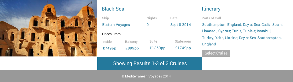
I moved it to the top with no background. This didn't really match the rest of the site.

I moved it in the middle to see if that helped, but I think it needs a background.

I added a background behind it which I think works better.

I adjusted the box to fit around the text.

I wasn't sure if I liked that, so I did an option without it.

I have completed all the pages that I am going to design now. I could design more of them as cruise sites are usually massive, but I don't have the time and I think this shows the main and most important points as well as the design, look and layout of the site.
No comments:
Post a Comment