The message should be derived from the research that I did, and stick to certain constraints:
The format of the poster should be 2:1 on A3;
A maximum of two colours can be used plus stock;
They must work as a set or series;
One poster can only use type;
One poster can only use image;
And the third poster has to use a mixture of the two.
First Poster
I started concentrating on the solely image poster at first, and from my research I found that only 19.1% of women have a seat in parliment, which could mean that womens opinions aren't heard as much as mens, and it is an unfair number for decision-making.
A quote from my research suggests that the reason for this is 'negative stereotypes about women's leadership roles, lack of commitment by political parties, inadequate funding and training for women candidate and government officials, and high levels of violence and intimidation against women in public office.' I chose this particular statistic because even though we only see men in politics on the news, in the paper etc, the reality is incredibly inequal.
I wanted to make an infographic style poster highlighting the gender inequalities in parliament, and I thought this would be an easy way of displaying information without text. I began to draw some sketches and variations of this idea:


Once I was confident about how it would look, I went onto Illustrator and made a document with the measurements of 420x210mm, and started to experiment.


 I customised the male figures to having a tie on them, and the women to having a bow in their hair to add a bit of character, but I thought this was inequal as it is sticking to gender stereotypes so decided against it.
I added the table and figure at the top like on my sketches, but when I got to this stage I decided against the whole design as I didn't like it and felt it was boring because it was so repetitive, and perhaps not an interesting topic for most people.


I went back to the drawing board, and decided again to look at a just image poster design. The one that stood out to me was the fourth one on the second row.
I based this idea on a book I read called the Feminine Mystique, published in 1963, which looks at society's attitudes towards women and how women were expected to get married and have children while the men worked, and be content with that life. I compared that to some of the recent research I collected, which shows that the principles are still the same today, and society hasn't moved forward with what womens roles are.


I based the illustration on the infographic I found in my research where the woman from a developing country has to carry water on her head as part of her daily routine, so I wanted to create one for western women. She is carrying such things as a briefcase, a baby, wedding rings and various housework chore symbols to signify what women are expected to do.

I wanted to create a clean style as I thought that would work well with two colour constraint I have to work with. I drew the woman on Illustrator, dressed in heels and wearing lipstick as women are also expected to look good while doing everything, which can be seen in the tv advertisements in my research.


I added some more illustrations and changed the colour scheme. I like to use colour from the beginning of working on screen as it helps me visualise the final product.


I started adding even more objects on top of each other at awkward angles, reflecting a jenga style position. I experimented with some more colours, and the colours I started to experiment more with reminded me of an older style which fitted in with the theme that nothing has changed in 50 years.
I liked the blue that I used in the first illustration but I do think black works better with a colour to make things stand out more, and fit in with the subject.
I think the burnt orange I have used on these is really nice but it might give off the impression of anger which isn't what I wanted to portray.


I started to then experiment with filling in different parts with the colours and and where the stock would be, and not using an outline. When working on the design, I didn't like the outline throughout it, and decided to get rid of it to create a cleaner design.


I then thought it would work well with some type added to it, so I started looking at different layouts and use of language and sketching them.


I thought about putting type at the top of the stack, but then I thought it made the stack seem less significant as it didn't reach the top of the page.

So I moved the text to the bottom so that the stack could be moved higher. I was going to put 'western woman', but after some feedback I recieved from my peers they said to use 'the modern woman' as it was more understandable.

Final Piece
I prefer it saying 'The Modern Woman' because the illustration isn't entirely modern in its style, therefore showing the principles haven't changed. I also like the colour scheme I have used, as the black fits with the actual colour of some of the objects, like the hair, skirt, briefcase etc, and it makes the blue stand out. I chose this shade of blue because it is an unthreatening colour, and doesn't project an angry tone, which a lot of people consider feminist messages to be in.
Second Poster
Now I have created my type and image poster, I wanted to look again at creating a poster with only image on it. Even though I had done previous sketches, I decided to do some more which will fit in with the style of the text and image poster.

I wanted to show the inequalities of women in the business sector. I found in my research that it is a male dominated career, with very few women having jobs at the top of the corporate ladder.
I then started to work on Illlustrator using my sketches to create some designs.

I started to create a couple of my sketches, and here is the first one, where the briefcases represent a corporate ladder. I decided to move on from this image and try another idea because I didn't like the randomness of the placement of the briefcases, and perhaps it wouldn't communicate well.


I started creating different shapes and seeing how they could represent a building in a non realistic way. I thought the second one worked better as the shapes got longer towards the bottom, and the black shows the shadowing from one side.

I created two characters on illustrator to be apart of the illustration. The man is in a suit, to depict that he is going to work, and the woman is dressed smartly with a briefcase. Again I used no outline like in my first poster to carry on the same style.


I started to draw things to go into the windows, and had three variations of a computer. I decided to use the third one, to keep the design simple as the main focus isn't on the objects in the windows.

Final Piece
This is my final poster, and it represents that less women are involved in the business sector as the repetition of men going in the door and the lone woman at the bottom show. I wanted to create a clean design as my first poster has the same style.
Third Poster
Now I had completed my first two posters, I started looking at what I could do for my final poster, which had to be all type. As I had collected lots of statistics in my research, I decided to put those on the poster to show gender inequalities.
I started doing some sketches of layout and certain statistics that I could use.

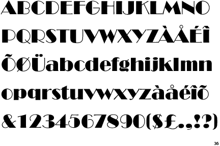
I had a pretty solid idea of how my poster would look, and I was going to use the font that I used in the type and image poster, as well as a decorative font for the numbers so that they stand out. I downloaded them of losttype, which has some great fonts.
I started working on Illustrator to create the poster:

I tried to make the type justified so that it would seem neat and organised.

I began creating a pattern to go behind the banner and text, but then I remembered that this poster was type only, and I would be breaching the brief requirements by using this, so I took it of for my final design.

Final Piece
This is my final piece for the type poster, and it is my least favourite out of the three I have done, but probably the most communicative because there is so much type.
This was the developmental process for my posters, and now they are finished I printed them off on matte paper.