I started to code the website now I had designed it digitally and knew what I wanted to do.
I started in CSS writing the basic styles that I knew such as the fonts and body.

I then started coding the navigation bar at the top, and to do this I created a container called #top which will hold a container for the logo and navigation in, as well as add the background colour.
I added margin-top: 0px and top: 0 because then it would reach the top of the page without leaving a gap. I also added width: 100% as a percentage because then no matter what screen resolution the user is on it will always reach the end of the page.
I then added the id 'nav-box' which will contain the logo and navigation links. I made the width 600px, and to make it central made the margin-left and margin-right auto. This means when I insert the logo and navigation within it, it will set within this box.
The only margins I had to add for the logo was margin-top so it wasn't right at the top of the container, and margin-left. I also made it float: left so that the navigation links would sit next to it when I added them.

Here is the HTML when for the whole top container, including navigation and logo.

This is how it looks in the browser:

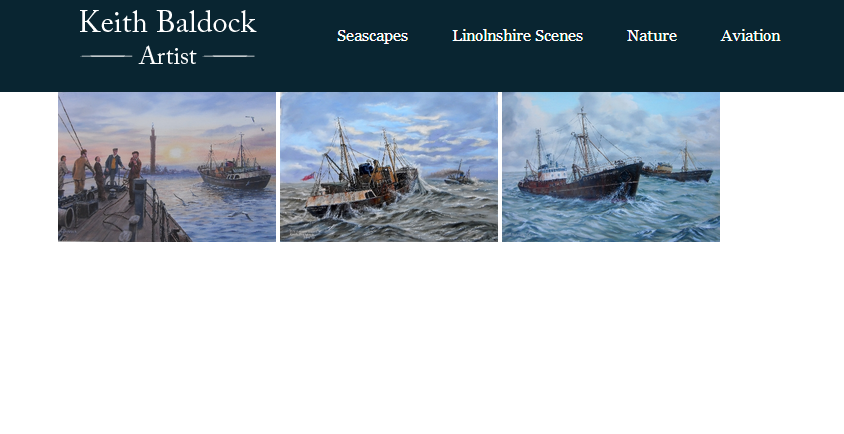
I then started adding the picture for the home page, and I created this in Photoshop. This was so simple to add, because I had done it at the right size, I just inserted the image into the HTML and the correct size inputted, then just added two styles.
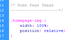
I made the width: 100& so that it would always cover the sides of the page and made the position: relative. It fitted in after the top container fine, and now I can work on the content.
To add the content was really easy, I just created a container which was has a 800px width, then made it central by adding margin-left and margin-right: auto.
I then added the text box with a width of 400px, and the box for the products with a width of 300px. By adding the padding and margins, this totalled up to 800px, the width of the container so it all fitted perfectly. To make the products box sit next to the text box, I just added float: left to them both. I also added a class for the picture of the artist, as I wanted to insert this so the user knows who will be doing the paintings. To make the image central, I again added margin-left and margin-right: auto.

This is what the HTML looks like. To add the lines between the products I just added a line break <hr /> to make things easier.

This is what it looks like in the browser:

This is a close up of the Products list:

I also tried it without the lines to see if this would look better, but I don't think it does. I think this looks too misplaced.

I then started to add the footer.


I added a class for the contact-details so that they would fit within the footer.

This is what it looked like in the browser, so I needed to change the colour of the hyperlink.

I then added the copyright part and the fact I designed it with a link to my Behance.

This is what it looked like in the browser when I finished the adjustments to the footer:
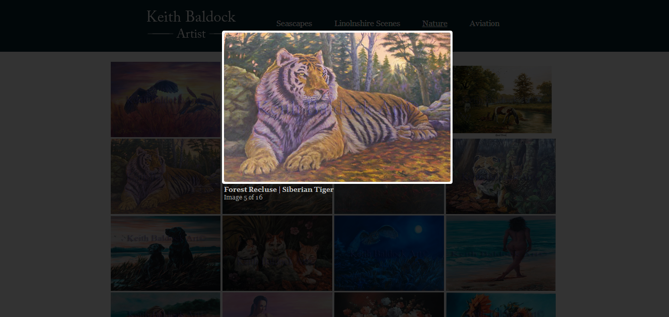
I then started to work on the portfolio pages. For this I had looked at lots of different tutorials, and thought about doing the Photoshop web gallery tool again, but they either didn't cater for large amounts of images, and wasn't easy to update. So, I decided to use Lightbox. It allows you to add thumbnails of an image, and then click on them which enlarges them for you to view. You can also create a 'set' of images so that you can click next and the next image will enlarge. This seemed my best option, and the great thing is that I can update it very easily when needed.

I downloaded it and added the files but it wasn't working at first and I wasn't sure why. It was just added a hyperlink of the painting title and opening a blank square.


I soon realised I hadn't linked up the files correctly, and once I did that it started working. I made sure the container fit four of the images across, making the width 900px.

I added a container so that the pictures would sit inside of it.

When you clicked on the images, they worked when enlarged. As I was doing them as a set, it comes up with 'Image x out of x' because I stated in the HTML that each image was part of the 'seascapes' set.

I started adding more photos by following the instructions from the website and changing them to fit my own. It was actually really easy when I got into it, just adding the pictures twice, and specifying the width of the thumbnail. I had all the picture files watermarked and in the right size already because the client had them all from when the previous website was coded, which made my life a lot easier.

I was really looking forward to how it was coming along.

I just kept adding more pictures, which although easy, was very time-consuming because there are so many and I double checked them all.


This is what the code was starting to look like. At least if I wanted to add another picture, it would only be one more line of code.

This is what it looked like when I finished adding all of the images:


I then did the same for the other pages, adding a container to each one with the correct height so that the footer sat underneath it well.

And adding all the picture files in. The current website has a section called 'Miscellaneous', and I changed this to Lincolnshire Scenes, and took the nude and floral pictures from this folder and put it into the Animals section, which I have renamed Nature. I think this works better because people know have a better idea of what each page contains.

The Lincolnshire Scenes page was one of most comprehensive because there are so many images, and this took a while to add.


I then started to think about the icons such as the previous and next button, as well as the loading gif. I created my own close, previous and next buttons. I decided to keep the previous and next button and the close button white, but I wanted the loading gif to be navy. To do this I opened the image on Photoshop, and added A Duotone colour in the navy I have been using.

I made sure I saved it as a GIF for web.


I changed the url for my new images so that they would appear.
I also had to change the width of the buttons because the next button wasn't showing parallel to the prev button due to the width being too much and pushing it underneath.

I changed the margins on the text so that it wasn't too close to the image.

Now when you hover on the left side of the image the prev button appears, and when you hover over the right hand side, the next button appears.

I added margins to the close button so that it wasn't right next to the image and looked a lot better.

I also got rid of the border around the image, because as they are all different sizes, it didn't fit around them all.


I also asked the client for a sentence or two for each of the portfolio pages as a little introduction, so I added these.

The website is now fully coded!
No comments:
Post a Comment