We've decided Sarah is going to make the title pages, and I'm going to get the page layouts done for Food, Travel and House Keeping, and we will see where we are in a few days to see what we do next.


We decided for the margins, they should be:
Top - 15mm
Bottom 20mm
Inside - 15mm
Outside - 20mm
Here are some of the screenshots of what I was working on:

I didn't know whether to stick to a strict colour scheme, or have as many as I like. But I think having a limited colour palette looks a lot more professional and stands out a lot more.

I wasn't very keen on the layout of the recipes pages.
We then went for Easter and started working on other projects. As we came back we started making new sketches and refining our idea.
We have decided not to include HouseKeeping as that is something you can google, and isn't something you only learn form experience.
We have also decided to do our own binding at Vernon Street rather than send it off to LuLu.
We went to Vernon Street to talk about the binding, and realised it is easier than we thought. We took some pictures of the different colours we could choose from for the cover:
Here are sketches that I've done for Travel section:
I then went onto Illustrator and InDesign to create the pages:

I worked out the percentages for all of the data about most popular taxis:
amber cars 36 61
apollo taxis 7 11.8
ace cars 4 6.7
royal car 3 5
blue line 3 5
stream line 1 1.6
premier 1 1.6
city cabs 1 1.6
speed line 1 1.6
express 1 1.6
t line 1 1.6
I think percentages look better than having the number of people who voted because then it looks like more people could have answered.
I tried one of the sketches ideas but because there is such a jump in votes, it didn't fit around a centre, and smaller ones looked stupid.

I then tried it in a circle which I like, and added illustration in the middle to make it look like a wheel, but I don't think it has worked. Something I have done is add a banner at the top to say which section it is part of, and added a place for the page number. By having this on every page, and different colours for each section I think it makes it more consistent.

I then added this to make it look like a steering wheel, as I wanted the fact I have used a circle to display the information relevant to the content. However, Sarah doesn't think that this works and suggested to add a horn symbol.


This is without anything in the middle, and all the taxi details at the bottom which is included in the pie chart, and I've also included the fact that Amber Cars have an app, as that is very useful.
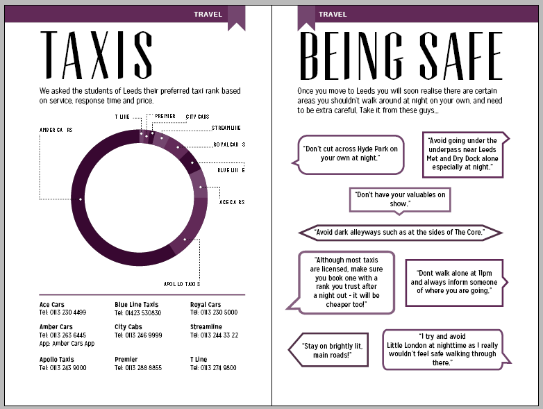

I then moved onto another part of Travel: Being Safe. I wanted this to be purely quotes from people's experiences, but not being disrespectful about certain areas with a bad reputation. I also tried a version where there are different fonts used, to show different people, but I don't think that looks very good.


I then started to design for the last page in the Travel section, railcards and bus passses. Although this is information you can find on the internet, you might not realise how valuable it could be without living away from home.

I used Sarah's illustration of a bus to match the title page, and changed the colours so that they matched the purple theme.
I then went onto the Graphic Design section, and wanted this to be full of information and resources which would have given me better insight when the course first started.
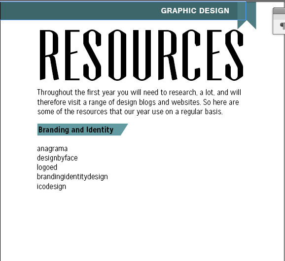
Although I think this would work best in a list, I didn't want it to be laid out like this, as it is quite boring.

I used a similar layout but moved the bodycopy to the right hand side of the page, and added a line at the top of each section to separate them.

I think that this works better and is clear.

I then started to do the advice page. Me and Sarah asked people in our class what piece of advice could they give to 1st years, and that is the content of this dps.

To make it a bit more interesting I added a couple of illustrations which linked in with what people had said. The weighing scales represent Sarah's quote about working and having fun, and the paper and pen show Ellen's idea of writing down everything.

When I filled in the two pages, I didn't think the right hand side looked right, it is too far away from the heading, but when I changed it to 5mm down from it (the gutter for the whole page layout), it looked to close.

So I made it higher a bit more, but not as high as 5mm from the header. I think this works better, and it also fits within the margins better like this.

Looking back at it, I realise the hands on the clock didn't stand out, so I have made them white.
I then moved onto the food section.


So I moved the infographic in the middle to start putting the text around it. I also made the text smaller to see if that would help.

I tried to angle the text boxes so that they would fit around the infographic better, but I think it just looks weird.


To make sure all the information was correct, I went onto the survey, and where people had voted for one of the restuarents, I went onto all of the individual responses and tallied up their individual answers for choice, value, quality and service.

Here is the final double page spread, I did the same for takeaways as well, because that had the same kind of information, and I thought it was the best way to present it.


I also worked on a calendar for the events that are happening in Leeds that were mentioned most, and had mainly positive feedback about them.
I then started to do the activities page, and at first it was going to be a page for everyday and seasonal actitivies, such as the ice skating rink and german market.

Looking back at it, I realise the hands on the clock didn't stand out, so I have made them white.
I then moved onto the food section.

As I didn't like the layout I tried first, I tried to do it a little differently. It took me a while to figure out how to lay the ingredients/where to buy/price section, as it was looking very boring, and the headings didn't really stand out. So I made the little banner to put the headers in, to match the page number banner, and separated the sections more.
I also put the icons down the side in the first layout I think they looked too separated at the top.
I also added a tip where the ingredients etc are to fill in the space.

I think the extra tip looked out of place, so I've removed it. I still think it looks a bit naked though, but I don't want to fill the space up a lot as other recipe pages will have more ingredients and will fill up the space.

Sarah suggested to make the line dotted where the icons are, so I did.


Sarah also suggested to add a tip speech bubble rather than the line I had before, and I think this looks a lot better.

I changed the layout slightly to fit in with spaghetti but I still think it works, and I think the tips help fill in spaces when needed.

I still wasn't happy with the stir fry page, so I added another tip.

These two recipes definitely look a lot fuller, and I think this layout has worked out a lot better than the first one that I tried.

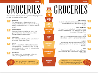
I then moved onto the groceries page, the infographic represents shopping baskets, the bigger ones being the more popular supermarkets based on the results from the survey we did.

I started writing a little bit about each one on the opposite page, using the shopping baskets as little icons to hold the numbers in. I tried these in the three different colours like the infographic.

I then tried them in red but I think this is too much as the banner at the top of the page is a majority red. I also started to realise a big problem - I wasn't going to have enough room to fit 10 paragraphs on one page for each of the supermarkets.

So I moved the infographic in the middle to start putting the text around it. I also made the text smaller to see if that would help.

I tried to angle the text boxes so that they would fit around the infographic better, but I think it just looks weird.

Here are the text boxes angled, but I don't think it works.

I made the text on the right flushed right, and made the textboxes a 1mm distance from the biggest basket so that they are all equal.

I then realised that I still had the text smaller from when I was changing it around before, so I made that to the regular point size again (12pt), and Sarah suggested to add a couple of tips to fill in the space, so I did and I think this looks a lot better now.

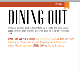
I went onto the survey results, and looked at the answers people put for their favourite restaurant. There was so many, and only a few had more than a couple of votes. So I decided the best way to display the information would be to write all that were mentioned, but with no data as they were all pretty similar and there would be no point showing about 10 with 1%.

I used different fonts from the same typeface that I have been using throughout, and the three colours that are being used in the food section.

I then started to make a table of the top four restaurants, and what people have said about them.

To make sure all the information was correct, I went onto the survey, and where people had voted for one of the restuarents, I went onto all of the individual responses and tallied up their individual answers for choice, value, quality and service.

Here is the final double page spread, I did the same for takeaways as well, because that had the same kind of information, and I thought it was the best way to present it.

I started to do the Nightlife page, and originally I was going to have this as one page, and another page for 'Bad Reccomendations', but then I thought there is quite a bit of information to be put on this page, and me and Sarah didn't want to dwell too much on negative things. So instead I decided to turn this into a double page spread.

I tried a different layout, as I wanted to do something different, and thought of separating different sections by colour and heading.

I also tried having quotes in different colours and fonts, but I think it looks a bit like St Patricks Day.

Here is the final dps for Nightlife. It is made up of quotes that people put on the survey we asked about nightlife, things people said to avoid about going out, and also random little facts about places that you wouldn't normally hear about.

I also worked on a calendar for the events that are happening in Leeds that were mentioned most, and had mainly positive feedback about them.
I then started to do the activities page, and at first it was going to be a page for everyday and seasonal actitivies, such as the ice skating rink and german market.
Gold Foiling and Feedback
We really wanted to do gold foiling on the front cover, to give a biblical and holy feel. However, after seeing Roxie and Joe's gold foiling we decided that because we wanted to do it on a textured surface, the gold wouldn't take that well and would be blotchy.
So in our final crit we asked what we could do, people suggested screenprinting. So we went to Vernon street to talk about it, and the bookbinding woman there, Sarah, said that we could bind and screenprint at the same time, so that is what we decided to do.
Also during our final crit we asked questions, which were mainly to do with the gold issue:
Where can we get gold foiling done cheaply?
Can you put leathery material through a toner printer?
How would you approach our gold on black dilemma?
Can you put leathery material through a toner printer?
How would you approach our gold on black dilemma?
We rang a lot of printers asking how much it would be, but only one place would do it and it would have been £80. Therefore, we are very glad we went with the screenprinting option.
People also suggested that having a front and back cover design would be too over powering - although me and Sarah loved the covers, we decided to take this on board, and instead of having the owl design on the back cover, we had it on the inside covers so it was a compromise, but I think it worked out
Printing and Production
As we wanted to do a hardcover back, it had to be printed into sections. To do this we made postscript files from InDesign which we could take straight down to print. We had to do this in multiples and four, and as we had 40 pages it went like this: 1-4, 5-9 etc.
However, when we went to print they didn't align well double sided which was a shame as it impacted greatly on our final product.
We went to Vernon Street to bind our book, and we did it by stitching each section together, then glueing the spine and putting buckham round mountboard for the hardcover. We also screenprinted the gold design that Sarah did onto the book: