Today we presented the answer to the question we got last week, and then got feedback on it. My question was How crucial is it to learn colour theory? which is on my design practise blog.
As my answer was based on how useful it is when working with the printing process in print, although it was right, there are other areas where it would be useful. For example, if you are working for screen, then my answer isn't relevant as there is no printing process. For this, legibility and readability play an important role in understanding colour theory. As a designer you need to know what colours work, and how using complimentary colours together can affect legibility because they can hurt the eye and make it hard to read or look at type and image. And if you use something like yellow type on white, whether it be on screen or in print, it can really affect the way you read the bodycopy, and can dramatically affect readability. There are also the aesthetics to consider, and choosing colours which work well together to provide an engaging and aesthetically pleasing piece of design to look at, to draw people in.
Another note I picked up on was the fact that if you want white colour on printed stock, you can use a tint or 4 process colour on white paper, because the colour is made up of dots, and you wouldn't be able to see them. However, if you are going to use a different coloured stock you will have to use a formula colour because it is flat, and there are no spots which make up the colour as it is pre-mixed, as you would be able to see them through the 4 process colour.
Tuesday, 29 January 2013
Wednesday, 23 January 2013
OUGD405: Research, Collect, Communicate: Product
As I had finished the design of my publication, I now had to print and bind it. As I had done the design on InDesign, it was really simple to set it up for print, just a few settings needed changing.
As I was printing a booklet, I chose Print Booklet under the File tab, and because I wanted the pages to fold left to right, I chose short-edge binding. I was also using my own stock, Antique White paper, to give an authentic feel so I had to change the Paper Feed to Bypass Tray. The Booklet Type was 2-up Saddle Stitch and I checked the box to Print Blank Pages, as I had one at the end. I also wanted it printing on A3 because even though the individual pages were A5, the double page spread would be A4, and I needed space for bleeding. I also added crop marks so that when I was cutting them down I would know where to cut.
Then I sent it to print, and when it came out it had a blue line on all of the sheets which ruined it a bit, but it isn't that noticeable.

As it was printed on A3, I had to crop it down quite a lot as it looked like this.

I got a metal ruler, cutting board and scalpel to cut the pages, but the paper was thicker than I thought, and I had to go over a couple of times with the scalpel before it went all the way through. The first page I did had a few rough bits because of this, but i cut them away and pressed harder with the other pages so that it didn't happen again.


I scored down the middle very lightly with the scalpel so that they would fold easily. When I cut them all out, I folded them and put them in the right order. I also marked three dots on the spine where I am going to bind them.


To bind them, I went to the wood workshop to drill a hole in the three places were I marked the spine. Then I got a needle and thread, and Simon showed me how to stitch it together, which was actually really simple.
As I was printing a booklet, I chose Print Booklet under the File tab, and because I wanted the pages to fold left to right, I chose short-edge binding. I was also using my own stock, Antique White paper, to give an authentic feel so I had to change the Paper Feed to Bypass Tray. The Booklet Type was 2-up Saddle Stitch and I checked the box to Print Blank Pages, as I had one at the end. I also wanted it printing on A3 because even though the individual pages were A5, the double page spread would be A4, and I needed space for bleeding. I also added crop marks so that when I was cutting them down I would know where to cut.
Then I sent it to print, and when it came out it had a blue line on all of the sheets which ruined it a bit, but it isn't that noticeable.

As it was printed on A3, I had to crop it down quite a lot as it looked like this.

I got a metal ruler, cutting board and scalpel to cut the pages, but the paper was thicker than I thought, and I had to go over a couple of times with the scalpel before it went all the way through. The first page I did had a few rough bits because of this, but i cut them away and pressed harder with the other pages so that it didn't happen again.


To bind them, I went to the wood workshop to drill a hole in the three places were I marked the spine. Then I got a needle and thread, and Simon showed me how to stitch it together, which was actually really simple.
Tuesday, 22 January 2013
OUGD404 - Colour Theory
In a group of six, we had to think of some questions each that we have about colour.
Mine were:
Then we read them out to each other, and made a list of what we thought were the best.
Then we had to pass the questions onto the next group, and our task is to answer another groups set of questions which are:
We shared out the questions, and I answered number 3.
How crucial is it to learn colour theory?
It is crucial to learn colour theory, and the reason I think it is most important for is the production aspect of printing. This is a necessary part of working in print, and if you have a client which is on a budget, then you would need to consider printing costs and how to make the most of them. It would make sense to choose colours which are Pantone Formula Colours, rather than Pantone 4 Process Colours, and they are:
Pantone Formula Colour is flat colour, so you would only need one plate for printing, and when you look through the linen tester you can't see any dots which make up the colour.
Pantone 4 Process Colour is colour which is made up of little dots which can be seen through a linen tester. These are more expensive when it comes to print because they use four plates, but there is a lot more choice of colours.
So if a Magenta was C = 10 M = 100 Y = 20 K = 0, it would be a lot cheaper, and not noticeably different to choose C = 0 M = 100 Y = 0 K = 0 instead.
This would mean printing costs would be dramatically reduced, as it would be using two less plates.
However, it would also mean that using over four Pantone Formula Colours would be more expensive than using Pantone 4 Process Colours, because you would need more than four plates. For example, if you used 9 Pantone Formula Colours in a design, then you would need 8 plates to print it.
I then started to answer my own questions:
How do you make different shades of colour?
When using paint, you can mix two different colours to make a new one, or a different shade. By adding white to any colour, you will make it lighter, and adding black to any colour will make it darker. Following Itten's colour wheel, when the primary colours mix together, they make the secondary colours for example, if you mix red and yellow, you create orange.
Watching the Pantone video, they have colour engineers and ink technicians who 'pick points within colour space' which allows them to begin a colour process, and create new colours.
To print different shades of colour, you need plates, for example, a 4 process colour like C = 40 M = 30 Y = 20 K = 10, you would have four plates of Cyan, Magenta, Yellow and Black, and they would each print the amount of colour that was in the formula of the colour.
Did RGB originate when TV was invented?
RGB is a colour model where colour is perceived through light. It has always existed, because it is how we perceive colour through our cones and rods in our eyes. However, it was only discovered how to be used in Television by John Logie Baird. In 1928 he created the first colour transmission, and in 1938 he introduced the first colour broadcast.
How do you use the Pantone Matching System?
Pantone have a Pantone Matching System, and I know that you can look up the colour you want in the swatch books, and type in the same values onto Illustrator so you have the same colour on screen, but that's it. I found out that when you find a colour that you like and use it for your work, you then send it to the printers with the pantone chip so that they also have the colour information. Then the printer finds the colour in a formula guide, and it is then sent to the press. What I didn't realise next was that the formula on the pantone chip is for them to create the mixture using ink. So if a colour is made up of three different variations of other pantone colours, they will mix those three quantities together to create the desired colour, and it will then go to print.
Is it possible to make a new colour, or have they all been created?
I was watching a Pantone video, and the Vice President of the manufactoring and colour technology there said that 'colour was infinite' and that the colour engineers pick 'points within colour space for us to create a new colour', therefore answering my question that more can be created. There is a formulation process where they get the points they picked and turn decipher the ink recipe, where it is then turned into ink, and then into a print. They also add other categories of colour such as metallics and pastels.
If colour can be made from ink, light and paint, is is possible there could be another colour mode with other colours in the future?
What I didn't already realise is that there are already different colour modes available, I thought there was only RGB, CMYK and mixing paint together, but when I researched more, there are other colour modes used in the Adobe products such as HSB, the CIE Lab Colour mode, and the fact that there are various alterations of the RGB colour format such as Apple RGB, Adobe RGB and sRGB.
How do colours make us feel different things? i.e. being in a green room makes us calm
Leatrice Eiseman is a colour specialist and I watched a video of her saying that colours do affect how we feel, for example, she says that because we associate blue with the sky, it is a colour which gives us reassurance, and we can depend on it, because it will always be there, so when a room is painted blue, it gives a sense of dependability and tranquility. So depending on what we associate colour with, depends on how it makes us feel.
Is black a colour?
This is an ongoing debate, and while some people think it is, some think it isn't. I researched this further on colourmatters, where there is an article about it. As colour is made up of light, it can be argued that black is not a colour because when there is no light, that is when we see black. However, when the primary colours of print (Cyan, Magenta and Yellow) and the primary colours of paint (Red, Yellow and Blue), are mixed together in certain quantities they make black. Therefore it can be said that black is a colour in this case, because it is made out of pigment and is physically there.
What is the HSB colour mode for?
I saw this on Illustrator during the session and didn't know what it was, so I decided to look at what it means. HSB stands for Hue, Saturation and Brightness, and this is a HSB color model.

Hue is what we say when we are referring to colours, such as red, violet, yellow etc. Saturation is how pale or strong a colour is, so if a colour is pale it is called desaturated, and a strong colour has a high saturation. It is possible to change the saturation of a colour or image in Photoshop, and it still keeps the same colour, it is just a paler tint of that colour, and can appear faded.
When talking about the brightness of a colour it is the chromatic value we are talking about. If a colour is bright, like orange, then it has a higher value than something which is darker, like a deep violet, because the orange is closer to white, whereas the deep violet is closer to black.
Why do natural colours fade?
This question was raised by somebody else in the group, and I thought it was an interesting one so used it as one of my own. I decided to look at natural dyes used in rugs to make the question more specific, and I discovered that actually, natural dyes are a lot more durable than synthetic dyes. Synthetic dyes which were first introduced in the late nineteenth century ran in water, and faded dramatically. Both synthetic and natural dye fades now, and I think that the fading is accelerated by light, as I have noticed in curtains that the part of the curtain which is always in the window fades a lot more than the curtain which always stays behind the wall. It is also supported in an article I was reading about it, as it says that they both fade from sunlight.
What do the rods and cones do?
Although we were taught this, I forgot, so I looked over the presentation again. Cones and rods are receptors in the eye, and are what we perceive colour through. Although we can only see red, green and blue, e have three cones which allow us to perceive different hues of colour. The first cone can see red-orange light, the second green light, and the third can see blue-violet light. The rods allow us to see tones of grey. These allow us to see a range of colours through just the three colours that we can see.
Mine were:
- How do you make different shades of colour?
- Did RGB originate when TV was first invented?
- How do you use the Pantone Macthing System?
- Is it possible to make a new colour, or have they all been created?
- If colour can be made from ink, light and paint, is is possible there could be another colour mode with other colours in the future?
- How do colours make us feel different things? i.e. being in a light green room makes us calm
- How do natural colours fade?
- Is black a colour or lack of chromatic value?
- What is the HSB colour mode for?
- What do the rods and cones do?
Then we read them out to each other, and made a list of what we thought were the best.
- Is colour more, less or equally important than typography in graphic design?
- Is black a colour?
- Why do people have favourite colours?
- How do colours make us feel different things?
- Why do natural colours fade?
- How/Why do colours trigger different emotions?
- What's the best light to look at colour in?
- Which colours look best together of them all?
Then we had to pass the questions onto the next group, and our task is to answer another groups set of questions which are:
- What is the difference between tint/shade and hue/tone?
- Is it possible that there are colours that exist that the human eye cannot process?
- How crucial is it to learn colour theory?
- Is colour theory learnt or instinct?
- Does it affect the way you see colours when looking through a certain eye?
We shared out the questions, and I answered number 3.
How crucial is it to learn colour theory?
It is crucial to learn colour theory, and the reason I think it is most important for is the production aspect of printing. This is a necessary part of working in print, and if you have a client which is on a budget, then you would need to consider printing costs and how to make the most of them. It would make sense to choose colours which are Pantone Formula Colours, rather than Pantone 4 Process Colours, and they are:
Pantone Formula Colour is flat colour, so you would only need one plate for printing, and when you look through the linen tester you can't see any dots which make up the colour.
Pantone 4 Process Colour is colour which is made up of little dots which can be seen through a linen tester. These are more expensive when it comes to print because they use four plates, but there is a lot more choice of colours.
So if a Magenta was C = 10 M = 100 Y = 20 K = 0, it would be a lot cheaper, and not noticeably different to choose C = 0 M = 100 Y = 0 K = 0 instead.
This would mean printing costs would be dramatically reduced, as it would be using two less plates.
However, it would also mean that using over four Pantone Formula Colours would be more expensive than using Pantone 4 Process Colours, because you would need more than four plates. For example, if you used 9 Pantone Formula Colours in a design, then you would need 8 plates to print it.
I then started to answer my own questions:
How do you make different shades of colour?
When using paint, you can mix two different colours to make a new one, or a different shade. By adding white to any colour, you will make it lighter, and adding black to any colour will make it darker. Following Itten's colour wheel, when the primary colours mix together, they make the secondary colours for example, if you mix red and yellow, you create orange.
Watching the Pantone video, they have colour engineers and ink technicians who 'pick points within colour space' which allows them to begin a colour process, and create new colours.
To print different shades of colour, you need plates, for example, a 4 process colour like C = 40 M = 30 Y = 20 K = 10, you would have four plates of Cyan, Magenta, Yellow and Black, and they would each print the amount of colour that was in the formula of the colour.
Did RGB originate when TV was invented?
RGB is a colour model where colour is perceived through light. It has always existed, because it is how we perceive colour through our cones and rods in our eyes. However, it was only discovered how to be used in Television by John Logie Baird. In 1928 he created the first colour transmission, and in 1938 he introduced the first colour broadcast.
How do you use the Pantone Matching System?
Pantone have a Pantone Matching System, and I know that you can look up the colour you want in the swatch books, and type in the same values onto Illustrator so you have the same colour on screen, but that's it. I found out that when you find a colour that you like and use it for your work, you then send it to the printers with the pantone chip so that they also have the colour information. Then the printer finds the colour in a formula guide, and it is then sent to the press. What I didn't realise next was that the formula on the pantone chip is for them to create the mixture using ink. So if a colour is made up of three different variations of other pantone colours, they will mix those three quantities together to create the desired colour, and it will then go to print.
Is it possible to make a new colour, or have they all been created?
I was watching a Pantone video, and the Vice President of the manufactoring and colour technology there said that 'colour was infinite' and that the colour engineers pick 'points within colour space for us to create a new colour', therefore answering my question that more can be created. There is a formulation process where they get the points they picked and turn decipher the ink recipe, where it is then turned into ink, and then into a print. They also add other categories of colour such as metallics and pastels.
If colour can be made from ink, light and paint, is is possible there could be another colour mode with other colours in the future?
What I didn't already realise is that there are already different colour modes available, I thought there was only RGB, CMYK and mixing paint together, but when I researched more, there are other colour modes used in the Adobe products such as HSB, the CIE Lab Colour mode, and the fact that there are various alterations of the RGB colour format such as Apple RGB, Adobe RGB and sRGB.
How do colours make us feel different things? i.e. being in a green room makes us calm
Leatrice Eiseman is a colour specialist and I watched a video of her saying that colours do affect how we feel, for example, she says that because we associate blue with the sky, it is a colour which gives us reassurance, and we can depend on it, because it will always be there, so when a room is painted blue, it gives a sense of dependability and tranquility. So depending on what we associate colour with, depends on how it makes us feel.
Is black a colour?
This is an ongoing debate, and while some people think it is, some think it isn't. I researched this further on colourmatters, where there is an article about it. As colour is made up of light, it can be argued that black is not a colour because when there is no light, that is when we see black. However, when the primary colours of print (Cyan, Magenta and Yellow) and the primary colours of paint (Red, Yellow and Blue), are mixed together in certain quantities they make black. Therefore it can be said that black is a colour in this case, because it is made out of pigment and is physically there.
What is the HSB colour mode for?
I saw this on Illustrator during the session and didn't know what it was, so I decided to look at what it means. HSB stands for Hue, Saturation and Brightness, and this is a HSB color model.
Hue is what we say when we are referring to colours, such as red, violet, yellow etc. Saturation is how pale or strong a colour is, so if a colour is pale it is called desaturated, and a strong colour has a high saturation. It is possible to change the saturation of a colour or image in Photoshop, and it still keeps the same colour, it is just a paler tint of that colour, and can appear faded.
When talking about the brightness of a colour it is the chromatic value we are talking about. If a colour is bright, like orange, then it has a higher value than something which is darker, like a deep violet, because the orange is closer to white, whereas the deep violet is closer to black.
Why do natural colours fade?
This question was raised by somebody else in the group, and I thought it was an interesting one so used it as one of my own. I decided to look at natural dyes used in rugs to make the question more specific, and I discovered that actually, natural dyes are a lot more durable than synthetic dyes. Synthetic dyes which were first introduced in the late nineteenth century ran in water, and faded dramatically. Both synthetic and natural dye fades now, and I think that the fading is accelerated by light, as I have noticed in curtains that the part of the curtain which is always in the window fades a lot more than the curtain which always stays behind the wall. It is also supported in an article I was reading about it, as it says that they both fade from sunlight.
What do the rods and cones do?
Although we were taught this, I forgot, so I looked over the presentation again. Cones and rods are receptors in the eye, and are what we perceive colour through. Although we can only see red, green and blue, e have three cones which allow us to perceive different hues of colour. The first cone can see red-orange light, the second green light, and the third can see blue-violet light. The rods allow us to see tones of grey. These allow us to see a range of colours through just the three colours that we can see.
Monday, 21 January 2013
OUGD405: Research, Collect, Communicate: Product
After I created my recipes and research illustrations, I started to make my own. I used a graphic tablet to create these and here are the sketches I did first:


Then I edited them and added colour to them on Illustrator. I changed the opacity to 80% on all of the illustrations, so that when different parts of the food overlapped, the shade turned darker in that area. As I did them all on a graphics tablet, they all have imperfect lines and nothing is completely straight. I used the Smooth Tool on certain things to make lines less jagged. I wanted them to look inaccurate and be quite rough though, as during the war everything was homemade, and people made the best out of what they had - make do and mend - and I wanted the illustrations to reflect the handmade, imperfect lifestyle.


As I was making the illustrations, I was adding them to a page layout, just so that I could see what it would look like in context.


When I started to think about page layout however, I went onto InDesign and made some guides on the A Master slide so that I could stick to the same layout throughout. I decided to make the grid like this because I had different amounts of information and illustrations on each page, and it needed to be consistent and look the same throughout.

Then I started to add all the information on:


Some of the recipes had fewer ingredients than others, so pages like the Rice Pudding and Fish Pudding look quite sparse in comparison to the Beef Pot-Roast and Rabbit Stew, but I still think it looks consistent because I haven't had to lower the point size of any text to make it fit the page, or enlarged any to eliminate white space, and the text starts at the same place on every page.

I drew how I wanted the front cover to look like first, and I wanted to create something which was simple and still handmade, to go with the rest of the theme. I traced it onto Illustrator using the graphics tablet, and made it into a Live Paint object so I could easily colour it in.

I then chose red and blue to colour it in with because they are the colours of the British flag, and I thought they would show the patriotism the country had during the War. For the text, I found it hard to warp the type on Illustrator because it didn't flow with the banner, and it looked too polished with the hand drawn illustration. So I printed of 'BRITISH WARTIME RECIPES' in Adobe Garamond Pro and traced it on the graphics tablet. I then edited the characters slightly, and placed them onto the banner. I think this looks a lot better because it fits in with the uneven lines of the banner and illustrations throughout the book.

Following some feedback about my recipe book, Alex said that he liked everything apart from the font which was featured on the contents page. I have to agree with this, and I think that the Tommasso font makes the text look too overcrowded. So I changed the font to Adobe Garamond Pro, but in bold.
Now I am ready to print.
Thursday, 17 January 2013
InDesign Induction

InDesign refers to images as links, and in the links palette it tells you all the images that are in the document. It says the page number the images are on, and if you hover over the image name a little window pops up saying where the original image came from.
Even though the images look low-res on the document, when it sends to print it finds the location of the original file and swaps it for the high-res version. It does this so that the document doesn't slow down.
The opposite of a link file is an embedded file, and you have the choice to do either in Illustrator.


If a file is missing, then a red hexagon will appear at the top of the image in the document to tell you that it is, and a link will appear when the image has a link for it.

We have to resize pictures in photoshop, you can't do it in indesign. However, if you do not know the exact size yet, you can resize it in indesign, check the scale in the links palette, and edit in to that scale in photoshop. Once you have done it on photoshop, once you have saved it, it will update itself on indesign so you don't have to redo the layout. To edit the image in Photoshop, you can do that from indesign. You can either choose the option above, or hold down alt and double click.

Once on Photoshop I changed the scale of it so that it matched the one on InDesign.

Then I edited the image on Photoshop so that I could see how it changed immediately on InDesign. I saved it and closed it, and when I went back onto InDesign it changed.
When working with a tiff file, we are working with a rectangular image which is made up of pixels, but if we use a psd file then it can have transparency, for example if you are preparing a cut out.

I went onto Photoshop, opened a tiff file and changed the image so that part of it was transparent and saved it as a psd file.

I then went back into InDesign, placed the file, and when I moved it around, the transparency shows through anything else on the document.


To add a guide that will be on multiple pages, you click the a master slide on the pages palette, and go on layout - create guides, then when you select some they appear on all of the pages.

By pressing 'W', you can see how the document will look when it is printed.

You can change what the W shows by changing the options on the toolbar. The bleed option is useful to see if the photos reach the edge, and the presentation view is helpful if you are showing a client the work.


To get text to wrap around an image you go on Window - Text Wrap and a little window pops up. Selecting both the image and text you can change the options so that the image does not obscure the text.The four options underneath are there to create an offset so that the text doesn't run completely next to the image.

To get text to wrap around a transparent part of an image, instead of treating like a rectangular image, you click the third text wrap option, then the Contour Option button becomes available, which you then choose Alpha Channel.

To make a shape into the text, you go on the frame tool and choose a shape, or use the pen tool, place it where ever you want and click the third text wrap option.

High Quality Print works good on the laser printer in college
Press Quality is high quality and suitable for commercial
Smallest File Size looks good on screen or issu
Tuesday, 15 January 2013
OUGD404 - Colour and Contrast
Here are some of the notes I made through today's presentations, which were mainly visual.
Johannes Itten came up with 7 contrasts:
Contrast of Tone
Contrast of Hue
Contrast of Saturation
Contrast of Extension
Contrast of Temperature
Complimentary Contrast
Simultaneous Contrast
These are all happening at the same time to greater or lesser impact.
Contrast of Tone
Formed by the juxtaposition of light and dark values. This could be monochromatic which means single colour.
Red is the midtone, blue is the darkest tone, and yellow has the highest contrast.
Contrast of Hue
Formed by juxtaposing of different hue. The greater distance between hues on a colour wheel, the greater the contrast.
High contrast means something stands out, low contrast blends in.
Contrast of Saturation
Formed by the juxtaposition of layout.
Contrast of Extension
Formed by assigning proportioned field sizes in relation to the visual weight of a colour, also known as the contrast of proportion.
When using high contrast colours, like purple and yellow, a small of amount of one should be used on the other to make the weight in proportion.
Complimentary Contrast
Formed by juxtaposing complimentary colours from a colour wheel or perceptual opposites.
Simultaneous Contrast
Formed when boundaries between colours perceptually vibrate.
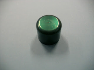
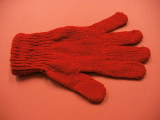
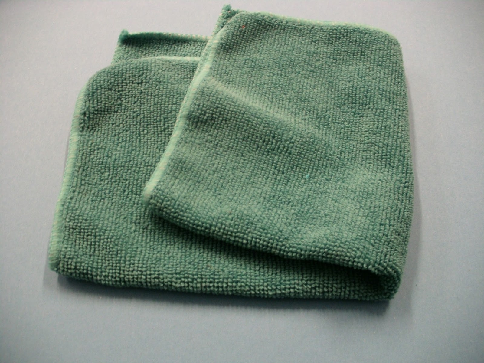
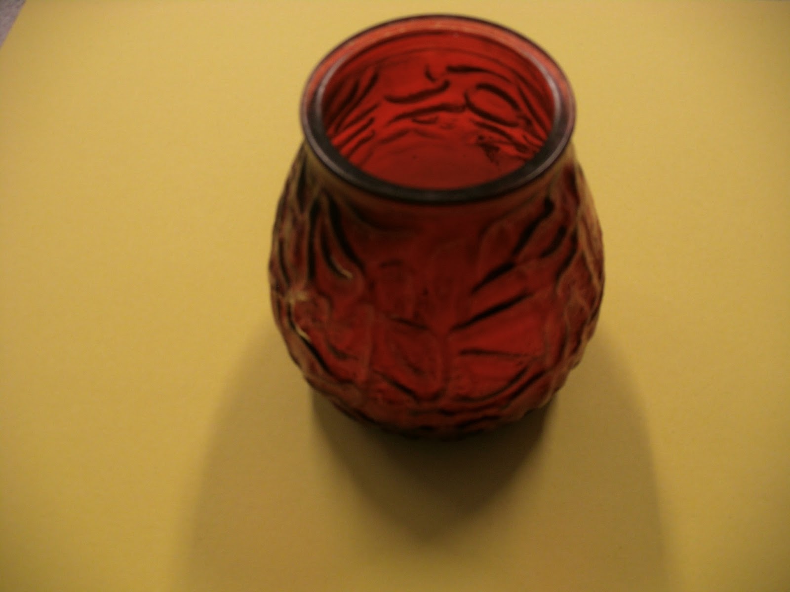
We had to pick two complimentary colours in a pair, and then photograph them on different coloured pieces of card to see the changes what happen.


Johannes Itten came up with 7 contrasts:
Contrast of Tone
Contrast of Hue
Contrast of Saturation
Contrast of Extension
Contrast of Temperature
Complimentary Contrast
Simultaneous Contrast
These are all happening at the same time to greater or lesser impact.
Contrast of Tone
Formed by the juxtaposition of light and dark values. This could be monochromatic which means single colour.
Red is the midtone, blue is the darkest tone, and yellow has the highest contrast.
Contrast of Hue
Formed by juxtaposing of different hue. The greater distance between hues on a colour wheel, the greater the contrast.
High contrast means something stands out, low contrast blends in.
Contrast of Saturation
Formed by the juxtaposition of layout.
Contrast of Extension
Formed by assigning proportioned field sizes in relation to the visual weight of a colour, also known as the contrast of proportion.
When using high contrast colours, like purple and yellow, a small of amount of one should be used on the other to make the weight in proportion.
Complimentary Contrast
Formed by juxtaposing complimentary colours from a colour wheel or perceptual opposites.
Simultaneous Contrast
Formed when boundaries between colours perceptually vibrate.
We had to pick two complimentary colours in a pair, and then photograph them on different coloured pieces of card to see the changes what happen.


Subscribe to:
Comments (Atom)