Anything from the inception of this blog is copyright to Danielle Harrison ©

Thursday 28 November 2013

OUGD503 - Responsive: Initial Ideas

While rewriting the brief and thinking about the project, I came up with a few ideas I had before I started researching, and here is a mindmap of them:


I know I definitely want to create a resealable package somehow, whether using a grip seal to close it, or being able to fold the package in a certain way so you don't have to add any more packaging. I think this will depend on what I can achieve at woodwork.


After thinking about the project a lot, I realised that it is actually quite hard to think about how to improve it other than using the resealable feature, so I decided to look at different areas and ask myself a lot of questions about what is needed and see what my housemates think of my ideas - they eat a lot of bacon and are afterall, the potential customers.


Shape

I started thinking about how I could reinvent the current packaging shape, as this would affect the shelf presence which is something the brief has asked me to do.

I thought about maybe having it in the shape of a circle, but that would mean changing the product and tampering with it more than is needed.


I thought about rolling the bacon up as this would save space, however when I asked for feedback people said:

'I like to be able to see the fat on the bacon and I wouldn't be able to when it's rolled up.'
'I think that's a good idea because it's something different and would stand out on the shelf.'
So this is mixed feedback, and overall rolling it up would affect the functionality of the product which would probably put people off.
People wanting to see the bacon got me thinking how could they see each rasher? Maybe lay them next to each other than having them stacked? But that would mean more packaging.

I thought about the idea of a stand up pouch - this is common when using grip seal packaging. It would have shelf presence which is what the brief is asking for, but would it use unnecessary packaging?

What about thermoformic film? This would wrap around the bacon completely condensing the shape, which should in theory lower transportation costs - would this compromise the quality by getting squashed? And would it actually not suppress the shape because each packaging would be different sizes?

Resealable
This is something that I definitely want to do because it would keep the product fresh for longer, which will in turn improve the customer experience. How I would make this is questionable - do I need to know software which will be used in woodwork? Should I use a complex fold or add a grip seal? How would I make a grip seal? How would this affect the shape?
I saw a packaging for cheese in Marks and Spencer's and it appeared to have a film lid, but it was actually resealable, which is something I can look into.

Design
Could I use the plastic packaging to create a design within it? This could be achievable through vacuum forming. Could this have the logo on? Or be unique to each product in the range?
Should I use a sticker with the graphics on and place it onto the plastic? This would eliminate the use of an outer packaging. But then none of the packaging would be recyclable.
Should the outer card packaging fold around the packaging to slip on and off easy? Would this slip off too easy? Should it surround the whole packaging, or just part of it? If it covered the whole packaging this has more room for the design and would protect it, but is this necessary as people like to see the product? How about using transparent packaging then, and screenprinting onto it? What about if it was completely transparent packaging, with a printed sticker onto it? And by using the vacuum form to create shapes onto the packaging? What shapes would these be, how would they relate to the product and would the customer appreciate this?

Target Audience
I reread the brief and it says that it has a lot of loyal customers that have put a lot of trust into the brand - should I focus at other audiences? Or improve the experience for these customers? Or by improving the packaging and customer experience will this appeal to both of these anyway? I need to look at the pricing of the products so that I can truly see how much of a premium brand it is and how to design for it. I need to look at other premium food packaging to see how that is packaged in the current state. Also, Danepak are well established - how can I keep this aspect, and reinforce this aspect, to customers?

Range
Danepak have a range of products, and not just bacon. They have ham and pork too, all ranges of pig. How would my packaging idea be reproduced across these products? They have five different ranges of bacon - how will the packaging be consistent and at the same time recognisable.
Sustainability
I really wanted to use a recyclable type of packaging for the meat, but after researching materials used in meat packaging, I have found that I will have to find other ways to make it sustainable. I can do this by using less packaging and a compact size to make transportation trips fewer, and therefore cheaper and less fuel being used. By making it resealable it will also be more sustainable because people can keep the food for longer, and won't have to use extra packaging - resealable food bags.

Material

For the material I will have to use plastic as this is the only current safe packaging for fresh meat. For the outer packaging I can use recyclable card to print the design onto, as this will add to the sustainability of it, and is a good material to use for printing colour onto.
One thing I noticed when researching meat packaging, is that it should actually have a barrier for light because this can discolour the meat. The reason it is mainly transparent is because the customer can then see it. This is something I should consider when doing the outer packaging - perhaps having it wrap all the way round. I could also use a sticker to put onto the plastic instead of a card outer packaging around it.

What would be better for the environment - a small sticker which isn't recyclable on the packaging, or a card slot around it. The card would be recyclable but would be bigger, and the sticker would be a lot smaller. I think the card would be better, especially if it used non-toxic inks. But if the card had die cut areas, then this would increase wastage - but the aesthetic appeal would attract customers. And is there any point having a completely sustainable packaging if it isn't attractive and customers don't buy it?

OUGD503 - Responsive: Pitch & Propose

When planning a project and proposal, you need to define the aims and objectives.

Be SMART about the project -

Specific - Details exactly what needs to be done
Measurable - Achievements that can be measured in tersm of units or specific success criteria
Achievable - That resources, scope and scale are within your capabilities or capacity
Realistic - The objectives are possible to attain - which is important for your motivation
Time Bound - The period of time, target dates, schedule or timetable is clearly defined

Use words from the brief. Don't ignore the original brief even though you've rewritten it.

Justify the needs for your proposal. 
- Who needs it?
- Why do they need it?
- What evidence can you provide to support your argument?
- Don't make empty statements
- What circumstances have created this need?

Describe your motivations

  • What are your goals?
  • What are your ambitions?
  • What are your success criteria?
  • What are your values?
    • Political standpoint
    • Environmental concerns
    • Social factors
    • Economic factors
Visualise the ending.

We had to pitch our ideas to our table and see what they thought. I asked for some feedback on my project as I felt I had hit a wall regarding how to make it stand out from current packaging. They discussed it with me and came up with some ideas:
  • Die cut the packaging
  • Have it hang from a hook (cardboard)
  • Make it look healthy/organic - people like that
  • Use different materials/patterns for different types of bacon - frosted areas for smoky etc
Having this gave me a lot of confidence to go ahead with the project as no one said that it was unrealistic or unachievable and seemed to be in similar situations.

Wednesday 27 November 2013

OUGD503 - Responsive: Five Reasons For Response

After doing some initial research and ideas, I have wrote a list of five reasons why my response for the Future of Bacon Packaging brief should win:


  1. Woodwork - Having this facility means I can produce the packaging in a professional way and answer one of the mandatory requirements.
  2. Resealable - I'm aiming to make the packaging resealable which through feedback people think would improve the use of the packaging. This also answers the brief in terms of being more sustainable (don't have to use extra packaging) and keeping the meat fresh for longer.
  3. Interest - I've always been interested in food packaging design - having books on it, pinning lots of examples and have generally been researching it for a couple of years I have a good knowledge on what it looks like/what to include.
  4. Illustrator - Being able on Illustrator is a good skill, because I am going to digitally produce the graphics on this programme. By producing them to a high quality finish will be a good thing to have because it will be more appealing, professional and the judges will have a good idea of how I would want it to be produced.

OUGD504 - Design for Print: Making the Tickets

Digital Print
To make the tickets, I started of by digitally printing them. I tried two different variations - one where I would add a process to borders and the logo, and one where I would just add the logo on.


I then cut them using a guillotine, so that they would be very straight. This type of guillotine is very good for cutting thick stock too, which I needed.


Lasercutting
I need to lasercut part of the ticket so that I can add the processes on through them.
This is what I need to lasercut for the monoprint, linoprint and embossing tickets. I also exposed this on a fabric and paper screen for the screenprinting and foiling.

The first version would mean the process would be added to borders as well as the logo. The second version would mean just the logo would be added in the process, which is a more subtle effect.

Lino
To lasercut the lino, the black area is what will be burnt out. I had to make most of the design black so that the majority would be burnt out. This is what it looks like:


Before I transfer the Illustrator file to Ethos, I need to export it as a JPEG, turn up the quality and change the colour model to Grayscale.


In Ethos, I highlighted everything and changed the engraving settings to this, and sent it to print.


Here is what it looked like when I rastered it:


After doing the lino icon, I realised that when you lasercut lino, the rastered area isn't very indented meaning it picks up a lot of ink still, which isn't what I want on the ticket as you need to be able to read the text. Therefore, I got my lino cutting tools and went over where it had already been rastered.


Embossing
I created the stencil for the embossing ticket through lasercutting. I did it onto MDF so that it would be thick enough to go through the mountboard. I did three variations as it didn't take long to cut, and I thought this way I could experiment to see what looked best.


I did a couple of practise runs to see what it would look like, and the pressure I should pump the press to. As I have done the embossed icons now, I was more confident with the press and did it very quickly.
I put a piece of tissue paper between the MDF and the stock so that it wouldn't get dirty, and pumped it to just over 4000psi.


I then tried it straight away on the real ticket which I think came out really well. To make sure I got it in the right place, I secured the MDF to the press with a bit of masking tape, and then secured the stock on top of that with a bit of masking tape too so that it wouldn't move in the press.


Foiling
I did these tickets the same time I made the posters for foiling. I bought some black foil, and screenprinted the tickets with glue.
When I added the foil and put it through the heat press, it didn't seem to work as well as other coloured foils I tried. I'm not sure why this is, as I waited for the foil to cool down before I took it off, and it happened on others I tried as well.


This is what the foil looks like when you peel it off the stock, and the foiled area is transparent.


I was able to get one ticket that worked well, and I feel like having just the logo in the process is better because it is more subtle and less overpowering.


Here are the tickets that I tried, with two working well and the other three not so much.


This is disappointing, but I think it is the foil because I tried other colours on the same day with the same designs and they worked out fine. At least I managed to get a couple that looked okay, as that's all I needed.

Screenprinting

This was very easy to do because I knew that the outcome would be very smooth and there would be no issues.

I did a few practice runs at first, and I did notice that the text was quite blurry and not very focussed.


However, after a few more runs that went away and I was confident to print onto the ticket.


Here is the ticket.


Monoprint
For the monoprint ticket I decided that it would be best to screenprint the logo instead, because when I tried to monoprint the logo on the icon it didn't work at all due to the stock choice. So I followed the same process as the screenprinting ticket and here is the result:

Linoprint

I got the lino cut that I had made and rolled black ink onto it.

I then put it through the press, and this is the result I got. However, I didn't like how the whole ticket was covered in the print, even though that is an effect of lino printing.


So I cut the lino so that I only had the logo, and threw the rest of it away. I did a few test prints of this to see how it looked:


Once I got the right imprint, I did it onto some more tickets I printed of:


I am much happier with this result because it is a lot cleaner, but still shows the effect of linoprinting.


OUGD504 - Design for Print and Web: Rewritten Brief

I have rewritten the brief for the ISTD brief I have chosen to do - Mutton Quad.

Brief Title

Typographically Themed Restaurant

The Brief

You have been asked to create a brand concept for a typographically themed restaurant which you must create a name, logo, printed material and screen based media for. Typography must be the theme throughout the branding and should be explored thoroughly to create an effective and consistent concept.

Considerations

You must consider the audience's wants, needs and understanding of typography, and how this can improve their customer experience in the restaurant. 
Consider the type of restaurant it is - is it ethical, a franchise, fast food chain, what kind of food does it serve? Which will be most appropriate to the target audience?
You should also consider the appropriate formats which will create a convincing brand concept with a consistent and apparent identity. Will these take place in the shape of letters, have an exclusive typeface or consider the use of typography carefully amongst the material?

Concept/Proposition

I am going to look at how typography and food can be connected through the restaurant environment. This may include creating moulds for food in the shape of letters; taking photographs of food as letters; engraving utensils and plates with letters and/or a variety of other ideas.
I also aim to produce a variety of printed material that is relevant in the restaurant environment which could include, but isn't restricted to, formats such as business cards; chalkboard specials; menus; napkins; wall art; promotional material; takeaway menus and uniforms.
I want to create a strong and consistent branding concept across both printed and web medias, and concentrate on creating a specific and unique experience for the target audience.

Background
Typography has been around for centuries, and is as current now as it was then. It can be seen everywhere in a variety of languages, tones and for different purposes. Designers, typographers, writers, educators and academics use it daily to communicate a message in visual, legible, informative and documentary ways. There are hundreds of fonts, grid systems, rules and terminology when using type, and this should be taken into account when creating the branding.

Target Audience

As it is a specific themed restaurant, people who appreciate and/or work with typography will be interested in this restaurant. The audience is designers, printers, typographers, educators and any other professionals in the creative industry. People are going to visit the restaurant on business dates, work do's and to enjoy a meal with like-minded people and work colleagues. 

Tone of Voice

The tone of voice will have subtle wit as the branding should incorporate technical and contextual references that the audience will understand through their knowledge of typography. It should have a professional, clean tone as the audience will visit mainly for business dates and with work colleagues, so should tailor to this.

Mandatory Requirements

A typographic theme should be apparent throughout the branding
Apply the branding to both print and web based media
Consider how technical, contextual and visual references can be used to relate to the typographical concept

Deliverables

  • Appropriate printed material 
  • Good quality mock-ups of screen based media and other appropriate prototypes

Tuesday 26 November 2013

OUGD504 - Design for Print and Web: ISTD Briefs

We have to pick three briefs from a selection of past ISTD briefs. 

2009 Project 2
I chose this brief because I'm interested music and think it would be fun to create type based on different lyrics and eras.


2010 Project 3
I like the idea of producing a project revolved around a journey, and this is something I have actually done for Design for Print. It is open for interpretation as well, so I think it would be fun to think of ideas for this project.


2011 Project 2
I chose this brief because it is a chance to do restaurant branding, and it is a restaurant that I would go to if one existed. I think it would be really exciting to combine food and typography so this is one that I would like to do.


OUGD504 - Design for Print: Making the Posters

This is the development of how I made the posters for Design for Print categorised by process.

Digital Printing

I started the processes of making the posters by digitally printing them without the illustrations ready for the illustrations to be printed on them in the different processes.

This is how they looked when going to print. I made sure there wasn't any typos, and took of all of the illustrations so they could be added.

They actually had to be scaled down to 95.87% to fit on the page, meaning all the illustrations I now print to be added, need to be scaled down to that size as well.
I only printed one of each poster because the stock is quite expensive, so I need to make sure I do lots of tests first to make sure I get it right.


Here is how they looked when printed:


Lino

I then printed of the two lino illustrations I have, and I'm going to lasercut one, and hand cut the other so that they fit in with context on the posters.


I stuck the bottom illustration onto the lino so I had an outline to score. I used a scalpel to score it so I knew where to cut.


However, when I was cutting it, I realised I hadn't reversed the image and so I had cut the numbers the wrong way round. This was also very difficult because it was so small, and it wouldn't have been very legible. So now my idea is to lasercut them both, but then use a scalpel to make the cut deeper. This will allow the intricate areas to be perfectly cut, but I can make it deeper so it won't print that area.

I booked another laser cut session so that I could print the two lino cut designs I had. To speed things along, I chose the scan line resolution to be 0.2mm rather than 0.1mm as this means it cuts have as much. This means you will be able to see the lines more on the design, but as I am lino cutting it after anyway, that won't matter.
I went onto Illustrator and converted the colours so that it was the other way round using the global swatch technique we learnt in the creative suite sessions.
I exported it as a grayscale jpeg and imported it into Ethos. I set the engraving options to 'Enable Engraving' and the scan line resolution '0.2mm' and sent it to cut. This is what it looks like in Ethos when inverted:


It needed to be inverted because where it is black, it will be burnt away.

The first lino looked like this when cut:


The first lino took a long time to cut, about half an hour, and I only had 15 minutes left in my session. So I decided to make the scan line resolution higher at 0.6mm so that it would be considerably quicker. 
This made the gaps sparser so you can see the raster more. However, it doesn't matter as I will go over it manually.

 I picked a navy colour for this print because my other prints have used bright colours at the moment so needed a cool colour to be more varied. This is the paint I rolled out, the roller and lino print:


As I had carved out the lino print it looked like this now, and picked up a lot less ink.


I put packing in the printing press:


Then placed some practice stock and the lino on top of it, and reapplied the packing.


I did a lot of tests to make sure I was getting the right consistency for my actual poster. This was my first print, and I realised I needed more packing so that the press had less space to print and would make a thicker imprint.


It looked like this because there were pieces of lino stuck to the linocut, paired with not enough pressure.


I applied more pressure, and the pieces were then more visible and I realised what they were. I took them off for the next one.


These came out a lot better.


I did a practice go on mountboard, because it needs different pressure to the thinner stock I was using.


Here is what the cut looked like when I cleaned off the ink:


Here is the final poster, I did it twice. I am very happy with the result, and think that it shows a good example of what linoprinting looks like.


For the next print I decided to go with a dark purple, again to break up the bright, warm colours that I've used.


This is what the print looked like inked up:


I did a practice run through the press first:


This is what the lino looked like when I placed it on the real poster to be put through the press:


Here is what the linocut looked like when I cleaned it:


Here is what the poster looked like, and I was really happy with it until  I then realised I had made a mistake - this poster is supposed to be hand pressed!


So I began practicing that by using a device to rub the linocut onto paper. It was quite hard at first and wasn't making much of an imprint, til I then realised I was rubbing it on the wrong side.


The next time I did it correctly it worked a lot better.


It was actually really hard and I applied a lot of pressure to make sure I got a good print.


To do it correctly I needed to rub the paper onto the linocut.


Then I tried it on mountboard as well:


However, when it came to the real poster, I needed to place the lino on top of the stock to line it up with the design first, and when I was turning the poster over to rub it, I moved it accidentally so it reprinted leaving marks everywhere. So I decided to use the other poster because I only had two to print on, even though that one is run through a press.


Foiling
I started preparing my screens for the foiling and flocking illustrations, and cleaning the screen was pretty simple because the printroom wasn't busy.
This is what it looked like when I exposed it:


I started by doing the foiling poster, First Class, and I didn't know what metallic foil to use, so firstly I tried three different ones on the icon as it needed less foil. I tried copper, champagne and platinum. I didn't want to use gold or silver as these are the obvious choices, and the others are more subtle.
To do the foiling, all I did was use glue to screenprint onto the stock and then place the foil onto it facing up. Then I put it into the heat press for 12 seconds:

Here is the outcome of the three different colours:

This is platinum.

This is copper.


This is champagne.


I actually like all three of them, but my favourite is the champagne. It is more subtle than the other two, and I think it goes well with the ivory stock.

To register the poster properly, I placed the positive on top of the stock and secured it with a bit of masking tape. Then I secured the screen into the bed, and placed the stock underneath and lined it up. By having the positive on the top, I can see through the screen where the design would go. I then used masking tape to create an outline of where the stock should be on the bed.

I then decided to try using all three of the foils on the same illustration to see what that would look like, as I liked all three of the colours. I placed the stock in the masking tape outline, and used glue to press the design. 
I had previously cut up the different foil so that it would fit onto the design, and I put these in their place and put it in the heat press. This is what it looked like:


When I was peeling it off, there was bits of the packing stuck to where there was no foil, and it wasn't very clean. I decided that just one colour would look better and have a cleaner finish.


This is what it looked like with just champagne, which is my final poster:


When I peeled it off it was a lot cleaner than when I used three different foils at once.


I then decided to do the flocking for the Oh, You Meant The Other Type of Flock? poster. I turned the heat up on the heat press, and while I was waiting for that to heat up I registered the bed to the screen ready. To register, I had a positive of the design so that I could see through the screen and line it up like that.


This was the same process, but instead of placing the foil facing up, I placed the flock facing down.
This is what the test run looked like, which worked really well and I'm glad there is no spaces where the flock didn't take to as it would be really noticeable with it being black.


This is what the flock looks like once it's been peeled of:


This is what the final poster looks like:


I am very happy with the outcome of the foiling and flocking posters as I only had one poster to do it on, and it worked well. 

Screenprinting
I used a couple of screens to get all the illustrations on, and this was again a simple process because the printroom wasn't busy.

For the Rush Hour poster, I wanted to do a colour overlap. I wanted to use two colours that would work well together when mixed, so two primaries that make a secondary would be ideal. I looked at left over paint pots in the printroom, as this would be cheaper for me and there is a lot of choice. It also wouldn't matter that there isn't a lot of paint as I am only doing one poster. I found a red and blue that complimented each other well, and would make a purple. However, I didn't want it to look like I was separating genders by colour as the purpose isn't about that - I just like these two colours together. So I thought about having the females in blue, and the males in red.


Here is the blue screenprinted females. I needed to do the layers separately so that they could overlap on the same piece of stock.


When I went to print the red on top, I asked Neil if the inks should be more transparent because I thought with them being thick it might not work. He said that process colours (Cyan, Magenta, Yellow) work best because they have a transparency to them.
So I decided to scrap this blue and try again. I made a blue and a yellow and tested these out.
I was apprehensive beforehand about using these colours as they are very bold, and when I printed them I definitely didn't like them. However, I didn't want to use magenta and cyan as these have too much association with gender, and that isn't what I wanted to portray.


So I thought about keeping the yellow, and trying the red I had originally found. I also wanted to try a couple of other shades of red to see what transparency would work best, if it would work at all. I tried having red underneath, and then with yellow underneath. The best combination was when the red was underneath because it is thicker.


I did a few test runs of what it would look like, and here is one of them.


This is what the poster looked like when just the red illustration was on it.


Originally, I was going to do the Dont Be A Rabbit In The Headlights poster in monoprint, but because of the difficulty I had when doing this process for the icon, I decided that I should just screenprint it instead. As it is just showing that there are fluorescent inks, it wouldn't matter what process it was in - I just originally wanted two posters for each process I talked about on the cards.

I had a look at different fluorescent inks, and saw a red, green and orange. I looked at these and put them next to the stock to see what would look best. I decided to go for the red as it was the most appealing colour in my opinion and I think it would stand out against the ivory. 

I did a couple of runs on normal paper firstly, and realised that the ink was really thin and quite light. This is because there is a lot of binder in the ink which makes it more transparent. 


To solve this, I added more acrylic to the paint and tried that. This was a lot better, and the print came out a lot thicker and brighter. It needed to be bright because it is to show of fluorescent inks.


Here is the final poster for it:


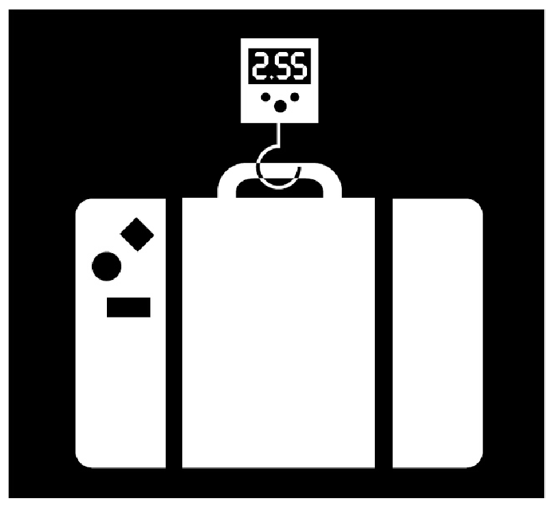
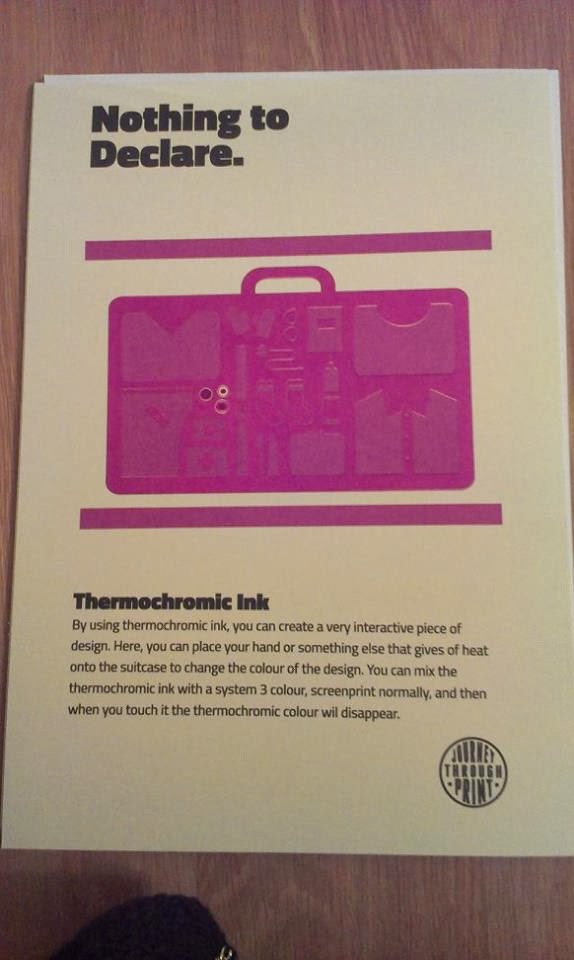
For the Nothing To Declare poster, I wanted to use thermochromic ink. I wanted the suitcase to be a block colour, then when you put your hand over it, it would reveal the contents.

Making the inks was tricky. I had to make the reactant ink by mixing Red and Cyan to create a purple, but this didn't work as it created a murky brown. So I then mixed Magenta and Cyan to make a purple which looked a lot better.
Then I had to recreate a System 3 colour to look exactly the same as the reactant ink colour. I did this after a lot of testing.

I then printed both of the illustrations in the System 3 colour to see what it would look like with this on the bottom on both versions.


I then added the reactant ink on top, and this didn't work at all as the transparency of the inks made it overlap and be very visible.


However it still worked when you put your hand over it, and I love the pink colour it produces.


I then tried the heat reactant as the base, and added the top layer in a spot varnish because it is very transparent and hopefully this would not be as visible. However it was quite visible when I printed it.


I tried putting my hand over it, but the varnish hadn't worked as a protective cover and the heat went straight through it so everything turned pink.


I'm going to try a third attempt now, and this involves making another screen. Instead of creating a mask, I'm going to create an inverted version of the suitcase so that it will slot together as one image. As I have made both of the colours the same I don't have to worry about mixing them, just creating the new screen.

I then figured out a new way I could do it - rather than making a mask, just make the negative of the baggage so that I can just line it up extremely carefully and mimic the same colour.

Here are both my pots of colour when I've tried to mix them to the same colour:


I lined it up on the true grain and printed so that I had my registration, and tried the system 3 ink first.


When I printed the poster, it was clear that the two colours weren't the same still. So, I decided to give up on trying to make this work, and instead change the wording on the poster slightly. I changed it so that it just said the colour changes, rather than reveals the luggage, this way the poster didn't have to act as a mask. I was much happier doing this because it was a lot easier and still meant the message got across. Here are the final poster:


This is a lot deeper because I ran the ink over twice.


Lasercutter

I need to lasercut some more things for the illustrations, which include the embossing and mono print illustrations.

This is the embossing plate, and I'm going to cut it onto MDF 3mm, as this is stronger than mountboard, and when embossing, the plate needs to be stronger than the stock. On the design I needed to make the shapes surrounding more designs not complete, otherwise it would cut straight through the design would be in pieces, when I need it to be one piece.


This is what it looks like when I set the option 'Cut Through' on Ethos.


This is the monoprint stencil, which I'm going to print onto card 220gsm, as it will be light enough to peel off the plastic plate when monoprinting, but strong enough not to break.


This is what the monoprint stencil looks like on Ethos when ready to cut:


Embossing

As I was lasercutting the stencil for the embossing poster, Get Stamped, here is the outcome of that. When I first tried to lasercut it, it didn't go very well. It was taking very long so I had to stop the cut as my session was over. It was just as well it didn't complete because I hadn't made the gaps big enough and when I took it out the lasercutter, the design fell apart. I learnt that I needed to make the gaps bigger next time.


I then redid it, and made the gaps bigger so that it wouldn't fall apart. This worked a lot better.


I tested out the stencil on some mountboard, and it worked well at 4000psi. Although I would like it to be more prominent, the stock isn't very elastic so isn't as obvious as it would be on paper.


I then embossed onto the poster and this is how it turned out. I am happy with it, and I know that with this stock I couldn't get a deeper imprint, but next time I will definitely choose a different stock so that it is a lot deeper.


Monoprinting
I also lasercut the monoprint stencil for the poster, From Paint to Press in 10 Minutes, and this is what it looks like. I think this will be an easy poster to create as creating a colour blend is a quick process, especially as I am just using one layer.


I used green and blue ink and rolled them together to create a gradient.


I then rolled the ink onto a plastic plate, put the stencil on top and placed it on the press.
I then I put the poster on top in line with the stencil.


I put packing on top of this, and rolled it through the press.


I tested it onto paper first, and was happy with the gradient, so went ahead with the final poster.


I did two versions, one with more pressure applied than the other. I am happy with these two prints, although I would have preferred the colours to have been lighter. The reason I didn't do them lighter was because 1. there was no lighter choice and 2. I didn't want to mix them because it would have been quite hard given the texture of the paint and I didn't want to waste it as I was putting excess paint back in the tin.