This actually made my publication a lot better than it was, and I'm glad this crit was done at a point I could go back and make changes, as it has improved it for the better.
Feedback included:
- Make weight of lines thinner
- Make text smaller
- Use a sans serif for the bodycopy
- High resolution images
- Number placement on pictures could be more consistent
Alterations Development:
I started on the contents page as it is the first dps, and by getting this right with all the point sizes and gutters I could do the next pages more easily.
I also made the weight on the lines to 0.5pt.
I also made the bottom margin 25mm, not 20mm.
Here I tried a sans serif next to Rockwell, and I have to admit, the feedback was right and it does look better. I used Museo 500, and I have used Museo 900 for the headings.
I added a sub-heading, as since designing the original I have started noticing these a lot more in magazines and brochures, so it makes it more realistic and gives the viewer more of an idea of the content.
I had a 10mm space between the image and the sub-heading, and then a 7mm space between the sub-heading and bodycopy.
I also went into Photoshop, and made the image the right size, as previously I had stretched it in InDesign and it looked blurry.
Amenities
I then started on this page, and I desperately needed to sort out the top area of the text. I hate how there is a gap on one side. I added a subheading on this as well, so the viewer knows more about the introduction.
I then made the secondary subheadings capital letters to match the subheadings.
Then I made the title on one line, and this looks a lot more balanced now.
I added more content to the introduction because I had lost of lot of space when reducing pt size and lengthening the title.
I then made the bodycopy 8.5pt as this is more descriptive, short bursts of information that is under the introduction.
I also added more content on these, so there was a 10mm gap til the photos.
One word of advice was to add the ship titles on the pictures, so I did that. I also made it 8.5pt, as it printed really big and doesn't need to be, it's only supposed to be a caption.
I also tried the captions started at the beginning of the margin, but this looked weird.
Here is the dps, and I think it looks a lot better and more polished.
I also made the pagenation smaller to 11pt.
I then realised I hadn't changed the bottom margin, so I went back and altered this.
Fly Cruise
Then I went onto the next page, and had quite a lot of space to fill. I added a subheading and moved the plane illustration to above the title rather than next to the itinerary.
I then started fiddling about with the itinerary.
Embark from Southampton
I then started working on the next page.
To make it the height as photo, I added another day to the itinerary.
Here is the final dps.
I also changed the pagenation.
Mediterranean
Then I started working on the next dps which is around the mediterranean. I altered the photos so made them smaller and added the excursion title.
I then added a subheading.
Then I remembered I didn't change the margin bottom on the last dps, so went back and altered that.
Here is is finished.
I then darkened a lot of the photos because you couldn't see the white text behind it, and this makes it more legible.
Back of Book
I altered all the point sizes and fonts on the back of the book, and added more information.
Here is the back of the book, and I am happy with it because it is appropriate.
Med
Back to the med dps, I had to add more content as when I reduced the pt size there was a lot of gaps. I made sure to follow the same gutter sizes.
Here is the final dps.
Caribbean
Then I went onto the caribbean dps, and started doing the same format here, adding more content, darkening imags and adding captions, changing pt sizes and fonts and pagenation.
I added a subheading here, and altered all the spacing on the highlights section.
This is the final dps.
Front
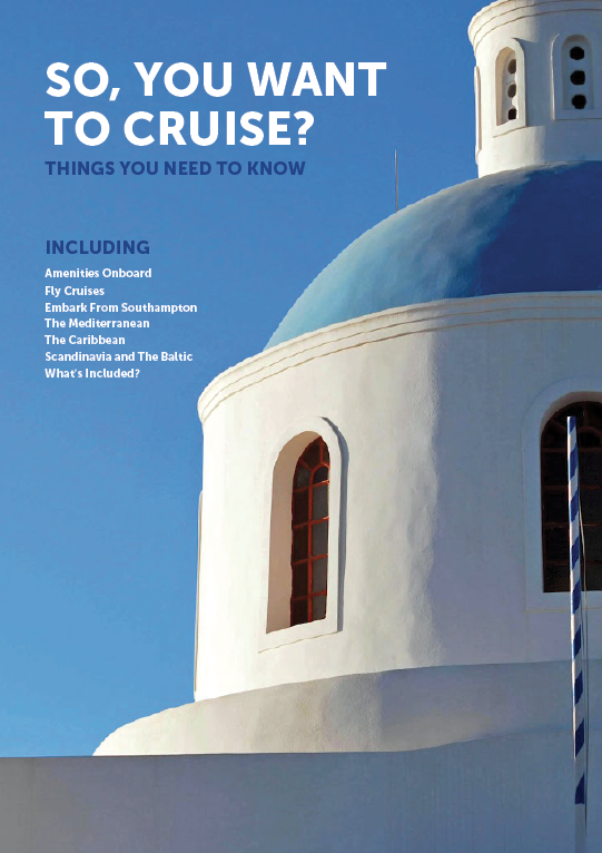
Then I started working on the front, and I needed to find a high res image to use. This actually proved so difficult to get one big enough, and I really wanted a scene of Santorini. This is because it is really picteresque, on the coast and has blue and white buildings. This means the colour scheme will match the back of the book, and with it by the sea it relates to cruises as well as one of the destinations talked about in the book.
I moved the placement of the introduction.
I changed the image which is nice, but again not very sharp.
I changed it again and this time it is better resolution.
I decided to get rid of the including bit, because it's on the next page anyway in the contents and it didn't look right.
Scandinavia
I started doing the same for this dps as I had done for the med and caribbean.
I added more content which looked more full.
Here are the dps's for the destination pages.
Here shows that I changed the bottom margin to 25mm.
For the last page I just made all the text smaller, and felt like it looked fine as it was.
Here is the final booklet ready for print:


No comments:
Post a Comment