I saw this font in one of the cruise brochures I found, and I really like it. I have seen it used before, but never knew what it was, so I took this screenshot and went on What The Font. It gave me a few results, but Museo was the top one, and I know I've seen it before.

I wanted to use it, but you have to buy some of the styles, so I downloaded the 500 weight version for free, and bought the 900 weight. I also downloaded the slab version of the font in 300, 500 and 700.

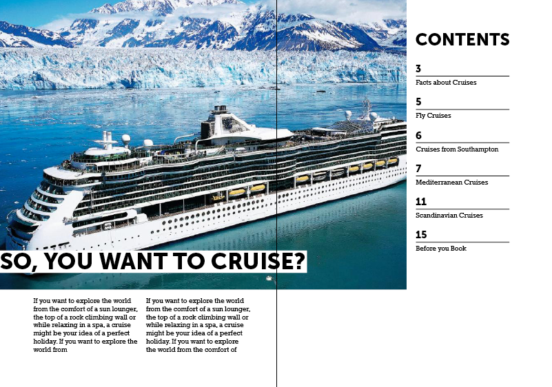
I started doing the contents page, and I thought I would try a few layouts I drew. Here is Museo in 900 for a heading.
Contents 1

I started adding the contents table to the first page. I knew I would have to change the amount of columns because it doesn't all fit in symmetrically.

This is what it looks like zoomed out. The document set up here is just short of an A4 piece, as brochures are usually this size.

Here is the grid.

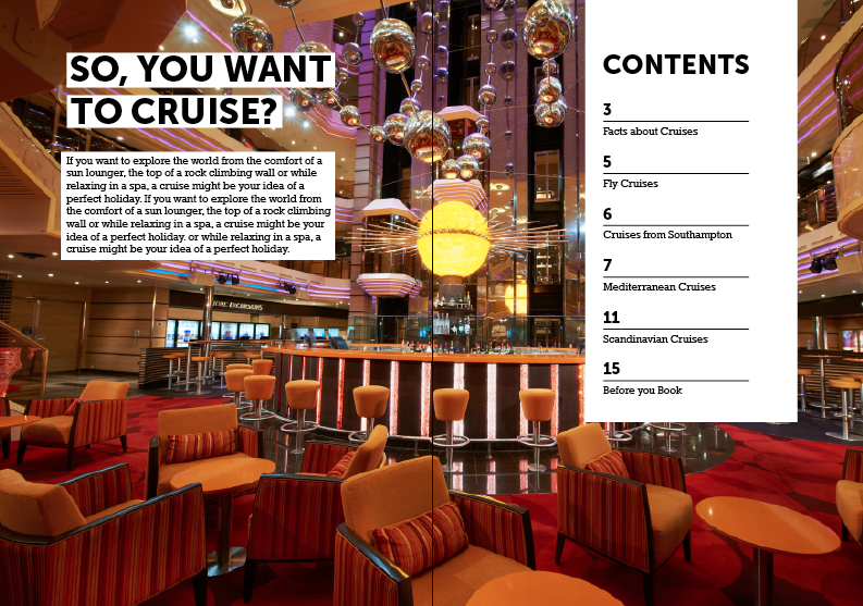
I also tried the contents as two columns, but then this doesn't use as much space.

I altered the grid, and made the photo cover more of the page.

I then added two columns for the introduction on the right hand side, which I think works well.

I then altered the grid on the left hand side so that there is three columns. This fits a lot better.

I then swapped the content around to see if this worked better as a hierarchy.

I tried making both sides start at the same height, as previously the two column text started the same height as the line on the contents.

It still seemed too close to the top. I changed the point size down of the numericals to see if I could get it fitting better, as some of the content was going out of the grid. I changed the gutter sizing a bit around the contents.

I made the height of two paragraphs the same as the contents again.

I have made them equal, but start lower so that it is more appealing and easier to read. I'm going to try another contents layout now to see if that is any better.

Contents 2
I started a different layout for contents now.
I used white backgrounds for the text so you can see it easily against the photograph.

I moved it lower so that it is level with the bottom of the contents and I think it is easier to read than when it is all level at the top. It makes the space look more equal.

I changed the layout of the contents a bit as well to see if that looked better.

Contents 3
I tried another layout that I had drawn out. I like this one because

I spread out the contents so it fills more space and looks easier to read.

I moved the 'So, You Want To Cruise?' heading down so it started after the contents. I also made the Contents header smaller so it fits within the rest of the contents.

Contents 4
I tried another layout, similar to the last one but I moved the Contents section to the right hand side of the page. I think when you open the book you will see this first.

I got rid of one of the paragraphs as it might be too much to read.
I moved the picture so the boat wasn't under the heading, as it was too white.

Contents 5
I then tried another layout where this is a full background image.

I added a white column on the grid where the contents will go.

This is without the grid. I also moved it nearer to the margin.

I added the contents, but there is too much white space underneath it now.

So I shortened it. You can see more of the picture now too.

I added some more content which adds more interest.

I changed the background image to see what this is like.

I moved it down to see what this looks like, to see if it makes the hierarchy more levelled out. I think I prefer the other picture and when the introduction was higher up.


I made the lines on the contents longer as well so it looks more in proportion.

I then made the contents header bigger to match the width of the lines.

Final Contents Designs
These are the final six designs for the contents, and I'm going to bring these to the crit and see what everybody thinks and what their favourite is and if they can make any suggestions.


Fly To
I then started to design the page which will have information about fly cruises on. This is when you fly to the departure port rather than go from the UK.
I drew a plane pictogram to show the departure port.

I wanted this to overlap a picture, so for now I put in a blank square to show where that would go.

I wrote the list of a sample itinerary, but at the moment it is hard to tell what it is.

I added itinerary to title it, and some Lorem Ipsom for the bodycopy. I also added the plane to show when you depart back.

I added more space between the lines as I feel it is easier to look at.

I really like the layout of this page, but it definitely needs tweaking.

I added 'Sample' before the title so it makes more sense.

Here is with the grid:

I then tried taking away the last plane as it wasn't fitting in with the layout, and going past the margin. I also don't think it is necessary really, as I have now added more information to it, so it makes more sense to the viewer. I've added the Days so you can see how long the holiday is and when you would be in each country. This makes it more legit. I did it in Rockwell Bold.

I then tried Museo Sans 900 to see if this worked better. This is what I use for the headings.

I found a photo that fits the theme, and works well with the icon. I also added the bodycopy that I thought of.

I made the bodycopy justified with the last line left aligned. I think this looks smarter.

I know that this is a definite layout I want to include, so I made sure everything is on point to the pixel and that there are no spelling mistakes. In the previous screenshot there was two Day 5's, so I've rectified that now.

Embark From Southampton
I then started on the next page. I put in a photo square, heading and bodycopy but it didn't seem to look right only having one column left for the itinerary.

I changed things round a bit, and had the heading at the top, and two columns for the text. I wanted it to be different from the left page so that it isn't symmetrical, but also so it works as part of a dps. I also tried a few different photographs, this is one of the side of a ship and the sea but I think it is too dark.

I then chose one of the sea, but I think it is too vague.

I then found one of the sea which had a frame of the cruise side which worked a lot better.

I started to create a boat pictogram to match the plane. I feel like these don't match the plane at the moment, they feel too detailed.

I then took out the windows which started to look better.

I then altered the proportions of it and now I think it works a lot better with the plane.

The next thing I had trouble with is fitting the itinerary in with the margins. This went too low.

I wanted a cruise that would be 3 days, but I didn't know what a realistic one would be, so I looked on Royal Caribbean.

This worked a lot better, but I had taken out the title to compensate to see if that worked. I thought that if people had seen it on the first page, they would know what this one was, but I wanted to put it back in.

I put it back in, and put the boat next to it, but it was still out of the margins.

I made the photo narrower so that everything would fit in.

Here is the final dps!

Ooops, I forgot pagenation. I added this outside both of the margins on the bottom.

Facts
I then started on the Facts page. This will have content such as largest ship, most popular destinations, amenities etc.
Mediterranean Cruises
I have started doing the Mediterranean section of the book. I wanted to focus on two different types of cruises regarding destination and excursions. I think people are most interested in this when they want to book a cruise as it is what they will be doing everyday.
I started by putting in some bodycopy I thought of and the title.

I then added a picture of one of the destinations to make it more interesting.

Then I changed the picture to one of Villefranche as I feel it was more subdued and looks more sophisticated rather than bright. I also changed the title from Round to Around as I think this sounds better. I also made the photo reach the edges as I thought, why have all that margin space being unused, when people can see more of the picture.
I also made a little destination icon which I can use throughout this section, like the plane and the boat. I think I want to add little icons through this and the next task to help people identify with things.

Here is the smaller image with margins, and the one without for comparison.

I then thought to finish this page of I should add highlights of the places you can go to, so I need an interesting way of laying them out. This is very boring and generic at the moment. I called it highlights because I wouldn't be able to fit all of the destinations on, so this justifies it.

I then thought about having the title in the picture, because this way I have more space for the destination highlights and could do something more interesting with it. However, the picture isn't great with white on top of it. I'll have to pick a different one, but I do really like this one.

I enlarged the image a lot so that the buildings are out of the way, but you can still see them. I think the title works well like this, however, it is higher than the margin.

This positioning is where the margin is, but it looks too low! So I don't know whether to ignore the grid or stick with it. I can ask this in the crit.

I then started looking at how I'm going to put in the bodycopy for the destinations and excursions. I wanted a brief introduction to each country - I don't have a lot of space so I need to make it short and sweet.

I wanted a picture of Park Guell so I tried a few that I liked, and thought this one was best - a close up of Gaudi's work.

I added a heading and description for it, and this is showing one of the excursions you can do. Thinking about it, I need to advertise the fact that these are excursions.

I then thought about having the destination highlights on the first page again, and having all the excursions on the remaining three pages, as I have realised there isn't a lot of space.
I think this is a better way of laying it out rather than just a list. I need more space still though.

I have shortened the image so now I have more space at the bottom.

I tried seeing what it would look like with the icon to break it up a bit, but I don't like that.

Amenities
Facts/Amenities
After the progress crit, I found out that people would want to know about the amenities onboard cruise ships, so I decided to scrap the 'Facts' page, and go with Amenities Onboard instead.
Format Change
I also decided from this crit to make the book bigger - this way I can include more information, as for this page and the excursions pages, it would be too hard to fit on a lot of information - everything would be cramped.
I tried a three column grid, using two columns for the pictures, and one for the writing. I would number the pictures. I just created the bodycopy as I went, using information I already know about ships, and thinking about what I noticed when I was researching - most of the amenities are from Royal Caribbean ships as they are the most exciting and advanced.

I tried swapping it around, which I think looks better because it breaks up the columns.

I also tried taking out the underline, as I haven't used it anywhere else in the book, but I think it needs them for separation.

I put them back in. I still wasn't happy with this layout, it seems to standard and boring as it's just two columns essentially.

I tried mixing it up a bit, making different sized pictures, but they don't (aren't) in line.

I then tried this organisation of squares, and I think it works a lot better. There is a 5mm gutter on this, and on the rest of the page I'm using a 10mm gutter. I now have space underneath for 6 different amenities which I think is a good number, and works well with the layout.

I wanted the dps to work well together, and I think this does as far as the pictures are concerned, but the text on the top left looks awful.

I tried making the heading one line, and more bodycopy, but now it looks too full. I also made the bottom picture bigger as it was too squashed on the previous one.

I kept the two columns, but shortened the title, which gives it more space to breathe now. Also, this matches titles on other pages.

I then started adding the pictures, to see what that looked like. I'm happy with this page now.

I then added numbers on the pictures so that you can see what text links where. I was going to have what ship it was on too, but it wasn't very legible.
Fly/Southampton
As I've made the pages bigger, I need to adjust this dps to fit it. I need to add more content to it, but here is it adjusted.

I then decided to make the photos fill the frame, to match the other pages photos.

Around The Mediterranean
I also needed to adjust this page, as well as


Based on the size of the blue squares, I made sure all of the pictures were the correct size to go into the document on Photoshop.

Here is the final dps with numbered photos.

Through Scandinavia and the Baltic
I wanted a very similar layout as it has the same content as the previous dps, but I wanted it to be a little bit different still.
So I started experimenting with the title, photograph and bodycopy.
I quite like this layout as it is a bit different.

I tried swapping it around so as a dps it went text, picture, text, but this didn't work out because of the margins.

I tried the text left aligned.

Caribbean
For the caribbean page I did something similar, but thought it was too similar as the previous page.

I put the photograph as the whole top half of the left page, and I knew the text wouldn't be too obstructed as I could find a really light picture of the sand/sea. However, I think it is too different from the previous two dps's.

Then I moved the picture box here with the heading and bodycopy at the bottom, but felt this didn't hit you in the face as much.

Then I swapped it around and I preferred that.

Then I wrote all the content for it.

And found all the pictures for it. I also resized them all in Photoshop.

I added the content for the Scandinavia page.

Then I started to do the front cover, and chose a nice picture in Santorini for it. This is so it is inviting, and makes you want to go on one. I didn't choose one of a cruise ship, as there is one in the contents page.
I wanted to keep the text simple like is on most cruise brochures, and just added a subheading in a different colour that matches the photo.

I also included what is in the book, and changing the subheading of that to navy too.

For the last dps, I wanted it to be 'what's included?' as I think a lot of people aren't sure what the cost of the cruise entails.
I liked this layout, but it isn't practical as it would crop too much of the image off.


This was the best layout, because it is a good size for the images as well as allowing a lot of text to be written next to it.

Here is the final dps.

For the back page, I wanted to have a little bit of information on it, so I decided to include some information on cruise liners so that people could take it further if they wanted to. I just kept it simple, and I'm happy with it. It matches the rest of the publication.

Picture Sources
No comments:
Post a Comment