Lorraine showed us the old Nasa logo first of all, and asked us to think about the meaning behind it.
Here are some points about it:
- It comes in black and red. The red could represent danger, and how exploration is dangerous. Also, the red can be patriotic of America as astronauts wear white and blue was used in a lot of other areas.
- The shape of the logo is very rounded and curved which can represent the tubing that astronauts have.
- The AS are joined together, and that can represent how the astronauts are connected to the shuttle and stand for Astronaut and Shuttle, as well as Space or Spirit.
- The type is also quite sci fi and futuristic, which links in with what the company does.
- NASA rebranded in 1992 as the logo was associated with death and the Challenger shuttle which exploded during a mission in 1986.
We then worked in groups and showed each other some examples of branding and logo that we had bought in.
Here were my branding examples:
I thought this branding of a bakery shop produced a warm and inviting feel. This is because of the colours used - a brown and warm red are associated with warmth, earth and a homely environment. As the stock of the packaging and leaflets are brown this is also associated with being rustic and hand produced which reflects on the bread. I think the type used on the leaflets and packaging is very friendly as its quite curvy and easy to read. The brand is Eastern European, and the name Karaway is Slavic for greeting people with warm bread, hence the name. The logo is a red 'K' which is shortened for Karaway and the style is inspired by Lithuanian art which fits in with the Eastern European identity.


Hampton Rustic Landscapes are a New York based company specialising in removing mature trees. The designers wanted it to be a vintage logo and not look too modern as the business moves around very old trees, and they wanted the logo to reflect that. I think the logo is very grand, and the frame around the tree makes it look quite prestigious to me. The use of colour is associated with the Earth and tree trunks so that is appropriate. To me the old tree makes it look like an established company because it looks old, and very trusting.

Food & is an online journal of food, which includes recipes and stories of fellow cooks. The logo connects the two o's and to me this shows unity and togetherness, as people network and talk about food. The use of the serif also shows it's quite a prestigious brand, and luxurious.


This is branding for a hotel, and the use of purple for the primary colour makes it a luxurious and high end brand. It particularly stands out against the grey background it is against. To me the use of the square is like how a house is known to have four walls - and the slogan is 'a home away from home'. As the name is Dolphin House, the use of negative space in the logo to have a dolphin fin is also clever because although it is just a shape, you can instantly tell it is a dolphin's fin.


This is branding for a photographer, and the logo is her name and initials within a circle. I think this is an appropriate shape and size for a photographer because it can be used as a watermark without taking up a lot of the image, and can be scaled to fit a lot of areas. Her initials are in the middle as a monogram which is modern and reflective of her photography work. The branding seems to be quite bespoke as the logo is embossed onto the business cards.


After we presented this information to each other we then had a discussion about interesting logos.
The Twitter and Apple logos are interesting as they are made of circles, and are mathematically and geometrically correct. This allows them to have a longer shelf life and scale to fit more things such as screen.
Pepsi
We now have to pick a logo that someone in the group brought in to research more in depth and find out the origins of it.
I've decided to look at Pepsi. I don't really like the logo and I know that it has changed a lot throughout the years unlike its rival Coca Cola, so I want to know why it keeps changing.
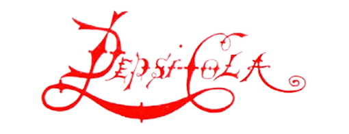
It was created in 1893.
This was the first logo that looks a lot like Coca Cola's logo except very thin and wispy, I think the design very poor. Script fonts were in fashion at the time it was made, and Coca Cola had already been established, two things it could be inspired by.
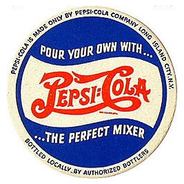
In 1906 this logo was produced, which is a vast improvement from the first one. The text is a lot thicker, but still looks a lot like Coca Cola. The iconic blue bubble is now introduced. This logo lasted until the 1940s, where it went back to just the red text.
In 1962 it again had a radical change - the text becomes a sans serif like we are used to today, and the blue bubble becomes a bottle top. It was part of the Pepsi Generations campaign.
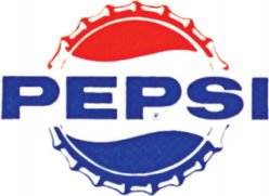
In the 70s they uncomplicated the bottle top back to a circle, and kept the text within the circle.
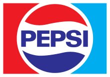
In 1991 they made the text italic to be like the original script text, but keeping the sans serif.
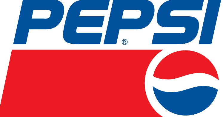
This is the current logo, which I personally don't think is a great improvement from all the previous attempts of improving it. I don't think the text sits well next to the icon, and it certainly isn't as successful as Coca Cola after 10 redesigns. It now has the same colour scheme from the 1940s which is very American, and combines the minimalist and cursive approach from the first and recent logos. Personally my favourite out of the variations is the 1906 logo, as it incorporates the text within the logo, has a vintage look, is patriotic of America and I prefer the thick, scripted type.
No comments:
Post a Comment