First we were put into groups, mine consisted of:
- Melissa
- Lizzy
- Roxie
- Joe
- Jordan
Then we had to pick three pieces of paper out of Jar 1, which we got
- Match
- Cloud
- Staple
We then had to pick another piece of paper out of Jar 2, which was
- Hotel
As a group we then had to create spider diagrams for each of the three words:


We then picked a word we wanted to focus on for our hotel branding. We decided Cloud was the best option because we could create a lot of concepts out of it.
Once we did that we made a spider diagram of different hotel audiences that Leeds would attract:
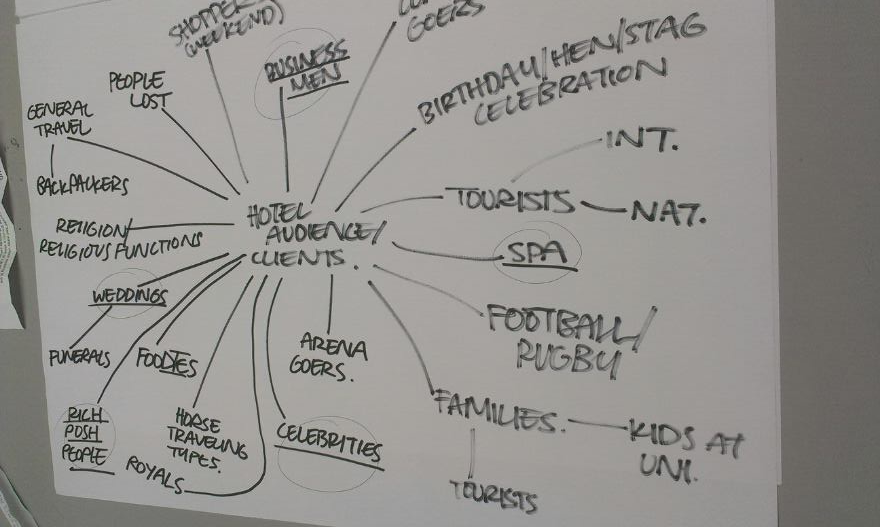
Our concept was taken from the saying 'Every cloud has a silver lining', and the idea that the hotel would be the silver lining of Leeds. After discussing our concept we thought about what target audience we would aim it at and circled the audiences on the spider diagram which are:
- Business Professionals
- Celebrities
- Rich/Posh people
- Mature
- Weddings
- People on a spa break
We then discussed the different areas of our concept and what the hotel would have for our audience:

We also got the Pantone swatches out and picked the colours that we wanted for the branding, which included:


- Metallic Grey - Pantone 877 M
- Blue - DE 213-9 C
- White
We then began to each start designing logos.
We discussed what we thought worked best, and I had created an icon that everyone liked, and Roxie had created a logo that everyone liked so we combined the two together, and Roxie created a quick version of the logo:

Roxie came up with the main logo, and the silver lining around the edges, whereas I came up with the capital S. On an angle it looks like a H, therefore representing Stratus Hotel. We thought it could be used as an icon on its own across the branding.
We did the presentation together, and I spoke for the Branding slide and said:
We wanted the branding to mirror the hotels quality and be quite modernist and sophisticated. We also wanted silver edges on the stationary to tie in with the silver lining theme.
I also spoke with Roxie on the Logo slide and I said:
The shape of the S looks like a H when you look at it from an angle so it stands for Stratus Hotel. We would use it as an icon on its own across the branding on things like towels and stationary.
No comments:
Post a Comment