This is the actual logo for the hotel and igloo village, and I wanted to redesign it so that it would fit in more with the contemporary design ideas I have, and also because I am focusing on the Igloo Village side of the resort. It needs to reflect the Igloo Village side, and not the hotel.

I wanted to keep it similar to the original logo, and just update it so that people could still recognise it, but it would suit the target audience and unique experience more. The original logo has the right idea that it has a lot of igloos to signify Igloo Village, but doesn't look good visually.
I went into Illustrator and created a few different shaped curves, which would act as the igloo shape. I used the Width Tool to make it thicker in the middle, so that it wouldn't look as plain and basic as before.

I then added some more curves throughout the shape to recreate the igloo pattern you get, and what is visible on the igloo hotel. I also added some text, and I chose the font Oil Can, from Lost Type, as it has different widths on it like the illustration. Although readable, it's a bit different due to the different widths and so matches the uniqueness of the igloos. I didn't want a serif as this would be too traditional, and it is contemporary, but I didn't want a script font as it could look a bit tacky and old fashioned. I wanted a sans serif, but not one that could be used in bodycopy, as that would be quite boring, and match the rest of the type used on the site. This is not a sans serif that I would use for bodycopy, which is why I think it is a good choice for a logo.

I downloaded some web grids so that I could design my website onto it. I used a 16 column grid for this:

I went onto Fireworks, and started creating Scamp #4, with the three main columns. I have chosen a black and white colour scheme as this goes well with the colourful images I'm going to use - it won't clash with them or blend in no matter what colours are used. I also changed the opacity lower so that you can see the background image behind, which I think is very subtle but very easy to achieve.
For the font, I looked on Google Web Fonts, and came across Roboto. It is a sans serif which comes in a variety of weights and style, and is therefore versatile.

I then added the logo and a language choice drop down menu, and I now think the top bar looks incredibly busy. I wanted the language drop down because it will be an international website targeting people across the world, so it needs to be accessible to them all.
As the background image would be a slider, I added some enlarged arrows. They are enlarged so that they stand out, and match the proportions of the image. They are white, at 30% opacity, and when you hover over them they will become 100%. This is so that they don't obstruct the image when not needed, but when the user wants to use them they will become more apparent.

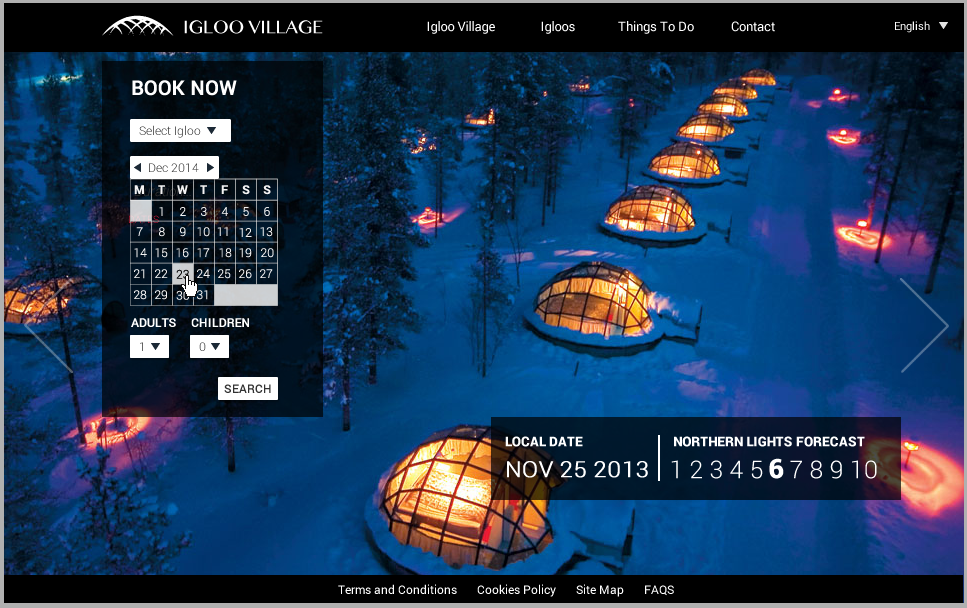
I moved the logo to the left, and the language option to the far right. I took the Northern Lights Forecast from the top bar and into the content. I wanted the forecast because most people who visit here want to see the Northern Lights, and I thought they would be interested in seeing the forecast - and would also make them more excited about going to see them. It adds something different to the site which is specific. Although I like having one big number, the viewer might not understand the scale that it is on (/10).

I then started looking at the booking feature, which is needed on the home page as this is what people would be looking for mostly. I gave people the option to choose the igloo that they want (Snow or Ice) and then choose the dates in a more visual way than a drop down menu. This way, instead of having two more menus (check in/check out), they can physically choose the dates by clicking on one and then another.

I moved it to the right to see what it would look like, but I don't think it reads as well to the viewer.

I also changed the forecast to look like this, so it is a bit more contained within a box, and the user can see the scale of how the forecast is measured. By highlighting the number so that is bigger and bolder, I think this is obvious to the user what the forecast is that day. I wouldn't actually code this to update daily, as that would be too difficult, but if it was a live website, that would be the function of this.

I created the booking feature the same width as the logo, and placed it underneath. I also placed the forecast in line with the right arrow and the booking feature. I had also moved the language option more towards nav bar, so that there is equal margins on either side.

However, I think that this looked too much like it was part of the nav bar, so I changed it back to the right and also added a white box around it so that it would stand out more and look like it was part of something different.

I changed the 'Things To Do' link so that it fit on one line, and then made the navigation bar smaller. I also added a local date onto the home page as people looking in different countries might have different time ranges and would let them know what day the forecast is applying to.

I didn't like the white box around the language option, so I got rid of that as I felt it stood out too much.
I made a mock up of what everything would look like if you hovered over objects.

I then tried a slightly different idea of moving the navigation bar to the right, and slightly down the page to break the screen up a bit. I actually really like this new layout and like how you can still see the image above the nav bar. I also made the links on the nav bar come out a bit so that if you clicked on the language drop down menu, it wouldn't obstruct the nav bar options.

However, I feel like it came out too much, so I moved it towards the edge more and made it smaller, as there was no real need for the language drop down to not obstruct the nav bar.

I then added the forecast to the home page, but felt it look too big now.

I got rid of the local date, because I thought, no matter the country the date isn't going to change in many, if any.

I had also tried it without a box, but I don't think it goes with the rest of the site, as a lot of it is boxed.

I then tried it without the date which I think functions better.

I then tried it with a different background image, to see what it would look like if it was a slider.

I then went back to the first home page I tried, and added a local time to the forecast section which I think works a lot better as it will be different in every country and more interesting. I went back to this layout as I feel that the nav bar wouldn't be a good idea on the other mock up when you go to other pages because it would have to move, or obstruct content.
Crit
At this stage I had my first crit on it, and the feedback I got was very positive, especially in regards to the Northern Lights forecast. One suggestion made was that the booking feature looks a bit blocky, so I said I could lower the opacity which people thought would be a good solution. I said my main concern was that I would have too many sub pages, and for the Things to Do section, people said just have a brief summary of each activity you can do all on one page.

I changed some of the links so that you can see what it would look like when you hover over certain areas. On everything I would hover over, I would change the cursor to a pointer.
The navigation bar would underline when you hover/click on it.

The language drop down menu would come down with all the options. The languages I have chosen are the ones that are on the current website.

When you hover over the slider arrow, it will go to full opacity.

The links on the footer would underline when hovered over.
This is what it would look like when you hover over adults.

I tried two different variations of when you select an igloo - I think it looks better without the line as it looks more clean.


For the search button, I thought it would be cool to change the opacity to 80% when you hover over it because I've changed the opacity when you hover over the slider arrows, and it is quite subtle but lets the user know it has been noticed.


For the calendar, I would want it to work like this:
You click on the date you want to depart, then when you move the cursor around it would highlight the other dates in a lighter opacity until you click on another date when it would save the dates you've chosen and show you what you've chosen.
When you click on the arrows of the month they would change too - obviously forward would go further in time and the backwards arrow would go back in months.
You would also be able to switch between the months so that wouldn't be a problem.

I then tried a layout for the resort page and which would have four boxes with photographs in them, and when you hovered over them more information would come up, in the example below.

I then changed the booking feature on the first home page to make it smaller and less in the way, as someone in the crit said it's quite bulky.

I moved the northern lights forecast to the left to make the layout more in proportion and balanced.

I changed the language drop down menu to be on the nav bar rather than below it so it looks cleaner.

This is another home page layout I then tried, having a side navigation bar instead of a top one - this way, the booking feature doesn't get in the way and looks clean. It also means that it will always be there no matter what page you are on. It also means the picture doesn't get as obscured. I prefer this layout to the previous ones that I've tried.

I then tried a resort page layout with four different blocks on which would have photos in, and then when you hover over them more text would appear. There is an introduction to the page at the top.

I then tried aligning it to the left.

I then tried aligning it to the right which I liked more because it looks cleaner on the right hand side.

I then tried layouts for the igloo page, and I tried to make something that would work without scrolling at first so you see it as soon as you go onto the page.

I would be able to do the lightbox coding with this because when you click on the thumbnails the picture would go bigger.

I then tried a different approach with just one of the igloos on the page, and then you would have to scroll down on the page to see the next one.

I tried this instead to separate areas to make it easier for people to look at.

I then tried a different layout which includes a pull out drop down menu and the glass igloo page would have two containers - one for image, one for text. I felt this looked too busy though.

I started to see what it would look like if I reversed the colours and had white nav bars etc, but I stopped as I started to realise that it looked awful.

I then got rid of the introductory part as I found it was cluttering the page and wasn't even needed really. I tried this layout instead which looks better but still needs tweaking.

I then tried doing a full size image on the background, and having a carousel scroller on the side which will jump the pages so you can either click on the arrows or scroll to see the content. I also think that this would work for the Igloos page to keep it consistent, with a button so that you can book from.

The buttons are needed I think because the user can choose which pages to go on, and see what they are on because the ones that aren't being clicked will have an opacity of 30%.

I also thought about having two images on the screen, and just being able to scroll down to reveal more images which would be easy to do, but I don't know if it is visually engaging?

I started designing for the book now page, and wanted the user to be able to alter the dates easily and see the prices for each visually.

I added two heading boxes for each of the igloos so the user can see the prices for both, but I think it looks to blocky with all the other squares and it's not really necessary.

I got rid of all the outlines, and made the surrounding boxes smaller so that the middle one (the one the user chooses) stands out a lot more.

I added this heading so that the user can change the booking more obviously, even though it is already on the screen. I think this is needed because it is what the user expects, and actually specifies it is the 'search results'.

I then added a way for people to add excursions onto the package, based on what is available in the 'Things To Do' page.

This is the finished version, with a 'confirm booking' button after the excursions box. This would then lead onto the payment details page, which I'm not going to code because it is just a 5 page website we have to do.

I then started to design the contact page, and I wanted to keep it simple as it is quite informative and people want to be able to see the info quickly. I made two columns, one being an enquiry form like they have on their website, and the second having their details on it. I took the content from their website.

These are the final designs for my pages:
Home Page::

Things To Do:
Igloos:

Resort:

Contact:
Book Now:
No comments:
Post a Comment