I chose the layout for the poster first, because then I would know the size to do the designs. This was easy enough to do because I already know my headings, bodycopy and the font as I had designed the tickets at this point.
The box in the middle is where the design will be, so it needs to fit within this.

Don't Be A Rabbit in the headlights
I tried to make the illustration as close to the heading as possible so that it was obvious to the viewer what it is and that it was related. I decided to use this idea for the fluorescent ink technique because headlights are bright, as is the ink.

First Class
In my original sketch I thought I would have one ticket tucked into a seat, like you see on a train, but then when I was creating the illustration it didn't look as I thought it would. So then I created several different tickets and created a pattern with them to see what that looked like.
At first I had them all as outlines, but then I decided to make some of them filled with colour, so that when I do the foiling on them they will stand out a lot and show how it can look with different ranges of foiling.
I also enlarged it to the size of the pattern so that it would just fit within the box on the poster as then you can really tell the grid.

Pressed for Space
For this heading I wanted to do a suitcase with suitcase scales showing a high weight to show there isn't much space. At first I decided to do a scale like this, but after doing a few variations decided against it because it didn't fit with how the suitcase looked.

I then decided to add some digital scales, and chose to do use the figure 22.5 because 22kg is usually the size you can go up to with luggage allowance.

Want clean-cut?
As this poster is about getting a clean finish with a machine press, I thought about what is clean cut during a journey and thought about businessmen going to work and commuting on trains. This led to this illustration because there is a person in a suit, on a train table with a book and coffee - two things people usually bring on a journey. I decided not to include a face because the illustration was supposed to be about the suit being clean-cut and relating to a journey/print design.

From Paint to Press in 10 Minutes
I could only get ready the stencil on screen, and the colour and rest of the design will have to be printed onto it. I needed to make a stencil for the monoprint because it will leave areas white where I want them to be. It is in the shape of a train window, and I'm going to create a colour blend of green and blue to look like countryside while a train is moving fast.


Rush Hour
For this I wanted to create a lot of silhouettes of people that would overlap, to give the impression of people rushing when going on a journey. I went on a train journey not long ago and noticed the female/male toilet icons everywhere, and thought this would be a good idea to have as the silhouettes because then the illustration relates to journeys evenmore. This is just how it looks like on screen, but when I go to print I will need to print of the female and male silhouettes separately, as to do a colour overlap I need to use two different colours on top of each other.

This is what it will look like with just one of the printed layers

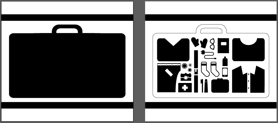
Thermochromatic Ink
This ink is very different from normal inks, because it reacts to heat and changes. So it can be used to reveal something by touching it with your hand, which is what I want to do.
The idea is that when you go through a security check at an airport, the contents of your suitcase gets checked, and this is what I want to recreate with thermochromatic ink - so the poster would be a suitcase, and when heat touched it, the contents is revealed.
I thought of different things you would pack in a suitcase, such as clothes, toiletries and gadgets and included these.

I tried different necklines/patterns for a top


This is what I would print - two positives for screenprinting. The first image would go on top, as this would cover the contents of the suitcase.
Flocking
This is for the poster 'Oh, you meant the other type of flock?'
I started by creating a sheep. I wanted it to be in the style of my other illustrations which is simple, 2D and primarily made of shapes. As I wanted it to be simple, I thought of things I could make it distinctive to a sheep, such as having a curved body to represent the wool and shaped ears.


I felt like the previous shapes didn't make it obvious that it was a sheep, so I decided to try a more bubbly sheep, still using basic shapes to keep in with the other illustrations. I asked my friend if he knew what it was, and he said that the ears looked like eyes.

So I moved the ears to be connected to the head, and he said that this made a difference and could tell what it is.

I then started making the tracks for the illustration, and I thought this didn't work at all, because the shape/size of the tracks didn't fit in with the perspective.

I then tried it from the side, and it still didn't work, but I think this is because the tracks didn't go past the edges.

I think it looks better this way when the tracks go of the edge, but I feel like going back to the perspective tracks will work better.

At first I added a horizon and sheep at the end, but then I thought about adding a train.

I then added a train, and created an outline around the sheep so that the black stood out from the tracks, but this didn't really work as it didn't fit in with the other illustrations.

I then made the tracks longer, and inverted the colours on the sheep so that you can see it on the tracks which I think looks better.

I then adde another sheep and changed their positioning. Nearly done, but I feel I need to change the sheep sizes.

I changed the size of the sheep further back so that it fit within the tracks more and you can see the shape a lot better.

Debossing
I wanted to create a departure board for this one, as you are going 'back' from a journey when you depart somewhere, and debossing is when an emboss is indented 'inwards' instead of point outwards. I chose a font which mimics digital, and made a plane icon to recreate the board, but changed the content to suit the print processes that I have used on this project.
However, I think that this might not be feasible, because the debossing might not make the writing legible, and because it is entirely text based it might not be readable at all.

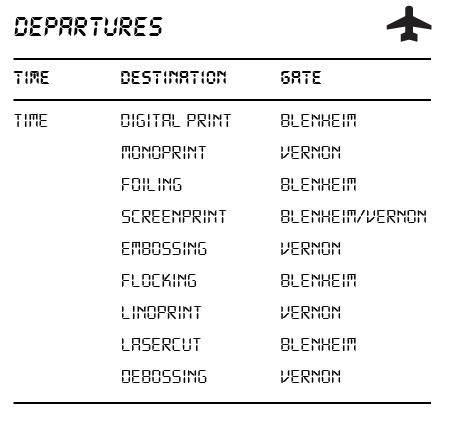
So I then thought of a different idea, and thought about doing a passport with lots of stamps on it. This would work because embossing/debossing works really well when used subtly such as on logos and business cards, and you would be able to read it easily with a chunky typeface.
I just created a simple open book, and created some different shapes that passport stamps come in, and kept it in context to print by adding the different processes I've used within this project.

No comments:
Post a Comment