I started by opening up Dreamweaver and creating a html and css stylesheet.
I want to use a font from google web fonts, called Roboto, in three different styles. I downloaded it and added the link to my html sheet, and am able to start using it in css. My font family is going to be Roboto, Arial, Helvetica, sans-serif.

Index
Background Image
I wanted to get the full size background image on first, and so I researched how to do this, and found this website.
I made the photo ready for web, and added this css:

This was the outcome, and now whenever I resize it, it's the same.


Navigation Bar
For the side nav bar, I needed to set the dimensions in the body first, so that I could make it full size. I have also started adding comments in the CSS labelling specific parts of the website, as this will help me keep things organised and be easy to find.

Here is the css for the nav bar:

Here is the html so far:

Here is the outcome with the nav bar on the left:

Logo
I started doing the logo, and I saved it appropriately for web in Photoshop. In CSS I made it centered by doing the margin-left and margin-right auto and made the margin-top 18px as that is where the logo starts on the Fireworks document.

This is what the html looks like. The img had to be within the nav id because I want it to be within the nav bar.

This is what the outcome:

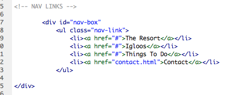
Navigation Links
I added the links now, and here is the html. I made a list, and at the moment I've put a # in the link, but when I add the pages I'll change this.

This is the CSS.


This is what it looks like at the minute, and I need to change the spacing.

Space Between Links
I've now changed the spacing so that it appears how it does on the Fireworks document.

To do this I needed to change the padding smaller, and set the margin top to start at the appropriate place.


This is how it looks in html now I've added the id.

I then remembered I had a white line between the sections on the side nav, so I added this nav-box which has a top and bottom border which will be the white line.

When you hover over the links and click on them, I want them to be underlined, so this is the CSS for that.

This is what it looks like with the lines on now.

This is what it looks like when you hover over one of the links.

Booking Feature
I now want to add the booking feature. I created a box for this so that I can contain everything within it.

The booknow class is for the header.

This is what it looks like in html. I made sure the booknow class is within the bookfeature id.

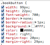
Booking Feature Buttons
Simon said in the crit I didn't have to make these and could add them as pictures but I thought I would give it a go on the 'Select Igloo' button as the drop down list is text based.
I added this form which created a drop down list, and I've tried so many ways of trying to add styles to it, such as adding a class around it (like here) and within areas of the form but it just didn't work.

Here is the CSS I tried to apply:

This is how the drop down list looked, although it work, it isn't how I want it to work.

But I managed to add the check in and check out pictures easily to mimic buttons, with these styles:

I then decided to add the select igloo picture in as well to make life easier, and this is how it looked in HTML:
This is how it looks now and I need to delete the form.

I then added the number buttons, and this hasn't gone as straightforward as the first ones:

Here is the CSS for the number button so far:

and the HTML:

In the Inspect Element aspect of Chrome I tried adding a margin-left which helped it a little bit:


I decided to move on from that for a bit while I think of a solution, and go onto the search button:

I added the form for a button in HTML:

This is what it looks like at the moment so got to work a bit on the styles:

After messing around a bit in the Inspect Element, I actually solved all of my problems. I realised that because I had padding and a width on the container for the booking feature, this meant when I adding float:right; onto the elements inside, it would go further than I wanted. So I changed the measurement from 158px to 106px for the width of the container.

I added the final styles to the button, changing margins on this and the buttons to fit with the new container width.

I also got rid of the top margins for the number buttons because I realised I had bottom margin for the 'adult' and 'children' which was creating double spacing.

Footer
To do the footer, I created the id styles in CSS. I know that it is 29px high due to the Fireworks mock up, and I want it to be 100% wide. By adding bottom: 0px; and position: absolute; it keeps it at the bottom of the page.

In HTML I just placed it after the nav id tag, as I didn't want it to be part of that.

At first when I checked it, it looked right - but then when I scrolled down there is a bit of space underneath the footer now which I don't want.

I've tried deleting the float: right, which made no difference, editing the height of the footer and the height of the body but none of these have worked.
Then I changed the footer to fixed and this worked!

Now I need to add the text onto the footer and make links. The footer-box is to contain the links in:

This means that when you hover or click on the links, they will stay underlined, and the display: inline on the 'li' makes it horizontal.

At first I had margin-left: auto and margin-right: auto, but I needed spacing between the words, so I got rid of margin-right: auto, and changed margin-left to 19px which worked.

This is what it looks like so far, but I want to make more central in terms of height.
I tried a few margin-tops on Inspect Element, then I figured out the right one was footer-link

Northern Lights Forecast
For this I created a new box for the container for the words that will go inside. Here is the CSS for it so far, it's about right I just need to sort out the positioning of it.

At the moment its in the top right corner.


I started altering the margins and found one that worked and fitted within the grid:


I then started to add the headings, I'm going to use the same class for them both cause they will use the same margins etc, but I need to add them separately in the HTML as I need to add the divider.

I've put it inside the container so that it will always be within it and the margins won't be massive.


To make a line divider between the two things in the box I needed to make a white line somehow. You can make a horizontal one using the <hr> tag but I needed to make it vertical. To do this I just created the height in CSS and then added border-left as this would make the line visible.

I fiddled around with the settings on Inspect Element to get all the spacing correct, which is done through these styles on the box and headings:

This is how it looks in HTM. The line had to be between the headings as this is how it is displayed.

This is what the outcome looks like, and I now need to add the other text.

I added the time in the HTML between the first heading and line.

At first it came out looking like this:

I then styled it to this, making sure the margin left is the same as the 'Local Time'

And it looked like this:

I then started to add the rest of the text, which had varying margins. At first I made the position absolute and checked it when resizing the window:

But it did this, which isn't what I want:

So I removed the position and now it works fine when being resized:

To make the bold '6' stand out, I changed the font-weight in CSS of the text, and adding a <b> tag in HTML:


Language Drop Down Menu
I needed to create the drop down menu for the language options. I was debating whether to make this a rollover image for easy, but thought I may as well give it a go doing a working drop down menu.
I'm following a tutorial how to make one, and at first I was messing the code up as I was altering it for my own needs.


I then realised what I was doing wrong and rectified it:

Without styles it looks like this at the moment:

And when you hover over it the links appear:
I started to then add some styles following the tutorial:

I added some styles specific to my own such as the background and size, but then added things that are on the tutorial. By checking my site each time I add something and understanding what each element does, I can make sure that I won't mess it up and not know what I've done.

This is what it looks like when normal, and when hovered over at the moment:


I then added some styles to text to make it like the rest of my website, but I couldn't figure out how to make the text only underlined when you hover over it.

I went into Inspect Element and changed some of the positioning elements to make it more clean, but this is something I need to work further on, or create a rollover button instead.

For the Resort page I started by trying a couple different things. I tried adding a container like this that would hold content but it seemed pointless because I may as well use the whole page.

I then added some content in a box like this instead, which I like, but I want to change the background image and make it have page jumps or parallax scrolling.

Here is the CSS for it so far. I haven't specified a height so that no matter what length the text is, it will always fit in. I made the padding 15px all around so that there is some space between the text and sides even though I've not specified the height.

This is what the text looks like inside which I am happy with:

I then attempted to do a 'page jump' tutorial which I aimed for the user to be able to click on a button for the page to jump down further which I have mocked up in Fireworks. I did this by following a tutorial on page jumps.
Here is what I put into HTML, the #top and #bot will make the browser look for these within the document which will be where the page jumps to.

I placed bot just before footer as I want it to jump to the bottom.

And top just after the body as I want it to be the first page.

Here are the styles for the dot:

The outcome didn't work for positioning, so I tried putting them within a container called jump but this didn't work either.


It also moved the nav bar down, so I gave up on this idea for now.

I then tried to follow a tutorial for parallax scrolling, and I had to download a few plugins and insert them in the head section of the html. I followed it through, editing certain things that applied to me, for example doing 'background-image' instead of 'background-color'.

For some reason the links on the arrow I made don't work which are supposed to make it jump to the next page, so I tried editing this and changing the data-slide which didn't work.

This is so the dots I wanted to let people know what slide they are on would be visible. By having the z-index it puts it on the top layer.

I also did this on the arrow as it wasn't visible at first, and when it did appear, it also worked when you hovered over it - but didn't jump to another page!

I tried different ways of making it work, like changing the slide class to position: absolute rather than relative, because the slides weren't placed like this - however, this meant the scroll didn't work then.

Here is what it looks like now, so not quite what I had in mind:


Here is the coding for it:


I then asked for advice, and Simon said that I could do this a lot easier by using CSS sections.


I decided to move on from this and concentrate on the Book Now page as I know that this would be easier. I wanted rollover buttons which you can change size so I followed a tutorial to do this.
I created a container with no set height so that it will change according to the content. I added the Search Results inside it using <h1>.

I then followed the tutorial and added my own bits in - the sizing, image and position.

This was the HTML for it:
This is how it turned out:


For the next one I needed to do different sizes, and I got all the measurements of these from the Fireworks file that they are from. At first it was going on top of the first rollover, so I changed the margin-left and this fixed that.


This is all of the HTML for it:

This is how it looks so far - I need to add the text and button now.


I decided to change the opacity back to 1 because it is making the top layers of the background transparent as well. Now I needed to sort out the positioning of it.

I played around with the margins in Inspect Element, and realised that it was the bottom margin of the heading <h2> that was making it so low.


Now it is all in the right position!

I then started making one of the boxes for the content and called it and set the position:fixed so that it wouldn't move on the page, and didn't set the height because it would depend on the content. I also did the padding so the text wouldn't be too close to the edges.

This is the text for the info:

This is the HTML:

Here is the outcome:

For the smaller boxes I made the text smaller:

I made all the squares the same, just at different percentages for positioning. Thinking about it now I've done it, I could have used the same box, just with a margin-right. I'll try this on the next set of boxes.


This is the outcome:

This is the HTML:

Then I needed to add the arrows, I did this by inserting an image, which I then added classes to. I wanted it to change opacity when you hovered over it, so I then decided to make it a rollover image instead.

Here it is as a rollover image, with the left arrow being hovered over:

Here is the CSS:

Here is what the container looks like for the content, and I called it #book because it's specific to this page.

After doing the rollover image for the arrows, I then decided to do it for the languag drop down menu, because although I had already made it into a working link drop down it had some issues with it (text being underlined, moving content when hovered over), and thought this would be easier for me.
Here is the HTML:
Here is the CSS for it - a lot less than the original drop down.

And here is the outcome:

I started doing the price boxes and trying different sizes to see what looked best on screen, and I think the second box looks better than the first one as there is less content.

Here is the finished outcome:

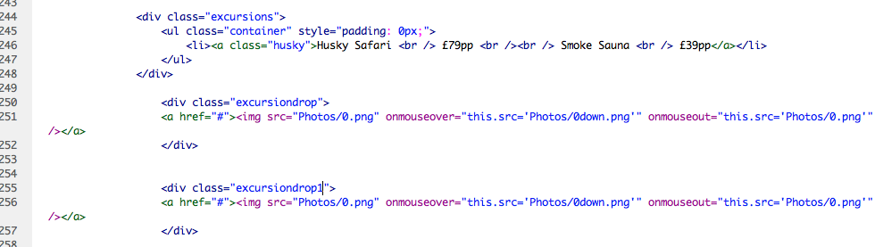
I then started doing the box for the 'Add Excursions' section. I made a container for it which would have a black background.

When I saw the outcome I changed the margins and got it sorted.

At first I had the arrows left as a percentage, but I realised that when I resized the arrows they moved and this wasn't working.

So I then made a container around the content, and I didn't have to use any margin-lefts then.

This is what it looked like with the new arrows and the excursions box in the right place.

I started to add the content to the excursions.

It was going well to start of with.

However, when I began to add more content it wouldn't go next to the other text because there seemed to be a margin-right even though I had set it as 0px.


I tried adding a span instead of a div to make it inline.
 \
\
Then I putting them in separate divs.


I decided to give up on that for now, and tried to add a link to the book now page on the booking feature button. However, I then realised you couldn't make actual buttons into links, so I changed it to look like a button.

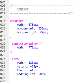
I started doing the contact page, and linked other pages to it in the HTML.
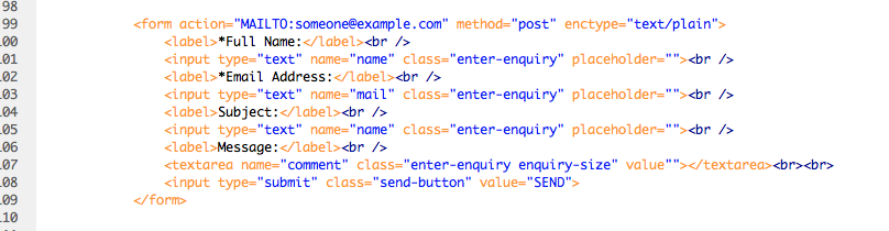
I then started the contact page, and put it into a form container.


I also grouped two classes together, so that I could use <h2> a lot, but add different margins to it when needed.

I added a form in HTML which would have all the textboxes in it.
This is the outcome at the moment:

I sorted out all the sizing, then adde another class for the message button so that I could make the height longer. I also set the button to float: right because I had set the form container to be the exact width of the text boxes so it lined up.

This is what it looks like when you type in it:

I then began on the second half of the page, which will have all the contact details on. Again, I grouped classes together.


I created a box which the content would go in.

I also added a wrapper around both of the boxes because at first the contact box was going underneath the enquiry form, not next to it.
I added a black box for the text to sit in so it looks more contained. I used information I found on the contact area of the original website.

I then adjusted the height of both the containers so that they matched.
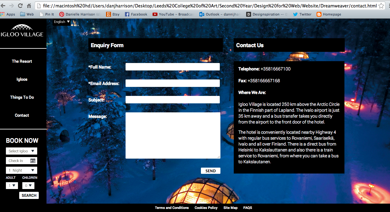
This is the HTML for the text I added:

I then went back to the book now page to try and finish of the add excursion box, with this being the aim:

However, I wasn't having much luck working it out. I tried a few different things going back and forth between Inspect Element and Dreamweaver, but I just can't figure out how to get the right sizing between all the text!


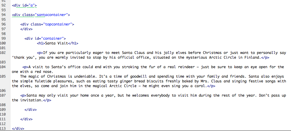
Things to Do Page Jump
I then went back to figure out how to do the page jump properly. I asked Simon, and he said just put the dots and the nav bar into a container and make it fixed, so that it wouldn't move, but the content would.
I did this, and placed the container around the nav and the dots, but ended the </div> before the content started in HTML.

I had a gap above the content which was making an unwanted gap at the top of the screen. To get rid of this, I got rid of the margin-top on the content, which solved the problem, but then the content box started too high.

So I created a new container called topcontainer which I set a height on the same as the old margin-left. This made a gap the same as the margin-height but didn't affect the rest of the page.


I put it above each content box.

When you click on the dots it goes to the right section of the page!

I decided to just add an image for the Add Excursions as it would take less time than trying to code it all separately as I was having trouble with that.

Here is the photo I added in HTML:

Here is the class around it:

I then added the Confirm Booking button as well, using the same class as the Search Again button on the page. Now this page is done!

To add the background image to the Things To Do page, I made another container to go around the content, and added the image in CSS.
In the CSS I made the z-index -1 so that it would go behind the content, and made the width 100% so that it would always cover the sides. I used the same code I've used for the background image and made everything 'cover' the screen. I've made separate containers for each image so I can change the url - in hindsight I could have just done this in HTML and used the same container for each one.

At first I had a gap so I changed the height to 640px as thats the size of my body.

This is when I added the 'cover' element because it was starting to repeat.

Here is the outcome:


I did the same for the igloo page.


This is one of the pictures for the Resort page:

I linked up all the navigation links, and I also made each link on the specific page underlined, so that when you are active on a page that part of the navigation is underlined so the user knows where they are.

All I need to do now is link up all the pictures to each page.
I added a container around each section in HTML, and in that container is the image.

In CSS it looked like this - the z-index: -1 is to make it go behind the content, the height is so that it covers the exact amount of screen and I added the image in here too. I did this for each picture.

I then started to add the arrows to the pages to make it easier for the user to see that you can scroll. I just inserted these as images rather than working buttons as that would be too hard for me to code, plus the dots work.
I added the images in to HTML with a class on them.
The class puts them in the right position and makes the position fixed.

I made the margin top the same as the text box - 65px, and also made sure the bottom one was 65px from the footer.

I sorted out the positioning of the dots by making them all equal to each other.

In CSS I made sure all the margin-tops were changed on the dots so that they were all equal, and the spacing between them all is 60px;.


The website is now finished and coded!
No comments:
Post a Comment