I wanted four pages on the website - home page; menu; books and contact. I wanted there to be a page for both the menus as this is the most visited thing by users going on a restaurant website. I also wanted there to be a books page as this is the focus of the cafe, and so people would be interested in it and I wanted to advertise this aspect. The contact and home page are a given, there needs to be a home page so the user knows what the cafe is all about, and the contact page is so that customers can enquire about anything they want, as well as find out how to get there and their address.
I started doing some wireframes for general layouts for web:

Then I started doing some scamps in more detail for web:


Then based on these, I started designing for mobile:

Website
I then went onto screen and started designing the website on Fireworks:
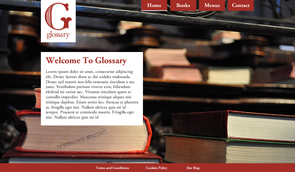
I began by adding an image in which would be the slider, 350px high as it is on my scamp. I chose one I took once which is fairly appropriate - but I will take another picture that fits in better. I added some arrows in red which would the user would use to change the image slider. To make these I created an arrow shape and deleted the anchor points which made it a full arrow. I also added the logo against a white background because 1. the logo can only be used in red and 2. this makes it more visible against the background. I added the navigation, but I feel like it is too spaced out and the background is too wide for the text. I also used Adobe Garamond Pro as that is what I've used for the printed material - however I might find another serif which works better on screen. I also added guide lines which indicate my margins.

I then tried shortening the background behind the navigation which worked a lot better, and I also aligned it right so that it wasn't as spaced out. I actually prefer this layout a lot more. I also changed the arrow colour to white to see if this would make them stand out more, which it does.

I also added the red sides outside of the margin, and some placeholder text for the about section. I also added a space for the opening times. Although this is what I have sketched out, now that I've done it on the screen I don't like it at all - it is too generic and the red is too overpowering. It needs to be used as an accent only I think.

I then started playing around with the layout on Fireworks. I find this easier to do than drawing because I can see the changes instantly. I made the image into a full background image, and added the about section on top. I think this looks really clean and I like it more than the first idea.
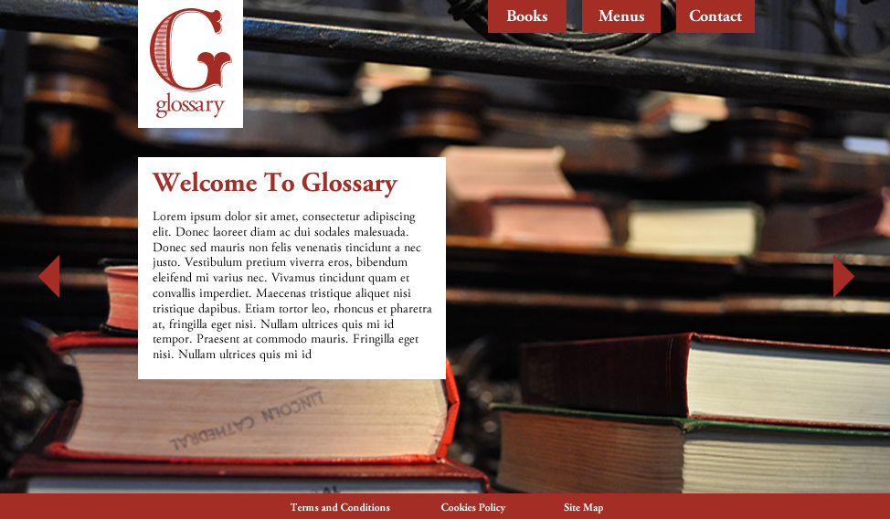
I got rid of the slider arrows, and I added a home page button. This is because I think it would work really well as one long website that has smooth page jumps when you click on the navigation. I think it would work well because it is a small website and therefore doesn't require a lot of content and pages. I have added a line at the bottom of the navigation box so the user knows what page they are on.
Here are the guides that I am using.

On the contact page I added a form which would have transparent boxes rather than filled in to make it a bit different. I think having white text/boxes on top of a darker image still lets the user be able to see what is written. I also added a container with more details on.

I then tried changing the layout of the form a bit to see how that worked, but I felt it looked too out of place.

I just tried changing the navigation to see what they looked like, but I preferred the previous one due to how my content will be laid out. I also added a full background rectangle on in black, changed the opacity down and changed the setting to Overlay, to make the background image darker and therefore the text being able to stand out a lot more.

I changed it back to the original navigation.

On the home page I then started adding some opening times so that there was more content that would be useful to the user. I felt like having the transparent background is a good idea because it would match the form on the contact page. Also, I added the red line to separate the heading and copy to match the menus I designed.

I moved it up more to be level with the bottom of the about page so that it looks more in line.

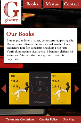
I then went onto the Books page, and for this I needed to use a lot of space to put in the book slider. I made the books overlap as this makes better use of the space and means the books can be bigger. I think it also gives a nice effect. I added the text content above this, and made it the same width of the navigation to look more in proportion. I don't think it matters that the text is placed here as opposed to under the logo because I think that the pages all still fit together well by using the same grid and type/colour hierarchy.

I changed the information on the contact page as I realised I had written the website - the user won't need this because they are already on the website. I changed it to a twitter name instead.

I then started doing the Menus page, and added a background border around the heading and the bodycopy just over the background image but I felt that this was too hard to read.


These are my final page designs:


All in all, I am really happy with the website because although it isn't generic like Costa and Caffe Nero, it is still easy to use and very simple. I think by having the long scroll it makes it contemporary, while the use of the serif, underlined navigation and simple layout makes it accessible for all of my audience. I think it relates well to the printed material due to the colour scheme being the same, and keeping the same layout (on the menu) and using the line to separate certain things.
Mobile
Now I am going to design the mobile version of this site.
I started off by copying the same permanent layout of the website to a mobile size - 320x480px. I decided this wouldn't be a scrolling site like the website and tablet because it would be harder to use on mobile, so it will work like a normal site. Also, I got rid of the home button due to this reason, as well as the fact it will save space - the logo will link to the home page.

I added a gap between the logo and the edge of the screen, like it has on the website. I added the same content from the website, and changed the point size of the heading from 30 to 24pt.

I made the margins wider at the side to make it more attractive for the user to look at.

For the Books page, I again copied over the same layout from the website and just adapted it so that it fit within my new mobile layout. For the book slider, I reduced the amount of books from 5 to 3 so that they could still be a viewable size, as having 5 would mean making them smaller to fit onto the screen. I also reduced the arrow size.
I then moved onto the menu page, and added the same arrows over but they looked too big. I got rid of the description to the meals so that they could all fit on the page as soon as you click onto it. I also added a tab for the drink menu so that you can click on that to view it.

I then added the arrows after the Sandwich but I think this would be too hard to use for the user because they are too close together and the fingers might press the wrong one.

I then added the arrows far apart so that they reached the end of the padding but I'm not sure if this looks too spaced out.

I then added them closer together, and again I'm not sure which I prefer out of the two.

I then did a Paninis section, one that you would select once you pressed an arrow. I also added arrows next to the meals here so that you can click on them to reveal the description.

This is what it would look like if you clicked on a meal:

I also tried it with the arrow at the bottom of the description but this looked out of place and would be confusing.

I then did the drinks menu tab, which was really simple.

To do the contact page, it would need to be in two halves because there is more content here. I added the form first,

Then I added the rest of the content underneath.

Here is what the whole contact page looks like.

Tablet Design
I then began working on the tablet design. I chose the dimensions for 1010x660px as advised by this website dimensions site.
I started with the home page, copying the same dimensions from the website version. I realised that it looked a little high here.

So I changed the spacing between the logo and the content, it is now 50px, which will be the same on all pages.

This is the Books page.

This is the Menus page, and I changed it slightly, adding the arrows inside the menu rather than outside the box.

Here is the Contact page:

Again, it would be a long scrolling one page, like the website:

To make the background image I took more appropriate, I added a gaussian blur so that you can't see the logo on the book pages. I think this is a good idea because the actual photo is appropriate for the cafe - it's warm, features books and is a big enough image for the screen.

No comments:
Post a Comment