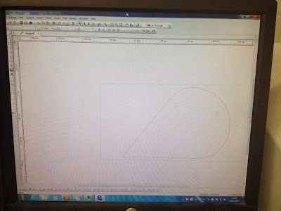
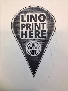
Here is the design for the icons, and I made them to each fit on an A4 piece of paper. I knew the measurement I wanted for them, as I cut out a rough mock up on paper to see how big it would be. I used the same text on here as I did on the tickets and posters to have a sense of continuity, as well as using the logo at the same size as they would be on the tickets and posters.
I wanted them to be simple and straight to the point so that they would stand out to students who want to find the equipment to use quickly and easily in the printroom.
These three had to be lasercut first, and this is how I set them up for it. They had to be back to front so that they print would the right way, and the lino print icon has a bigger black area because this is what would be burnt away.
I also printed 10 blank icons so that I could print designs on to them. As I am doing print processes onto them, and not digital print, it doesn't matter that I've cut the size beforehand.
When I first cut the icons, they had burnt edges which didn't look great, and it looked a bit unprofessional.
So I went into the lasercutter again, and did them individually this time. This is so that I could use a device which would make the stock 'float' and the laser wouldn't bounce back and burn the card.
This is the device in the lasercutter, and I had to remove the metal boards so that it would fit in. There are also clips so that the stock can be held in.
This is the stock within the device, and I set the cutter to cut the circle first, otherwise if the outline was cut first it would fall and wouldn't be in the right place/height to cut the circle.
This is what it looked like from the side when cutting.
This is what it looked like when cutting it. It took relatively quickly because of how simple the shape is.
Emboss
I also lasercut some MDF 3mm for the embossing icon, and this is what it looked like:
I also lasercut the stencil for the monoprint icon on cartridge paper:
This is what the embossing looked like with a 4000 pressure, which I think looks good but I physically couldn't pull the press any harder, so I would like to see what it looked like with more pressure. As I have now lasercut some more icons which are cleaner, I can try it again with a higher pressure.
I also tried it on paper to see what it looked like.
Mono
I went to lasercut the icon again, and I had to use the setting card 0.6mm, cartridge, card from paper and none of these worked. The correct one to use was card 220gsm.
I also tried embossing the monoprint plate to see if that would take any more ink, but that was harder to line up and had the same outcome.
This is the monoprint versions:
The main text was coming out well, but the logo wasn't picking up much ink. This is due to the stock that I've used, it isn't very absorbant and the stencil on this area is small.
This is what it looked like when I embossed it:
This is a close up of the main text, and I like how the edges are soft as it lets the viewer know the kind of effect they can get from this kind of printmaking. Each of the icons are looking a bit different and I feel like it's coming together with the icons.
I started rolling out the ink, in black.
I had recut the stencil, leaving out the logo and border as I had screenprinted this area. I then put it on the plastic plate, and cut some pieces of paper that would cover the rest of the plate which the stencil hadn't. This would stop ink getting everywhere.
Then I inked up the plate and put the stencil and paper back on.
Then I put it in the press, laid over the screenprinted icon and ran it through.
Here is the result, and I am very happy with it! It lined up well, and you can see the effect on monoprint still. The only downside to this is that there is an embossed line on it where the edge of the plate stopped. In future I will make sure to use a plate bigger than my stock to stop this from happening.
Foil
I was really happy with the outcome of the foiling icons, because I was worried I wouldn't be able to line it up properly. I did this by placing a positive of the icon on top of the stock so that I could see the design clearly. I secured it with a bit of masking tape. I then put it on the screen bed, and lined it up with the design on the screen. I then put some masking tape around the stock so that I knew where to place it and make sure it would go in the right place.
This is what the foil looks like before you peel it off:
When I was foiling the final thing, the black really stands out and has a nice shine to it. It didn't work as well as the other foils on the logo but it is still legible.
This is what it looks like when the foil has been peeled off:
Screenprinting
The screenprinting icon was probably the easiest to do because I am confident with it, and it is easy to line up. I printed onto true grain first so that I knew where to line it up with and did a test run:
Here are the final icons and they worked really well and with even colour:
Lino
For the lino icon I decided to lasercut it to get the detail in the logo and to keep the font consistent with the other icons.
When I went to print it, I soon realised that the raster from the lasercut wasn't very deep, and it actually printed what I wanted it to leave out. However, I actually quite like this happy accident because it adds a bit of difference to the icon - if they all looked the same I may as well have digitally printed them all.
I did a few mock ups on paper first:
This is what it looked like when I printed it onto the icon and I am happy with the outcome:


No comments:
Post a Comment