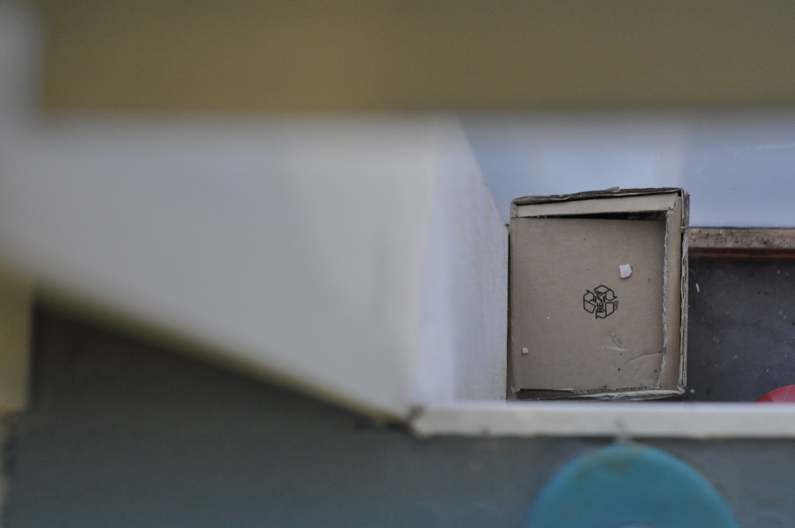
I started going round the college taking photographs, and here are my inital images:


When I took them into the session, Simon revealed that they should work as a set. I wasn't overly happy with the images that I took, but the ones that I did like were 936, 947, 951, 964, 960 and 971.
I went away and thought of different ideas that could incorporate them all as a set, and take some more images to work with them:
- Narrow depth of field
- All images taken from a bird's eye view
- Cropped images
- Windows
- Metal
I then started taking some more images, bearing these in mind, and I took a couple which had a narrow depth of field, and I really liked this concept, so I went ahead with those.

I picked the five that I liked the best and opened them into Photoshop:


I then started thinking of ways I could edit them. I only wanted to alter them slightly because I liked the images as they were. I decided to change the colouring of them to make them warmer with a Photo Filter.

I started playing around, and moving/cropping them to make the squares a more prominent part of the image.


Once I changed the Exposure to make them brighter, cropped them and added the photo filter I decided that the front of the images were finished.
For the back of the images, I wanted to use the same that was on the front but alter them further. I thought it would be a good idea to section the photograph into smaller squares, as that is my theme, then move them around to shuffle the image.


I added these guides to make squares, and when I started highlighting each square to copy and paste it, I realised it would have taken me a very long time, and would be completely illegible from the original image. I made the guides 1.5x1.5mm

To make the squares bigger I deleted every other guide so that they measured 3x3mm. This is a more practical size.

I started to highlight each square, copy and paste it, then name it by coordinates so that it was organised for when I moved them around.

This is how the first one looked like.

I started doing it again for this image, and highlighting the squares.

However, I had a different idea this time and left the part of the photograph untouched which was the square. This way, the theme was still intact, and you could still see that there was mixed up squares in the image.

As I preferred that method, I did it for this one as well.

Here is the image with the guides on, before I moved the squares around.

Because this is a photograph of the wall, the change is really subtle, mainly in colour which I think has a nice effect.

For this image, I decided to alter just the inside of the window, and keep the frame untouched as that is what is creating the square shape.

This is the final back for the cropped window.

As I originally did the wood image differently, I went back and changed it so that it was like the rest of them.

Here is what the layers looked like when I rearranged them all.
I then needed to save them in a particular way, like I was shown in the Photoshop tutorial. I had to put the front and the back layer of each photograph together, then save them as a tiff file. One had to have both layers shown, and then one of them hidden so that there was a front and a back.
I then opened Adobe Acrobat and chose combine files. Then I selected a front and a back image, and combined them. This has now made them into a double sided file, and I saved it as a pdf, ready for print. I did this for all five of my images.
No comments:
Post a Comment