
I changed the colours to shades of blue, to make the colours work better together. I think it is quite plain, and I don't really like it.


However, that brown is a horrible colour, so I changed it to make it brighter and fit in better with capturing children's attention.


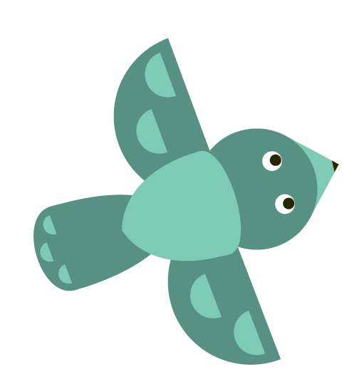
This is the finished toucan, and it is the only one out of these illustrations that I actually like. I changed the yellow part to be a circle to fit in with the eyes.
The next day I showed the group the toucan that I designed, because I wasn't happy with the other designs, and they all really liked the style that it was in. Kirsty then scanned in her drawings, which I then started to illustrate. Here are her drawings:


Here are some screenshots of while I was producing the illustrations.


 I also started working on the koala bear, but I wasn't happy with that either because our styles are too different, and didn't work as one. I didn't want to create my style and completely disregard hers, but I wanted it to work with the basic shape toucan that I designed, because the feedback I recieved from my group about it was really positive.
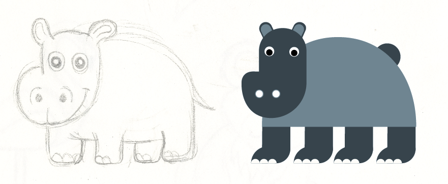
I then started to work on the elephant, and at first I was happy with it, because it was simple, but it didn't fit in with Kirsty's drawing.


I then started working on the flamingo, and at first I tried to make a curved neck by tracing an 'S' but it didn't fit in proportionally with the rest of the animals, so I went with a straight neck instead.


I found this one quite difficult as the mane in the drawing wouldn't look clean. I decided to keep it clean and use simple shapes, but I don't really like the finish. I used triangles as teeth, as they are that shape in the drawing.


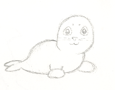
This is the original drawing of the seal.

 This wasn't a drawing originally, but I just started playing around with shapes to see what I could make. At first the face looked slightly like a birds face, so I altered it to look more like the giraffes face shape, as it looked more like a horse. I also altered the tail on the second attempt. I quite like this illustration, and I used rectangles which were curved at the end for the mane, to keep it geometric and clean.
So far this is my contribution to the group. I showed them to the group today, and everyone apart from Kirsty who wasn't there, said they really liked them, so I sent it to them all so that they can continue designing posters, murals etc with the illustrations. I am happy with some of them, but some of them I think could have been better. However, with the tight deadline we are working to these are the best I could produce, and I needed to have them finished so that the rest of the group could work with them. Tomorrow they should have done some poster and bookmark designs, so I will be able to contribute again to the group.
No comments:
Post a Comment