
I began of in Illustrator, because I wanted to know the exact sizes of the pictures I wanted so I could alter them correctly into InDesign, and I wanted to play around first. As the brief states the article should have 500 words that isn't a lot, so I decided to have wide margins, which would also make the article look clean.
Top - 2cm
Outside - 4cm
Inside - 2cm
Bottom - 3cm
I decided to add a outline to the WWF logo and have it coming of the end of the page, but it looks too long here reaching to the bottom of the bodycopy.
I decided to use Headline One for the heading because I think the boldness of it makes it stand out, and because it is quite condensed it allows me to have long words in a small space.
I decided to use Georgia for the introduction because it is professional and I wanted to use Akzidenz Grotesk for the rest of the bodycopy to separate the two. The fonts need to aim at both adults and children, because it is children who want to adopt animals (hence the cuddly toy, stickers etc in the adoption pack), but it is the adults who are going to pay for it. Therefore the fonts need to be professional and sophisticated for the adult, but easy to digest and interesting for the child.

I moved the logo higher so that it reaches the end of the heading, but now the white space next to the introduction looks unbalanced.

I lengthened the text box so that it reaches to the end of the margin, and I think that this looks better now. I also made the gutter 0.5cm between the title and the introduction, which I will continue throughout the rest of the article.

I added some facts about the elephant seal and a photo, but the text seems very condensed and doesn't fill the rest of the page to the photo. I wanted the photo to reach the end of the page, as I had done the same with the WWF logo.

So I decided to make each space between the facts the same space as the gutter, 0.5cm, and this gave me a lot more space. I also added another image which went with one of the facts. I also added a title for it, so that it was easy to understand what that section was about. I also worked out that the point size of the headings should be 19pt with the bodycopy being 12pt, using the fibbonachi sequence. Doing all this allowed the text to reach to the photo and fill in the blank space. I also added a gutter next to the middle of the page, so that when I put the information on the right hand side, they didn't meet each other completely in the middle of the page.

I then did the same on the right column on the left page, and I added another photograph under the Southern Seals section, so when I added the Contact WWF at the bottom it separated those two sections. I added the same grid on the right hand side, and because I have let the other photographs reach the end of the page on the left, I did the same on the second page.

Once I had filled in all the information, I decided to add another image because it looked quite blank, but I don't think the bottom right image works that well because the seal is having a fight with another - I just cropped the other seal out.

So I added a different image of a seal pup, because it is a lot cuter which would persuade the viewer to adopt the animal more. I also made sure that the image was portrait because I think the previous image made it hard to see that the grid was balanced on both pages with it reaching the end of two sides, as an image has already done that on the page.

When I looked at it, I didn't think the left hand page looks quite right, I didn't think the image above the Contact WWF fitted in. It looks too cramped and it isn't necessary.

I extended the information on the Southern Seals so that I filled in the white space. I also added page numbers to make it more realistic as a double page spread.

However, I then took back the information, because the brief does say that the article must have 500 words, and I didn't want to go over that.

I decided to add another photograph on the right page because I think it did look like something was missing, and I also extended the information on the Southern Seals section, and I am going to ask my tutor if the brief means it must have at least 500 words, or 500 words max.
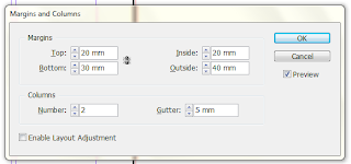
I went into InDesign and started making it. I set my margins, gutter and column:
I soon realised that I didn't need to do the pictures on Illustrator first, because I resized them on Photoshop anyway to place into InDesign.

I then opened up the same image in Photoshop, and went onto Image Size to change the proportions:

This meant when I placed it back in InDesign, it was the perfect size already.
Here is the finished double page spread:

Here is a close up so that you can see the text:


I decided to add another photograph on the right page because I think it did look like something was missing, and I also extended the information on the Southern Seals section, and I am going to ask my tutor if the brief means it must have at least 500 words, or 500 words max.
I went into InDesign and started making it. I set my margins, gutter and column:

I soon realised that I didn't need to do the pictures on Illustrator first, because I resized them on Photoshop anyway to place into InDesign.
I put an image into InDesign, and resized it to what I wanted. This was the width and height:
I then opened up the same image in Photoshop, and went onto Image Size to change the proportions:

This meant when I placed it back in InDesign, it was the perfect size already.
Here is the finished double page spread:

Here is a close up so that you can see the text:

No comments:
Post a Comment