How many points are in a pica?
I then went onto InDesign, Illustrator and Photoshop.

I created my first sketch idea on InDesign, then to see what it could look like when printed I created a magazine mock-up on Photoshop. I think that with the bodycopy the same font as the heading, it looks too chunky.

I tried experimenting with the same heading font with just outlines, but now I think it looks too empty, and the bodycopy font is too big.

I tried the same outline idea with the bodycopy font. I think the text on the left page looks out of place and too big compared to the squares.

I think it looks tidier now the type is in line with the margins.

I tried Bodoni as the heading font, but I don't think it works well for this type of publication, as it is more recognizable with fashion, however I do think it looks good.

I tried the text on one line only.

I then tried the text underneath the square, with the gaps sticking to the gutter size and a smaller point size, which I now think looks a lot better.
Visual Literacy is a International Language

On Illustrator I made some illustrations that relate to the text on the left page.

I think that they work well, and I am starting to see a theme occur in the publication. I wanted to do these illustrations so that they were relevant to the words, and were also my own work rather than finding pictograms from a different source.
Readability and Legibility Between the Typeface Family in Bodycopy

I wanted to experiment with type, and being ironic with the words readability and legibility, but I don't think it works at all.


I wanted to create a fold out page for this section, so that the four points about gothic, roman, script and block would be together and I didn't have to condense the examples that I made. I also think that it would make the book more interactive. It is easy to see that they are the same point, because I have used the same grid on each page.

I added a space between each letter here, which makes it look lighter.

I then removed it, which I think makes it look bolder than the previous idea.
I started changing the leading on the headings as well to see how they looked when they were different.

As I had made changes to the layout on some pages, I changed this point to fit in with rest of them.
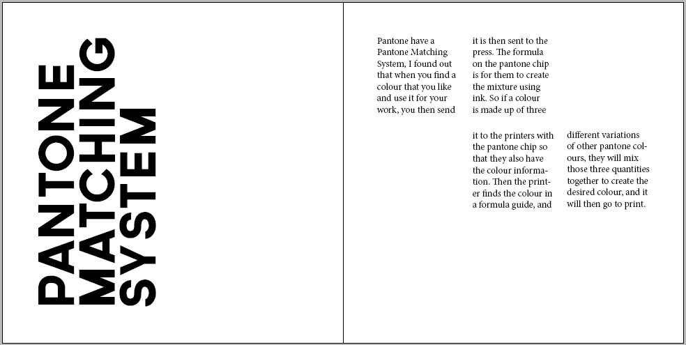
How To Use the Pantone Matching System

For the Pantone Matching System spread, I thought it would be a good idea to have the text in a square frame to match Pantone swatches.

I experimented with turning things on their sides so that the viewer would have to interact and turn the book around, but I didn't know if this interrupted the legibility too much as it isn't necessary.
I quite like the layout of the text here, and the white space between that and the title.

I prefer the previous idea, as I liked the amount of white space.

I tried seeing what using both pages for the information would look like rather than having one for the title, and one for the bodycopy.

When I saw them next to each other in the previous image, I thought it would make more sense to have them as three frames rather than six, to utilise the space more. However this looks very uneven.

I altered the frames so that they were all an equal size.

I then thought of having the title page as a replica of a Pantone swatch, so that it has relevance to the topic. As although I liked the previous layouts, they didn't have a meaning to the content, whereas I wanted them too, so I think that this works better.
The Difference Between Typeface and Font

I also need to think of a way to make 'Typeface' and 'Font' look relevant, as I don't like this at all.

I then played around with the type, and preferred this much better, as it makes use of the space.
Optical and Physical Mixing

I started on the optical and physical mixing page, and using both pages to have the heading on. I don't like how the 'L' on the physical crosses over the margin.

I think it looks better justified left to fit in with the bodycopy.

I also like how the text on the right fits in with the heading on the left page.

I then tried separating the pages functions - one for heading, one for bodycopy.

To make the title more coherent with the topic, I decided to do it in the style of an optician's chart, as that is what I think of when I think of 'optical'. Here I tried to make the the bottom three rows justified.

Here I tried to enlarge the line lengths by one, then reduce the last one.
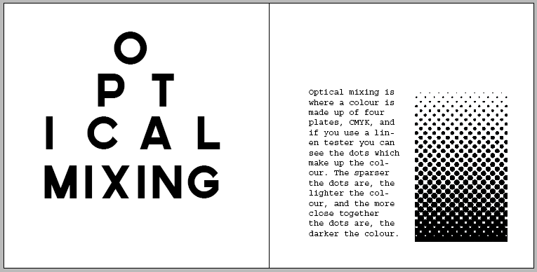
Here I tried to justify the 'ical' with mixing and I added a halftone image that I made on Illustrator to fit in with the text.

I then got rid of the optician chart idea, and focused on the halftone vector as a main part of the spread, as I didn't feel like the previous idea was working.

But then I went back to it, and made the text smaller the further it went down, as that is more realistic, and I think it looks better now.

For the phyiscal mixing page I decided to have the same layout of text as the optical page, but have a different title. As the optical heading fitted in the word, I decided to do the same for physical. So here is the layout of how I want the heading to look like, but I have made a typeface out of paperclips to show the word in a physical form.
How Semiotics Are Important For People To Interpret Things

For the Semiotics page I knew from my sketches that I wanted the example to fill up a lot of the page, and I think that it looks good as a focal point. I wasn't sure how to lay out the heading, but I thought this worked well as it is a 3x3 grid, and there are three points to semiotics that I wanted to talk about.

I made the title smaller so that I could fit some information on, as I didn't want to add anything else on to the right page.
Visual Metaphors, Metanyms and Synechodches
As this point was about using visual examples to express the definition of the three words, I went onto Illustrator and created my own illustrations for the points. I wanted the points to work across the double page spread as it would look visually unbalanced having one point on one page, and two points on another. I also changed the illustrations to greyscale, as I think that it would look better when printed. However, I might print it and see what it looks like, because it might work better in colour with the other images in the document being in colour.


Readability and Legibility using Colour in Bodycopy
I used the same layout for these pages as I did for the readability and legibility between using the typeface families in bodycopy, to keep it consistent as they both have the same amount of information.


Things I am unsure of:
Whether the gutter needs to be same measurement on every page - it looks good at 0.25cm on the spacing between the squares on PICA, but looks too small between heading/bodycopy and bodycopy/images so I changed it to 0.5cm.
Is having headings at different point sizes and leading, but the same font inconsistent?
On the Pica, Pantone, Optical mixing and Physical mixing page I started the bodycopy/image at 3cm on the right page for some consistency, but when I tried it on the 'readability and legibility in bodycopy' spread I thought it worked better starting at the top of the margin.
Also, is having two of the pages with a hand rendered font inconsistent as all the other pages have Governer as the font?
Also, I originally had the margins equally at 1cm, but then I changed the inside margin to 1.5cm as it is said that better design usually has differently measured margins, but I feel that in this case it looked better when they were all equal. Would that be considered bad design, or are there exceptions to the rule?
I uploaded what I have done so far on Issu, it is finished, but I am not completely happy with it so I might change it.
We had a peer review in Phil's session yesterday (20.30.13) and after seeing the publication on screen and other people looking at it, I have made some revisions to it. When people wrote feedback it was all really positive, and didn't comment on areas to improve on, which hasn't helped much. But when I was speaking to people about my design and asked them questions, then I got feedback that I was looking for. I have now gone back and revised the publication, and I am ready to print!
Here are the final pages:
This is the title page, and it fits in with the design on the back page. I wanted it to be like this, so that the viewer would have to turn the book around and interact with it.

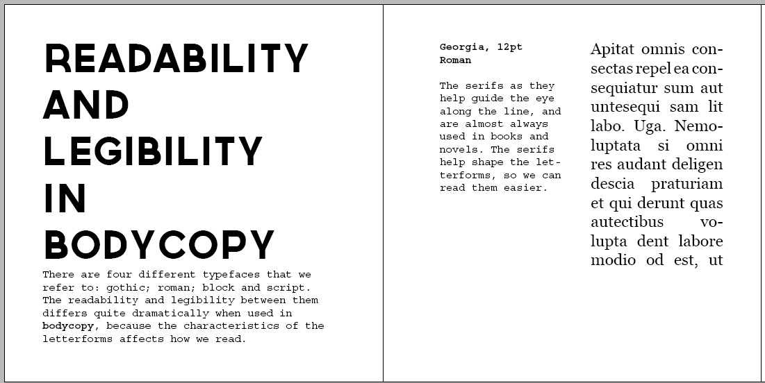
Here is the first double page spread, and the gutter between the squares and the leading of the bodycopy is 2.5mm.

The spacing here is equally horizontally between the text and image on the pages so that the viewer can see they are related.

As the content of this spread is about the Pantone Matching System, I wanted the title to look like a Pantone Swatch so that it fitted in with the text. The gutter between the text columns is 2.5mm, and the gutter between the lines on the first page is also 2.5mm. However, I thought it looked better between the black rectangle and the heading to be 5mm, otherwise it looked too cramped.

Again, I wanted the title to reflect the content of the spread. When I think of optical I think of an optician's chart, so I created it in the style of one. As in the previous spread there were two text columns, I used one of them here for an image. But I think it still looks consistent as they both follow the same grid and sizes.

I wanted these two pages to be next to each other, as technically they are both part of the same point. The second page follows the exact same grid to keep it consistent. I did try to create a physical typeface using paperclips, but it just didn't look consistent with all the other headings in the publication being digital. By placing the letters on top of each other, I thought it gave the effect of stacking, which you do with physical objects.

I changed the layout of the readability and legibility pages, as I thought the two columns next to each other in different fonts looked too out of place, and this way I have separated them so it doesn't look confusing.

For the semiotics page I thought it would be a good idea to have the title in a 3x3 grid to match the fact there are three things to be aware of in semiotics. I think that the heading reflects the image on the right hand page well because they are both central and are the same size.

I wanted to use image to use alongside the text, but I didn't want to use existing photographs as photography hasn't been featured in the rest of the publication so would look out of place, and I am trying to limit the use of colour where I can here. So I made my own illustrations and made them greyscale. The distance between the subheading and bodycopy is 2.5mm. The gutter between the columns is 5mm along with the space between the heading and subheadings.

I changed this layout to match the exact same as the Readability and Legibility between bodycopy.

I made sure that all the letters were correctly aligned using guides.

Here is the final double page spread, and you can see the grid that I used here. The margins that are shown here are used on every page.

This is the backcover, and when opened you will be able to see how it relates to the front cover.

No comments:
Post a Comment